Who, what, where and why for me have to be some of the most challenging and thought-provoking questions of self-reflection. At the start of this exercise, I had to really think about what I wanted people to see me as, or what they would think of me. First impressions count, I needed to brand myself or as Micheal Wolff suggests, we should package ourselves in accordance with how we wish people to see us. After all, this is a question of identity.
The temptation to hit illustrator without planning would have resulted in a series of simple illustrations, typographic experiments of my name and location being thrown around on the artboard with nothing more than an exercise in CMD + Z. To really get me thinking I had to go back to basics and practice what I preach. Start on paper, it is easier to scribble and get ideas down using a pen. This process forced me to think about why I am doing this what do aim to get out of this process. Going back to the idea of branding and identity.
I was drawn to the idea and concept of being a Designer, what does it mean to be a Designer? How do I quantify myself as a Designer, is it my degree, job or interest. Do I need the validation of peers to confirm my identity as a Designer? I also contemplated with the idea, is what I do, what I am. On this idea, what I do is teach, therefore I am a teacher, not a designer. The what and why element becomes clear at this point, I am a teacher and the question of why would change the what into a Designer. Rather than an admirer of design, I aim to develop my skills into a practitioner of design. I still needed to find the answer to the who element of this four as I initially thought that the where question would be one of current geographic location.
On my quest for answers to the Who, Emma Gannon is an advocate for the Multi-hyphenated career path, could this be the answer? Gannon states that millennials left university during an economic downturn and had to fight for jobs and make themselves employable, learning new skills and developing job roles to become un-sackable. In her book and podcasts, she argues that the job for life isn’t one of a linear path. We are studying for jobs at school and university that have not yet been invented. As a social media content manager and self-proclaimed multi-hyphenated woman, she is creating her own path and making her own jobs. I feel that as a teacher of a creative subject I too have to adopt this multi-hyphenated idea. Being the creative designer but also pastoral support, data analyst and disciplinarian. The who and what become blurred lines and further raise the question of is what I do, what I am. If so am I too a multi-hyphenated creative?
After throwing my ideas down on paper I had decided that the answer to who, simply should be Jamie Baldwin. I am the person that is a multi-hyphenated creative and feel that a ‘job’ isn’t who I am but the what would definitely be a Teacher as this is what I do. Where was a little more difficult to answer. Currently, my geographic location is in Cornwall but I am a proud Yorkshire man. However no sooner had I written this I thought, why does my where have to be my current location, could it not be where do I want to be in the future? I then concluded that to answer all four questions could I answer ‘Designer’. I remember writing the words Graphic Designer in an Art class at school, I had spelled it incorrectly and I’m sure I didn’t entirely know what it would entail, I just wanted to be one.
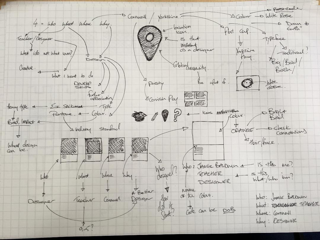
How do I visualize this? is there a universal language for who I am, what I do, where I am from, where I am now and Why I am undertaking this masters degree. I had some idea of answers but had no idea how I could show this. During a conversation with students discussing colour and how this can have an impact on the audience in different cultures, the concept of colour to answer my questions had emerged. The use of colour and how it could be interpreted has always been of interest to me, the work of James Edgar for the secret lives of colour book further sparked an idea. (thanks to the procrastination of Instagram) Could I use colour to answer these four simple, thought-provoking questions? My initial thoughts around colour were drawn to the biggest colour catalog and a key designer tool, the Pantone swatch book. My idea was to use the layout and concept of these cards to show my responses. I just needed to think about what colours would represent each answer and crucially clarify my answers.
Pantone started its life in New York in the 50s as M & J Levine Advertising a printing company, by 1957 the founders had hired Lawrence Herbert to apply his knowledge of chemistry to simplify the company’s inks. By the early sixties, Herbert was running the printing division at a profit. This standardisation of colour revolutionised printing and quality. The fan books would include a series of hues and tints of each available colour and its code.
Colour is the characteristic of human visual perception described through colour categories, with names such as red, orange, yellow, green, blue, or purple.
My investigation into colour was not as focused as that of Herbert but one based on physical links or connotations of each answer. Initially, the colour of choice to answer my Who question was Orange. A bright bold colour that suggests positivity and energy, something that I aim to portray. I will stick with this idea but in what hue. Linking my Where to a colour, I decided on Cornwall as my current location and initially thought of Black and Yellow, the colours of the Cornish arms. Is this too obvious? I continued to think about Cornwall and why I moved here, sandy beaches, open spaces and somewhere less crowded as my last location, London. Colours of Blue, Green and what I can only describe as Beige started to come to mind. This reflected the beach, cream teas, and Cornish pasties. Is the colour of Cornwall really Beige? Beige brings images of nursing homes and poorly decorated office spaces. Logically this seemed to work but visually I wasn’t so sure. Blue. the colour of loyalty, authority, and power. Is this the colour of a teacher? As I look down at my Blue suit, Blue shirt, Blue tie, Blue pen and reflected, is this too obvious? Connotations of the colour would lead me back to the attributes of a teacher but with so many hues and tones, I would find it difficult to choose.
![4631991238_bf860cc35c_o [colours in cultures]](https://bwn.design.blog/wp-content/uploads/2018/09/4631991238_bf860cc35c_o-colours-in-cultures.png)
Until now I have been able to link physical items to each colour and answer. What is the colour of design? White was my first thought, we see magazines with Swedish inspired home decor, clean lines, white furniture with splashes of colour. White is dependable, mixes well with other colours. White can be the foundation of colours and pigments in printing. Designers usually start with white paper or a white art board. As I started to assemble my Pantone swatches and look at them as a collective. While each colour made sense, I did not feel that as a collective they blended all that well and would require some amendments. The investigation into colour pairs and tetrad combinations flexed these concepts a little further and some of the colours had to change. I wanted to keep the Blue and Orange but Beige had to go and while white was an obvious choice I had to experiment with other colours to make this four a complete set. A raspberry red worked well with all other colours however I was not sold on the idea of this representing design and being a Designer. It had to be White.
Reflecting on the final design, I believe that this series of four colours captures my intentions to deliver a message of who I am, what I do, Where I am from and why I am undertaking this Masters Degree. Okay, so it may be a little conceptual but I have enjoyed the journey from pen and paper to developing the ideas digitally. However simple the final outcome I have discovered through this process that I could answer ‘Designer’ to all of the questions but in order to do that I must take this journey. If each swatch was titled Designer, would I develop a colour for each entity of design and discipline? I would hope so.


Design can be art. Design can be aesthetics. Design is so simple, that’s why it is so complicated. Paul Rand.

Great reflection! You can write well – we are excited about designers who can write 🙂 We will show in the webinar Thanks You have done really well to get on board – get to grips with it all and get this done this week. I suggest you spend time looking at all the content we have given to you in week 1 – the readings, films, practitioner case studies – it is important that you reference this on your blog too. Keep the writing concise. Ask yourself questions in relation to the material each week. In future tasks try to experiment across different media to test and create different iterations of your visual problem solving. Fab start Jamie well done 🙂
LikeLike