The self and Identity, are they the same thing? At the start of this process, I certainly believed so. Through his podcast, Dr. Scott Barry Kaufman raise this question of the self and identity in episode 121, The self, Identity and removing the mask, he explores labels and categorisation, in discussion with Mark Leary, Ph.D. a professor of psychology, Kaufman and Leary aim to define each term and conclude that the self, is to be self-aware, the self is not content, it is an apparatus to allow us to think subconsciously. Leary goes on to suggest that Identity is content, it is what you are thinking about yourself and who you think you are and what you are like. In his book, the Trajectory of the self, Anthony Giddens argues an opposing view to that of Leary, Giddens states:
The self is seen as a reflexive project, for which the individual is responsible. We are, not what we are, but what we make of ourselves. It would not be true to say that the self is regarded as entirely empty of content for there are psychological processes of self-formation, and psychological needs, which provide the parameters for the reorganisation of the self.
Giddens goes on to state that the self is not empty of context as suggested by Leary, and identifies that the self-has some content, and that this is essential for our own identification. Giddens does acknowledge that the body is part of an active system rather than a passive object which makes me think that the self and our identity is more than skin deep. We are not who we are due to our body type, skin colour, gender or sexuality. We are who we are due to values, beliefs, and traits, this I believe is how we can define identity.
When given the subject of the self and asked to reflect on the lecture by Martin Hosken my initial thoughts lay with the idea of how I see myself and how others see me, it was a reflection of identity. I thought about how others may see me, and how others see the digital me, the edited and filtered me. In this digital age, is the online presence our self-defined ‘me’ the one we truly wish to project onto the world and is this an accurate account of our life and identity. These questions and ideas were just my starting point and reference for further reading. I continued to think about society and identity, our perception of others and this idea of culture our social culture to judge others and our desire to be seen in a certain way. The idea of the culture of our environment also resonated with me and I then began to reflect on how people connect and are seen in different cultures and think about how people have different beliefs, does this define them?
Religion, in my opinion, is a set of boundaries and guides of how we should live, in some cases, spirituality guides us to how we should see the world and how we should deal with difficult situations. I questioned my own spirituality and where do I see myself on this spectrum. I reflected on my work, and the people around me, I aimed to really focus in on what I believe to be my morals and wondered, is this how we are defined. I believe in the power of good and believe that people can do good things, despite what we see in the media more often than not. I do not follow a religious lifestyle, I was baptised as a child but do not feel this reflects me or my family’s beliefs in Christianity. However, I do believe in the teachings and morals practiced by Buddhists. I believe in self-belief and being at one with our mind and body, this is something that I find solace in. Meditation and mindfulness certainly can help us reflect on the day’s events and deal with difficult situations, this also gives us the opportunity to think about our self and how we may have been perceived or how we may have dealt with situations. Are we reactive or responsive in moments of stress? I do not believe that my spiritual beliefs define who I am but appreciate that for some, this can be their defining status and all-encompassing. I raised the topic of religion as this comes with identity, to align one’s self to a religion, a group of ethics or beliefs is no different to brand loyalty or suggesting that you are a Mod, Rocker, Punk, or Goth. Each has its own style, belief, music and connects people. Kaufman suggests as humans we strive to belong and connect with others, it is in our nature.
To further this idea of belonging and nature, Hosken raised the concept of nature vs nurture, this too can be linked back to our need to connect and identify ourselves with a religious group. Are we nurtured, is our family religious, are these the values that we aim to hold dear to us or is it nature? People find a place in society and find a group that they feel they belong to and this can become their identity. In his lecture, Hosken spoke about the archetypes of society and that these can be identified in many cultures and I began to wonder where would I sit within this categorisation, is it so black and white to identify people in this way? I cannot argue with Hosken, I think that we do see these archetypes in society but I question if there must be a broader spectrum of people or do we all identify with one of the archetypes?
In the documentary The Century of the Self, Edward Bernays had taken influence from his uncle’s research and concluded that people who were left to think for themselves would lead us into despair and used the first world war as an example. Bernays developed the profession of Public Relations and worked with businesses and politicians to train and lead the American nation into an industrial consumer of goods. America in the 1920s before they joined the war, was in boom people were told to invest and what appeared to be brainwashed into believing that their spending habits were for the benefit of a nation. After the war, this changed and the nation becomes one of need not want. Bernays had to change this, there was a conflict of interest with business and politics but he still managed to turn around the consumer habits of an entire nation. I found it interesting that we can be influenced so easily and given today’s mass of media presence in our life, now more than ever we are pushed, influenced and sold ideas of lifestyles, ethics, and consumerism.
This then made me think more about my identity and how true it may be, with all these external influences in our lives, Instagram, Facebook, Magazines, Tv even books. With this impact on our life, values and our identity I once again questioned is what I do who I am, Is what I do a result of external influences. I think that I have become a teacher and working in education as a result of chasing a certain lifestyle and maybe even as a result of my lack of drive to be where I actually wanted to be when I left university. I should have chased the dream and done as friends had, moved away sooner and found the dream job. It has been interesting to speak with designer friends and how they found themselves to be where they are today. Some admit that their education has had a big influence but others not so much. My point here is I seem to blame my education for not better equipping me for industry and so I found a path and took control to become a teacher. Anyway, back to my pursuit of the self and identity, while I accept that I am not necessarily what I do, there is an element of how I am perceived or how I wish to be perceived that would like my identity to be, a Designer.
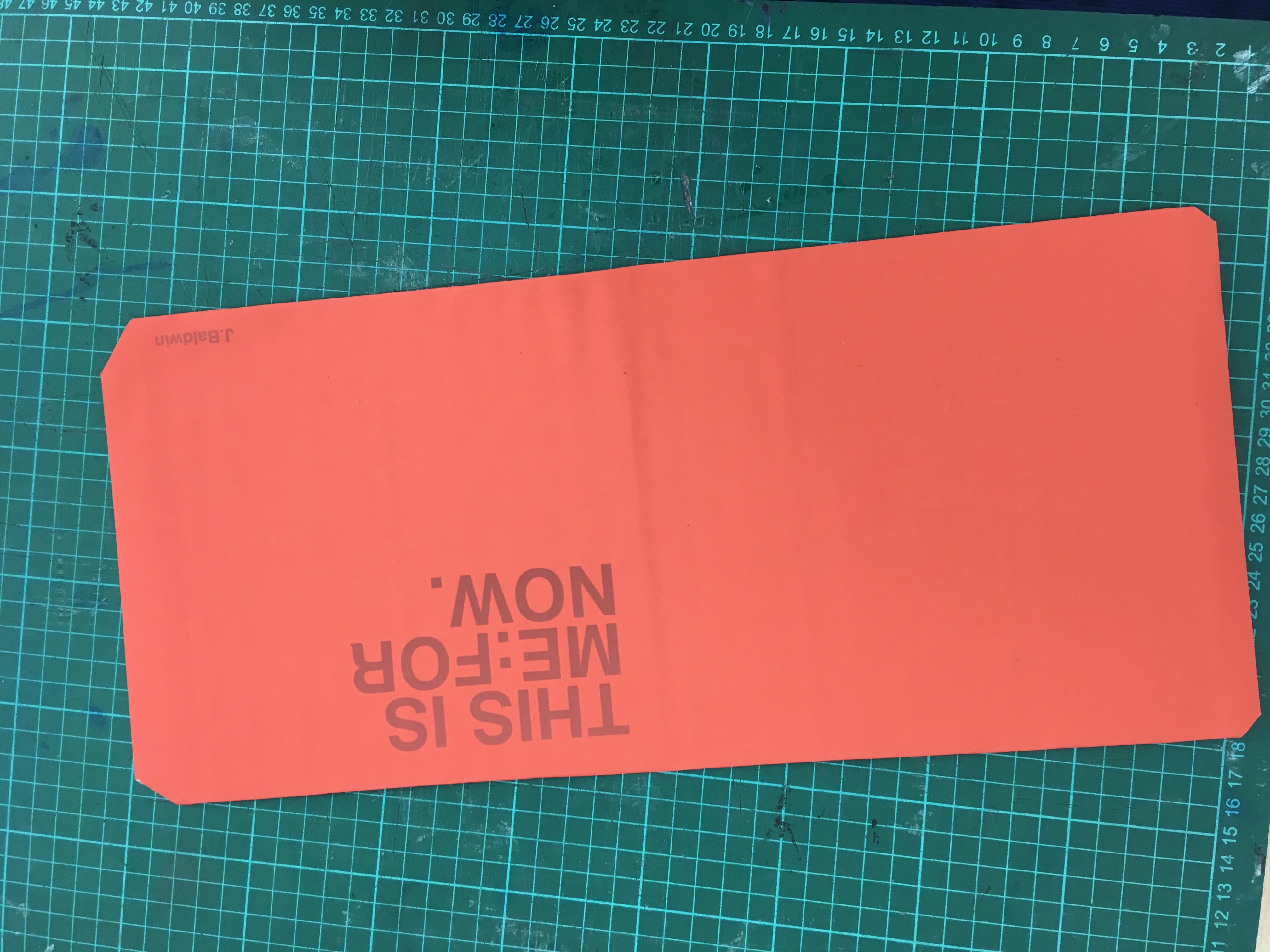
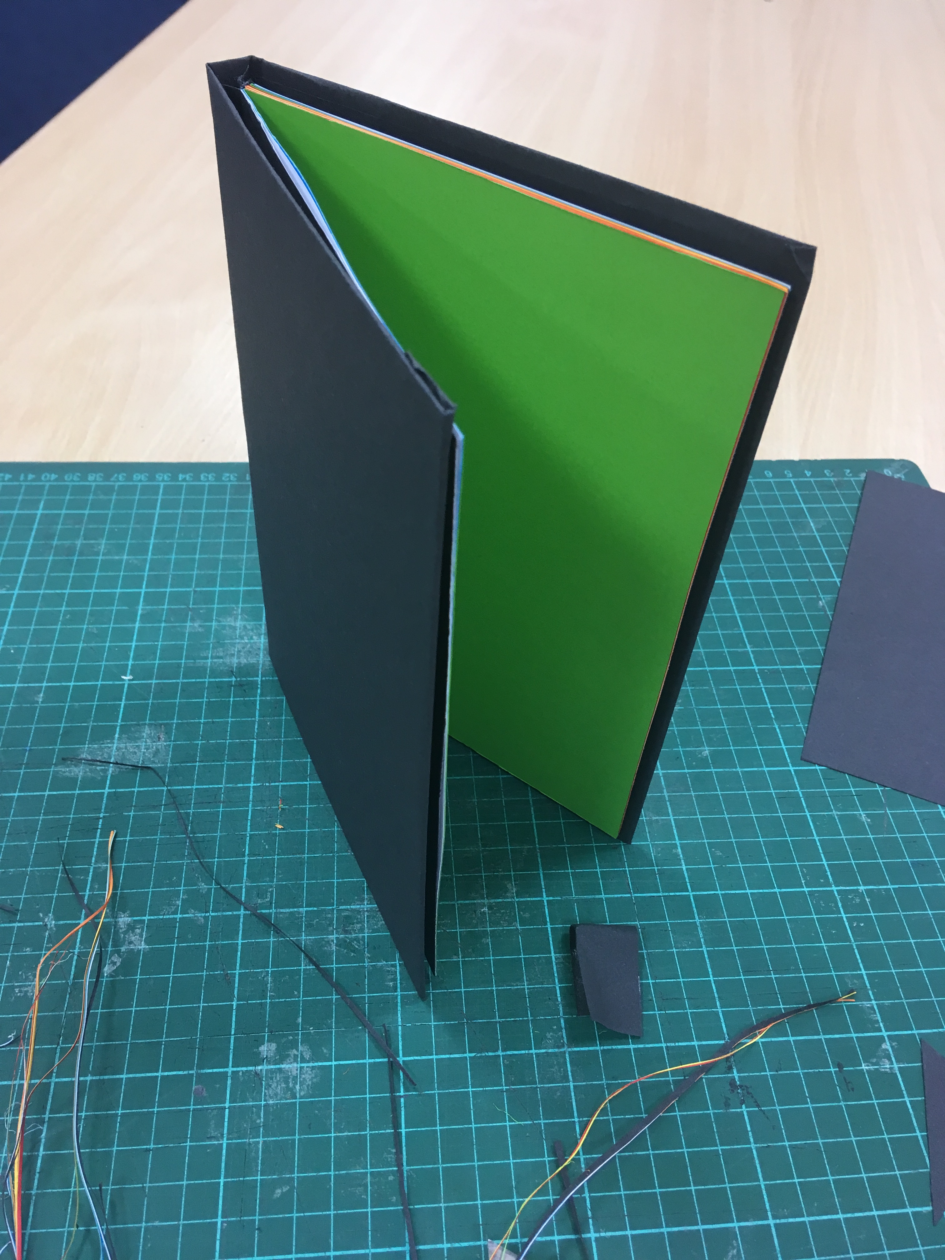
Designing an artifact that represents me right now, I explored the idea of developing a typeface (only a few letters), laser cutting this and using it to print a series of type ‘posters’. I concluded that the stamp or template itself would end up being the artifact and not the print, although this idea does reflect my passion for print, printing, and typography. I also liked the idea of screenprinting a series of typographical ‘posters’ but due to time constraints, I did not think this was a viable option. A book is a snapshot, a moment in time, preserved forever (in theory) in print. A book represents what I love about design and as someone who enjoys a good book, I felt that this is something I had to make. Design and print what I was taught in college and at university, I never really delved into the design of websites and user experiences, this is something that I hope to look into further during this course, but for now design and print it is. I also believe that a book would best represent my self and give me the opportunity to explore my identity. The book itself would be a snapshot of right now, it would aim to represent me in the present and be my ‘self’ a vessel for me to place values and principles that is my identity. This idea did not entirely come to fruition, the content of the book would explore my design practice and how I wish to be seen as a creative. I did not want to include any works as not to add a ‘date stamp’ although I did want the book to represent the now, I didn’t want it to be defined by work or projects. The book should be a representation of me right now and with themes of who I am, want to be and how I wish to be seen. I found this double page spread in a copy of Computer arts: projects in my classrooms back catalog, how interesting would it be to develop a book that uses mixed paper stocks, die-cutting and fold out elements.


The design of the book is based around a 180 x 180 mm printed area, this InDesign document shows some of the bleed and guides used. Due to the way I had set up this page I was unable to add additional grids and guides (I probably could have if I knew how to lock some of the guides) this, I found annoying as not having guides to work to really didn’t help the placement of type. Anyway, excuses out of the way, using the orange colour from week one I decided on a colour pallet of Orange and Grey. The grey I believed would be subtle and ‘sink’ into the page as if it was barely there. The joys of on-screen design to the realities of print, testing, and development of this colour should have shown me that I needed to add more white to the hue and gain the desired effect. However, wanting to ensure I had an artifact and the time I could allocate to this I continued with this colour.


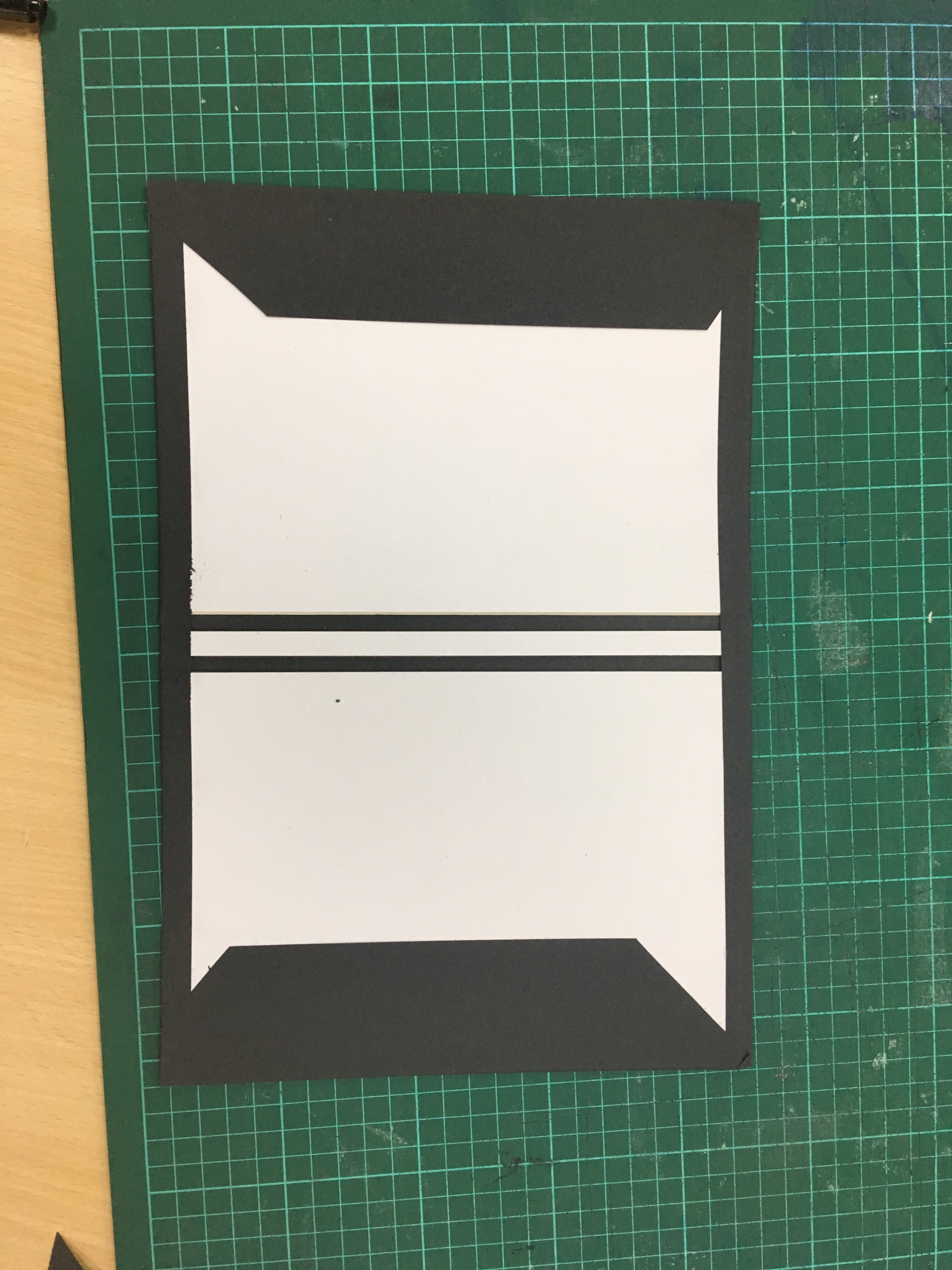
I have used words to highlight my identity, how I wish to be seen and fill the pages of my ‘self’. The first page draws reference from an inspirational moment while at University. The Helvetica at 50 exhibitions come to a local design center. Despite being in love with Design I had not yet seen the powers of Helvetica, the exhibition asked 50 designers and illustrators to use the type and illustrate a given year. I left the exhibition, went back to my desk at university and ‘played’ around with the typeface. I watched the film and understood more about the use of typography and what that can say about a person or brand. I must admit that I agree with Erik Spiekermann who says Helvetica is unambiguous, it is off-white paint. Take any brand and set their logo in Helvetica and it will look contemporary and accessible. This was the downside to the typeface and soon become the reason why it fell out of favor with designers. I’m not sure what it says about me, can I be classified as contemporary and versatile or am I off-white paint? In reflection maybe I could have explored other typefaces but I believe that these values that I see in Helvetica also demonstrate elements of my identity and also captures my first love with Design.
The second page explores the idea of identity by layering words and using colour to hide ‘what I do’ with ‘what I want to be’. The layout of this page aims to draw the attention to the word Design and Designer I wanted the user to focus on the relationship between the words and the use of colour to disguise my job title. In week one I really explored this idea of identity and self, I asked is what I do who I am and while I conclude that no this is not the case, I hold values and have traits that define my identity I believe that right now these words are characteristics of what I do and form a part of my identity.


The following pages were an experimentation, I thought it would be too obvious to place images or examples of work. I did not wish for this book to become a portfolio, I wanted to, more than anything show my appreciation for type and my interest in layout and design and print in this exercise I thought that would show my identity more and be a reflection of me. I used placeholder type only, as an illustration, I wanted to explore my interest and passion for each of these areas and how I feel the link to my identity and self. I guess I will just do that here instead.
I remember getting my first film camera from my Grandad, it was a Pentax that he had found on a car boot. The viewfinder was scratched and the lens had a sticking point when focusing but I used it throughout College and University. A film camera only offers you up to 35 opportunities to capture a moment, a recent visit to Paris with my Canon film camera tested this. I had no opportunity to delete and take again like with my digital. I enjoy setting the iso, the film speed and hoping you have set things up right. I like to shoot in black and white, this just reminds me of developing my own negatives at University. While at university I collaborated with a good friend on a series of projects that encouraged us to make comment on society and the times we were living in, we produced a 16ft illustration that took influence from a range of ‘street artists’ and illustrators. We spent days and hours developing a simple, hand-drawn style. I think that the beauty of illustrations is that even if it does look like a 4-year-old could do it. That’s your style, I was once told that I should continue to develop my own style and not aim to be versatile when it comes to my illustration work. I find this difficult at times as I like to use Adobe Illustrator to produce simple ‘flat’ illustrations but then I also like to draw and sketch out in pen, combining type with weird, creatures and psychedelic ideas.


The remaining pages are aimed to reflect my need for space and time to think, my ability to problem solve and how I believe in conversation with others. On the page titled: Ideas to change the world, I often find myself speaking with friends about things, sometimes serious or other times mundane but end up feeling like we are ‘putting the world to rights’. The page that is titled ‘notes and scribbles’ is a nod to my love of sketchbooks and scrap bits of paper that end up lost or behind other books, small sketches of ideas that to anyone else is nothing more than a few lines, but to me, it is the start of something. I thought that the gray would sit barely noticed on these pages. The final page is a quote from one of my favorite designers, Erik Spiekermann. This quote questions my thoughts in week one but I believe sums up what I aimed to do with this book. I wanted it to show what I am and how that is my identity.
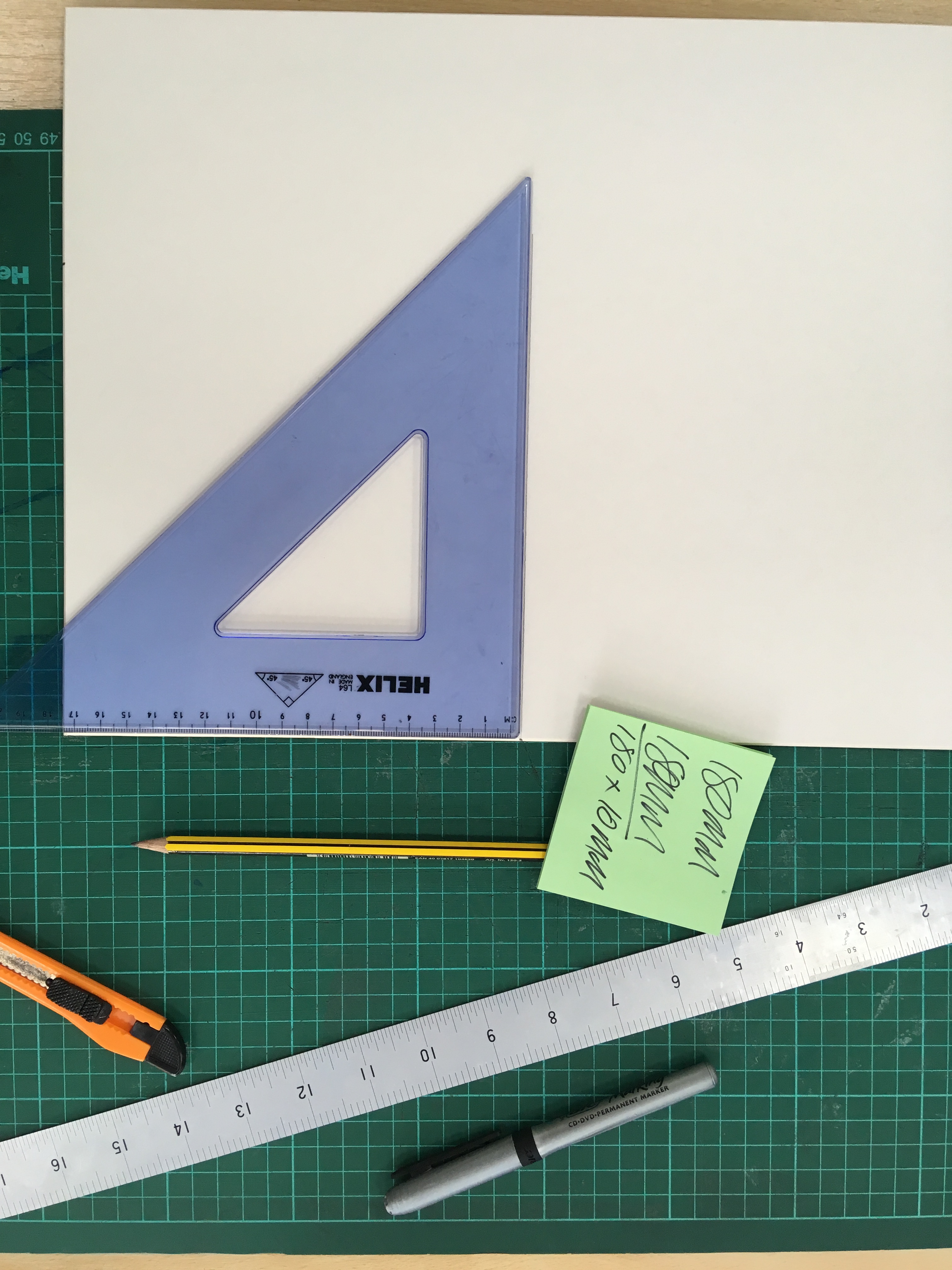


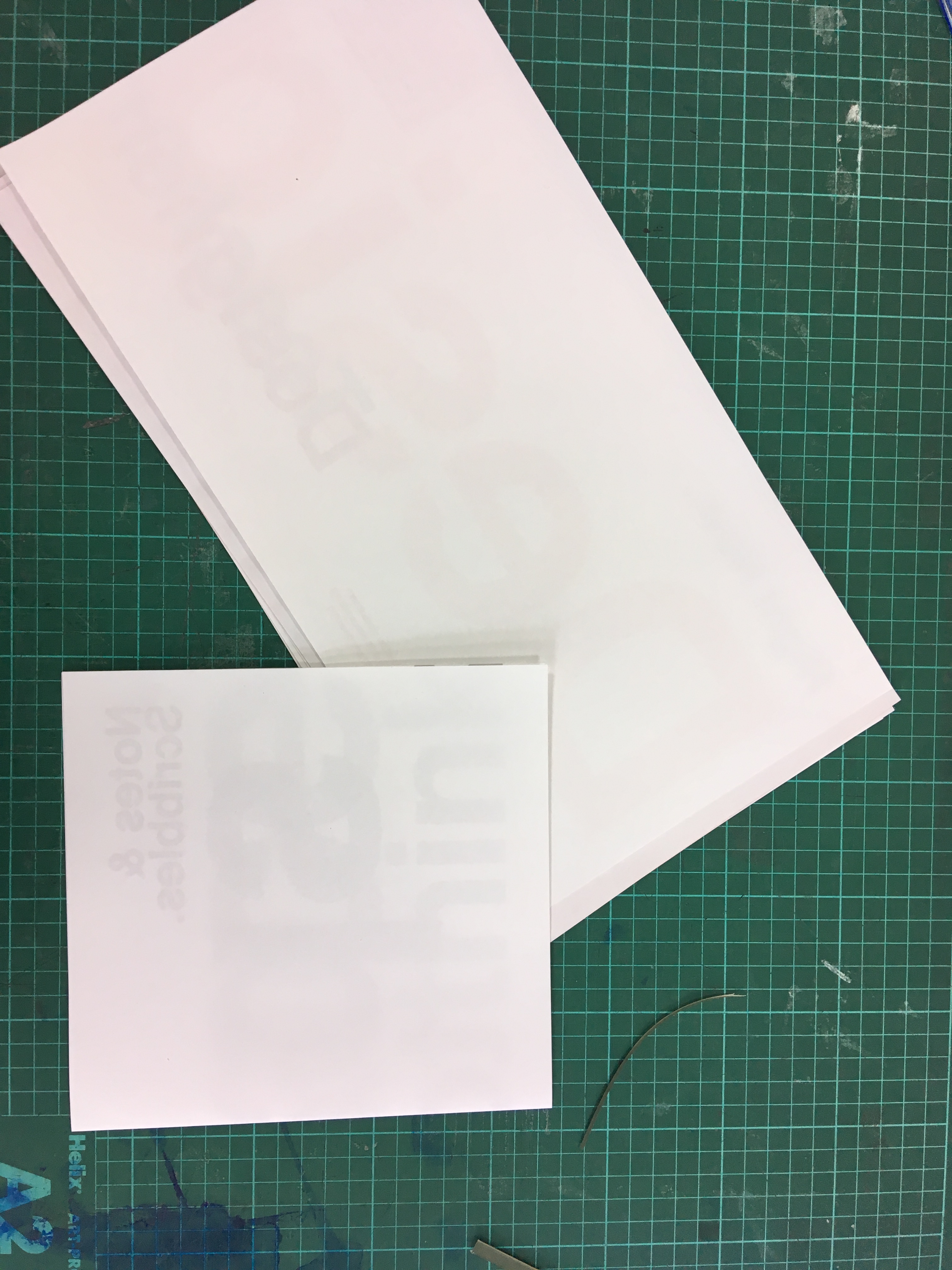

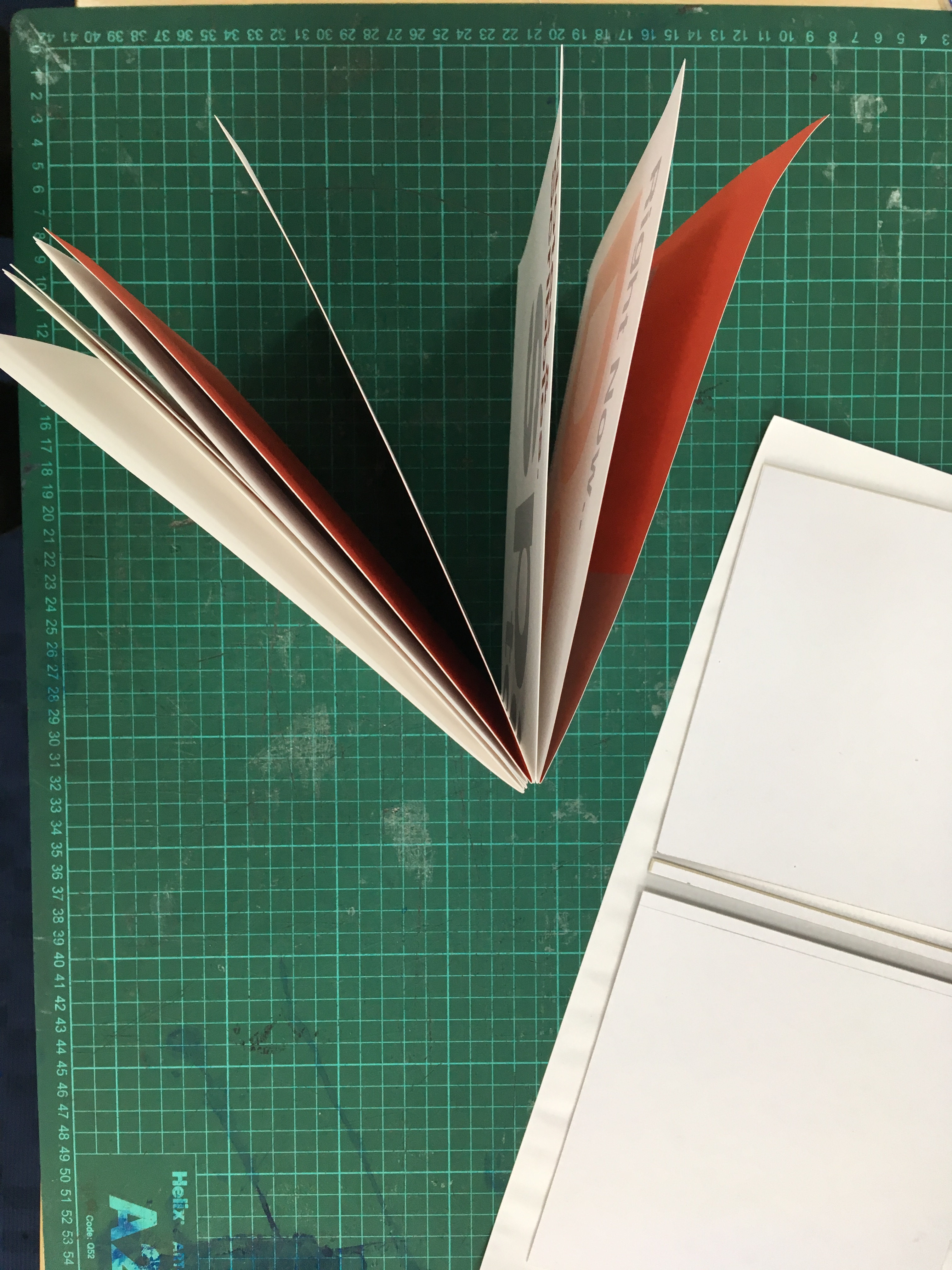

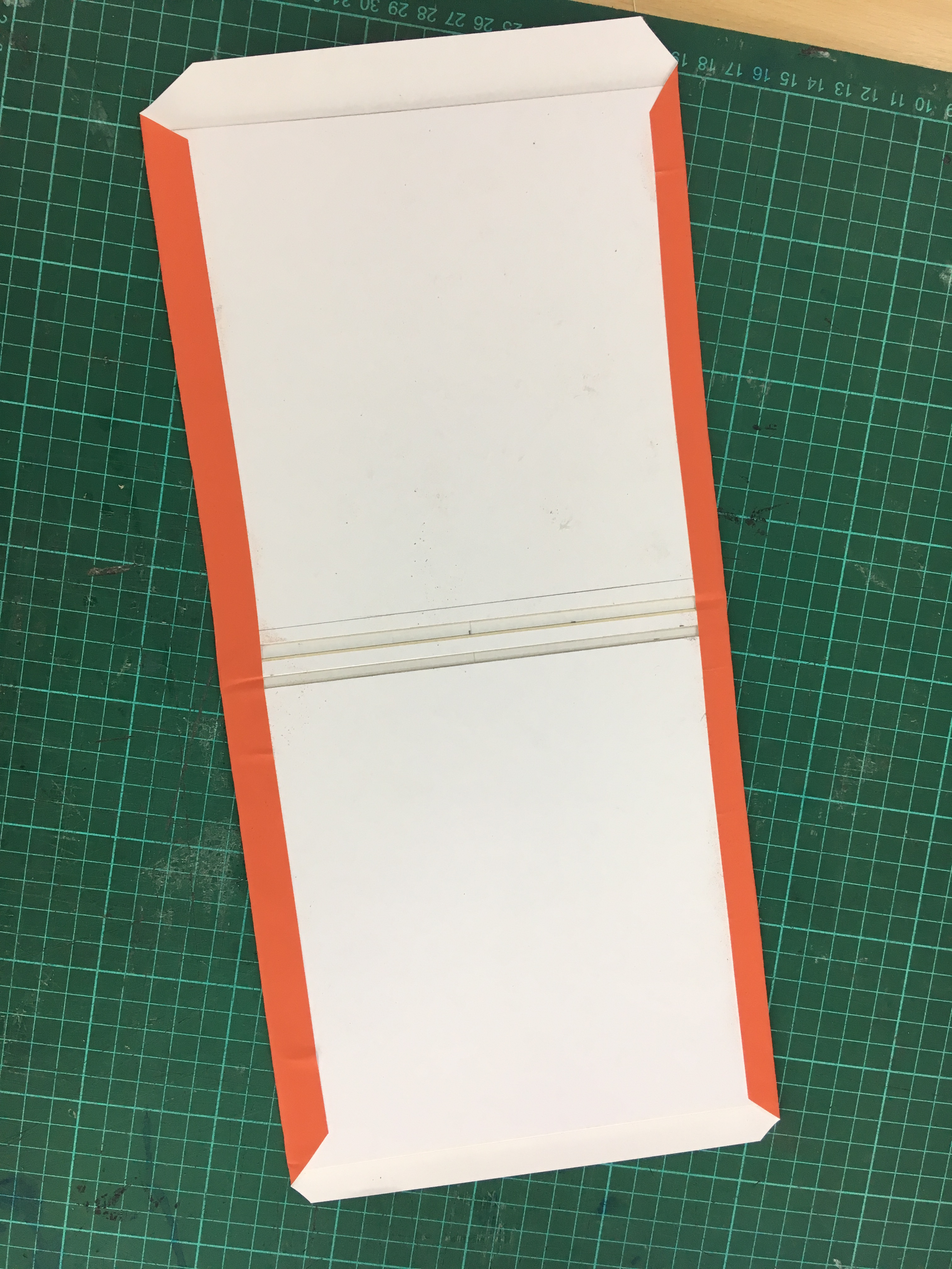
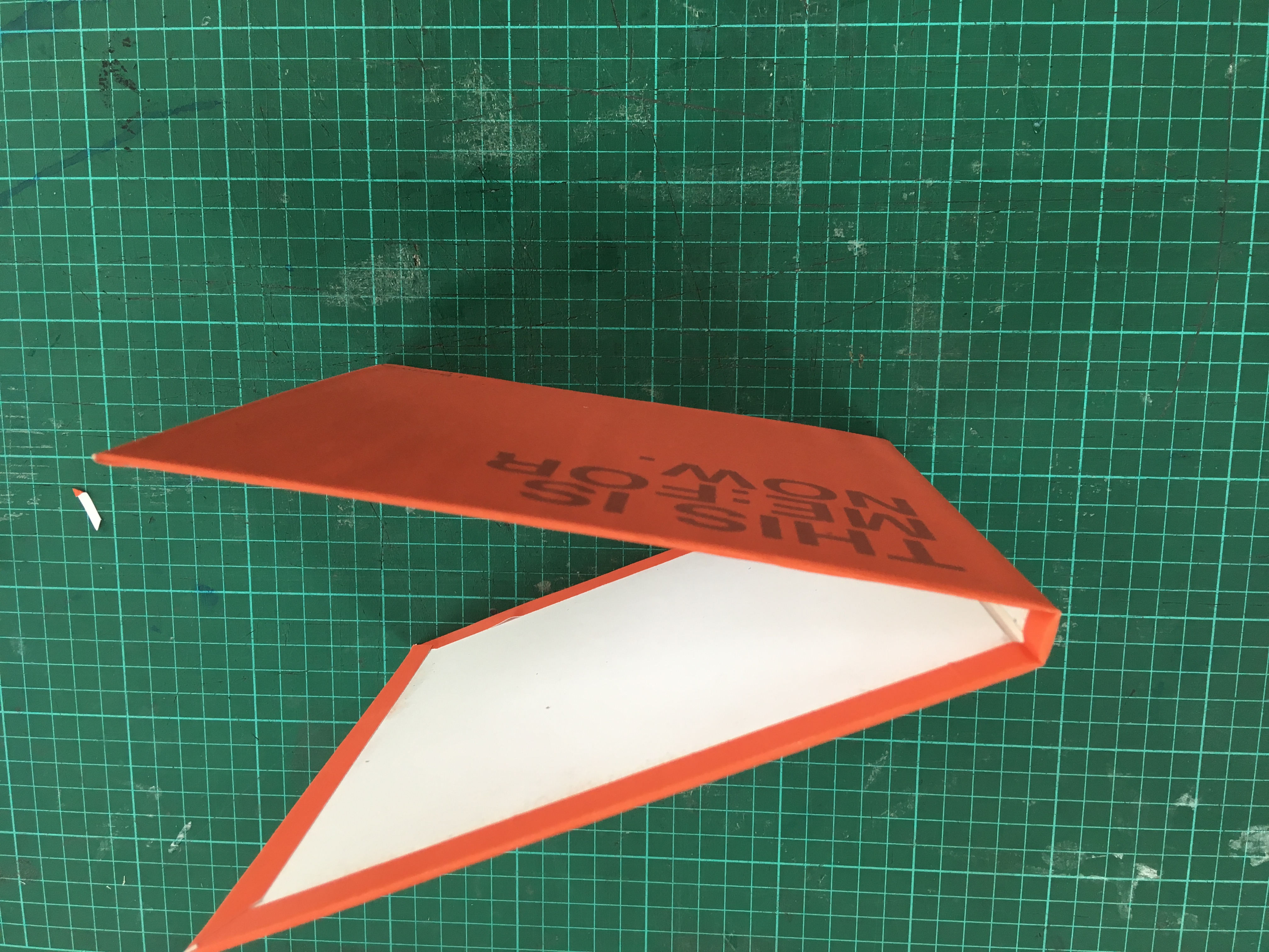

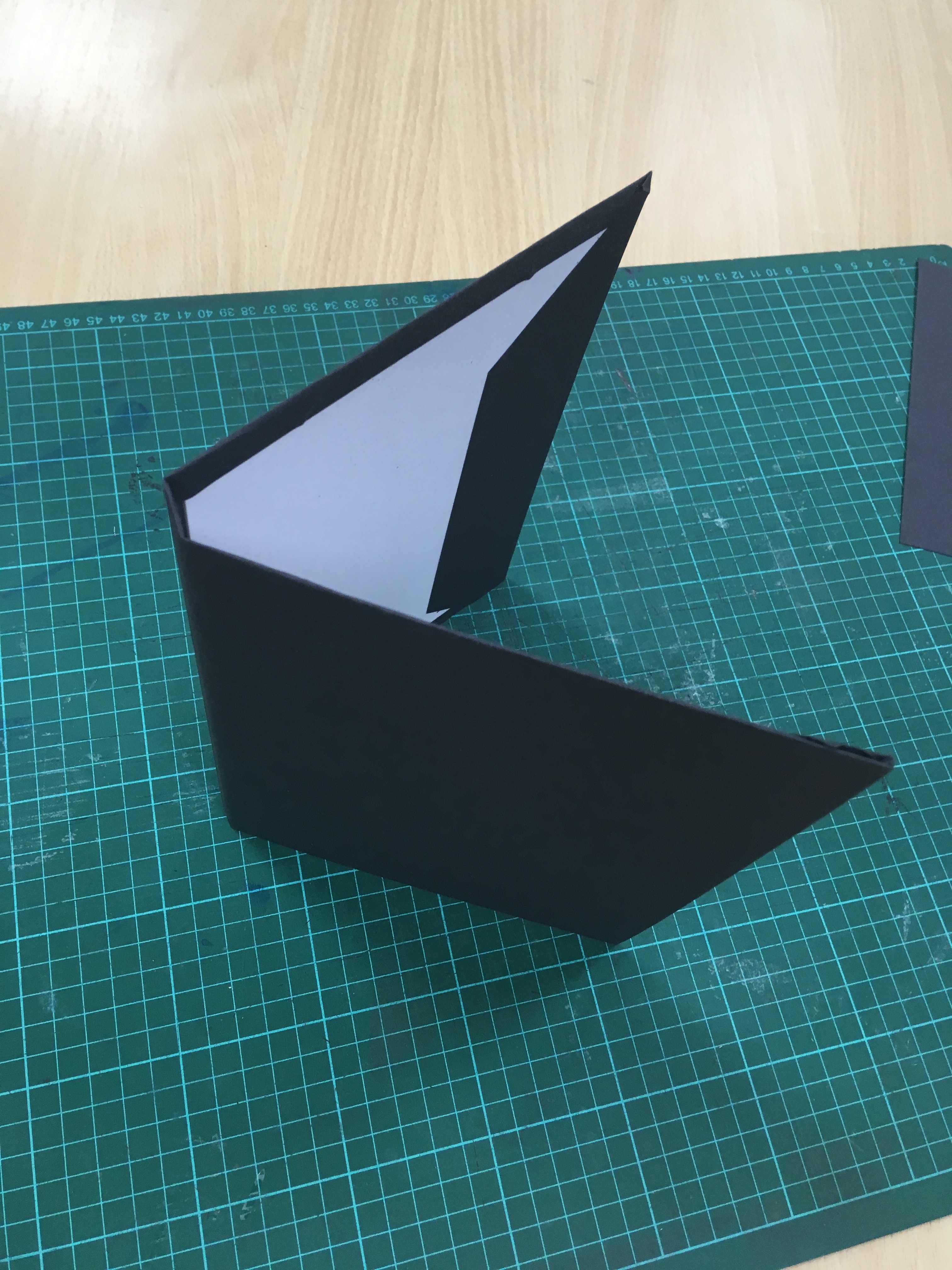
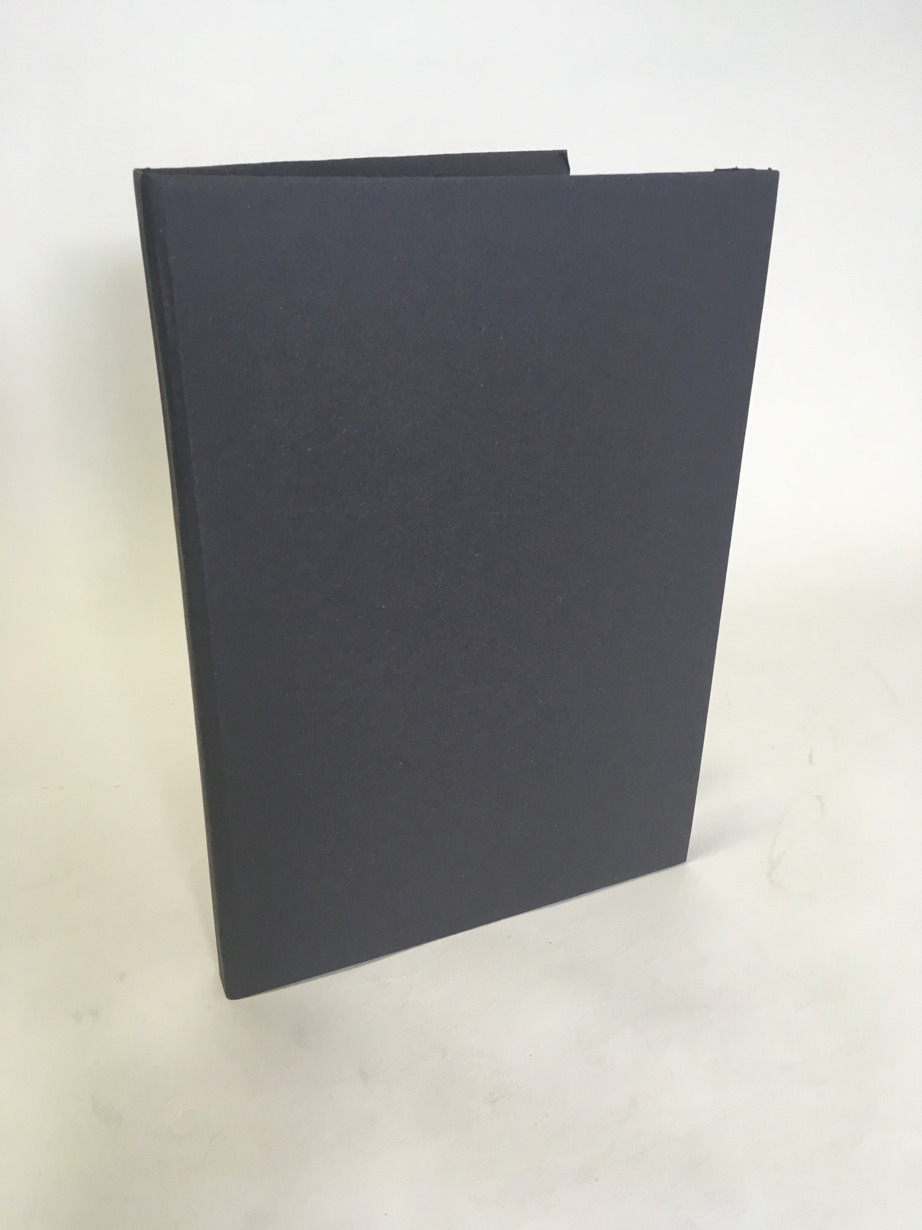
Making the book was interesting, I enjoyed the process and would like to design and make another, once the maths has been worked out for bleeds and trims, the book itself was relatively easy to assemble. I have used a 120 GSM paper that is back to back to give it the weight I wanted. Each spread was folded and spray-mounted to the next page. Traditionally the inside pages are blank but here I had an opportunity to include type and content to each page of the book. The cover of the book is made from mount board and backed in the same 120 GSM paper. I would have liked to applied a spot varnish to the front or maybe have applied a foil all done via screen printing, I think that if time constraints had not dictated this I would have loved to explore this further and will consider this book a first draft. I have learned a great deal in terms of print and the making during this process that I would aim for my next book to be better and explore more finishes and challenge my craftsmanship by ensuring the fine detail is perfect.
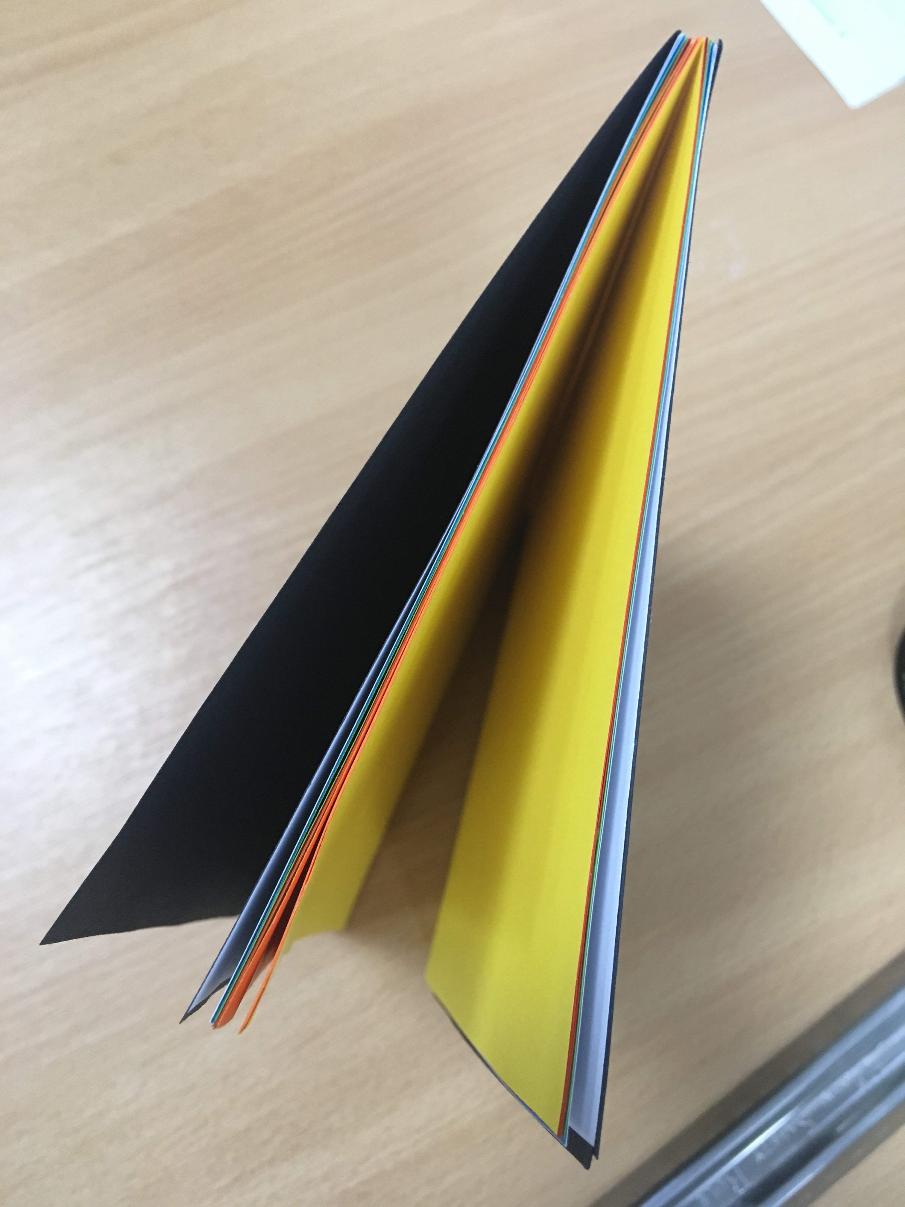
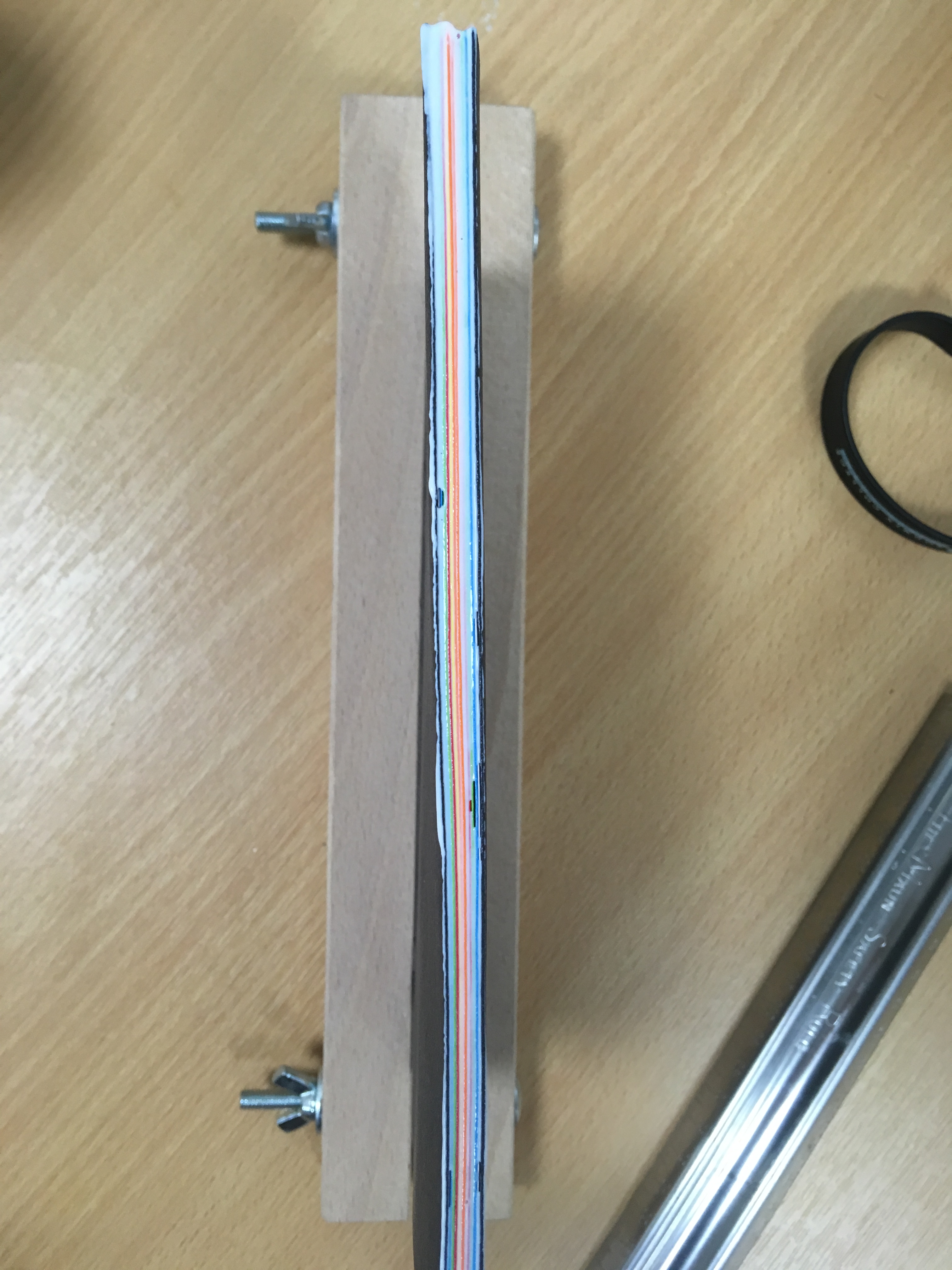
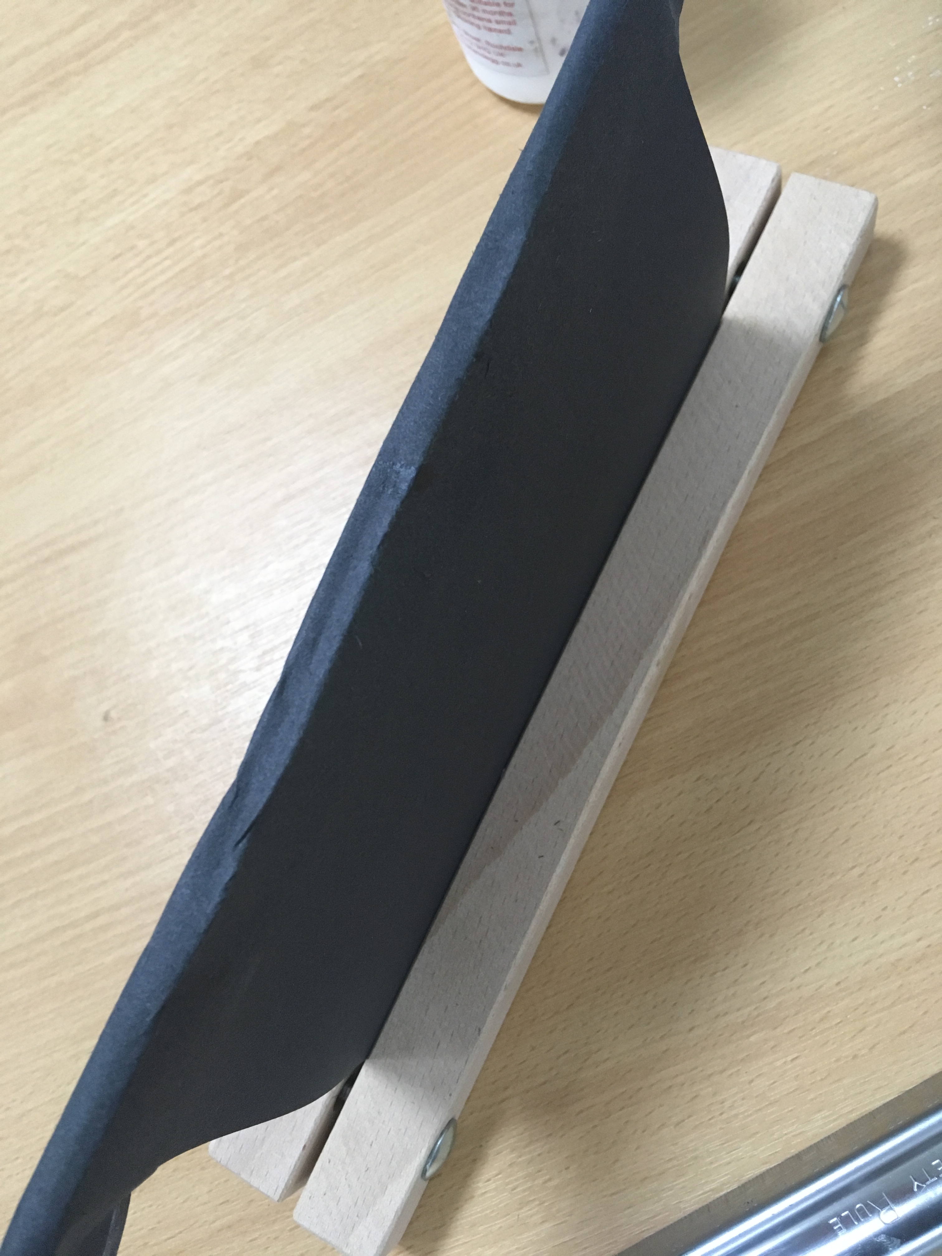


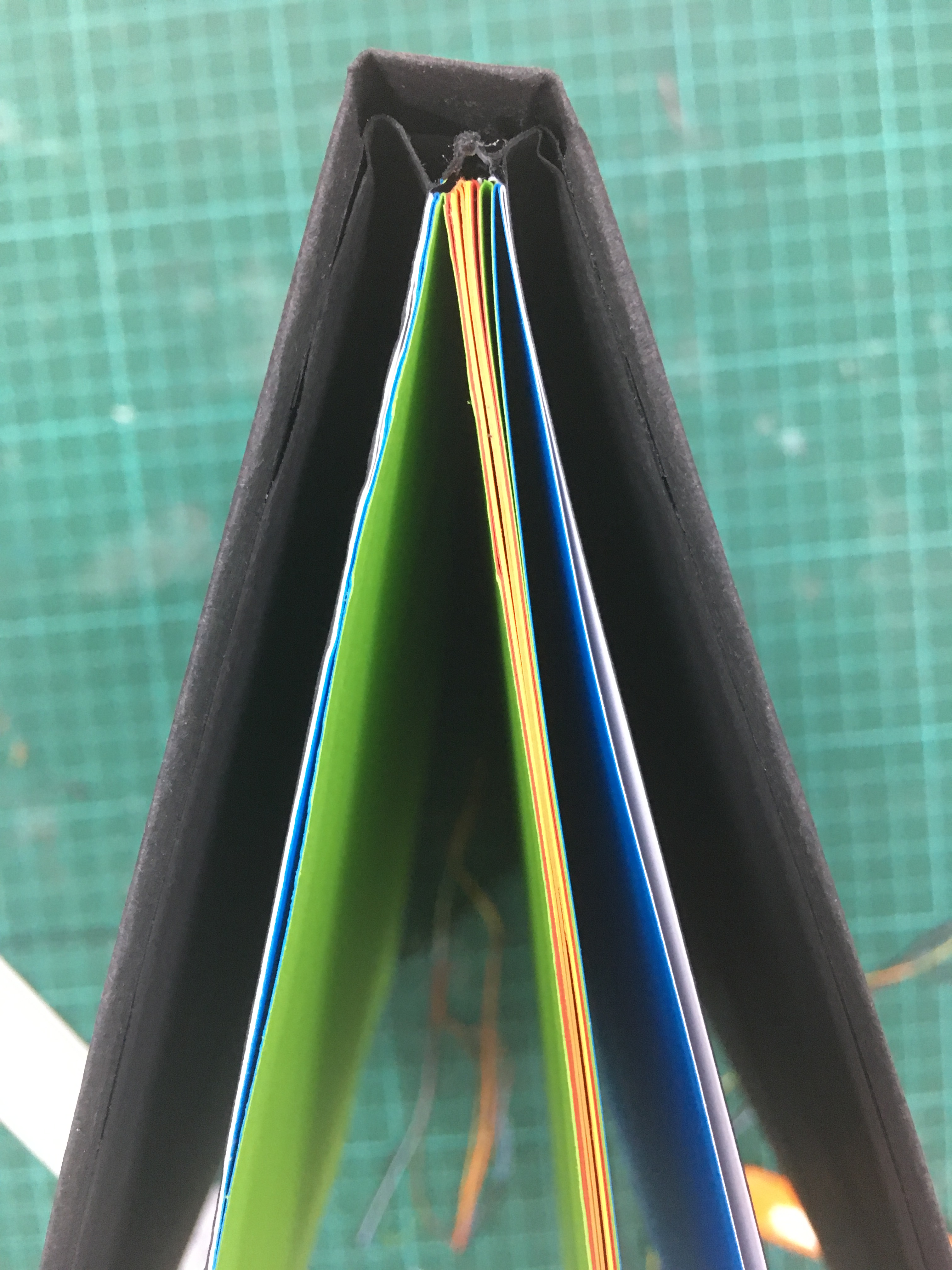
So, not being entirely happy with book one, I decided to make another book that also represented me right now and my design interests. I choose not to design the pages but to use this opportunity to make a book of paper samples. The paper in question is 80 GSM coloured paper that I hoped would symbolise the many areas within the design industry and the overlaps of skills needed to work in a multidisciplinary industry. I made both books in the same way and feel I have learned new skills in the process. I am surprised at how effective the outcomes are but I still would like to experiment with screen printing these books and explore print finishes. These books I believe represent my identity right now, a designer who is still learning and who loves the craft of the bespoke. In a world where digital can be king, It is reassuring that this craft is still going strong.

Going back into the InDesign file and stripping away most of the pages I have decided to have another go at the placement of type and allowing the type to speak more than its just written words after all is this not the beauty of working with type. I will continue to develop this book and have made a start by adding this page that explores my love of type. Here I have used a clipping mask to tear away the words and add the phrase typomaniac. When I heard this in the Helvetica film, Spiekermann spoke of his love of big, bold letters, not like most people who love skinny letters. I like the space that these bib bold letters take, it is about the negative space between each of the characters that we engage with, it is this that makes each character.


I am still developing ideas and now have decided to use a range of type styles to demonstrate multiple areas of my identity and self. I will aim to experiment with mixed media and I would like to illustrate a series of typefaces using paint, ink and other material such as tape and tearing paper. I will scan these in and collate them into the InDesign pages. This will be an ongoing process but It has taught me a lesson of slowing things down and focusing on what is important. It is one thing to finish but another to finish well. This book will be developed further and better represent me and what I love about design and type.


The self and identity
Once again you are referencing the learning material well and commenting on it further through your blog. Maybe you can pepper your blog posts with further images that illustrate your written narrative – in a creative way. For example
“I thought about how others may see me, and how others see the digital me, the edited and filtered me.”
“People find a place in society and find a group that they feel they belong to and this can become their identity.”
“I remember getting my first film camera from my Grandad, it was a Pentax that he had found on a car boot. The viewfinder was scratched and the lens had a sticking point when focusing but I used it throughout College and University.”
This could be a lovely opportunity to create a small series of visuals that are experimental. Your blog becomes a really engaging piece of considered design with you generating fresh new visual response to yoiur writing. Just a few – this would elevate things to the next level. I am aware of time though, so if you can..
Your workshop challenge gets hung up on creating a designed artefact – which is part of the brief but it loses the wonderful depth and thinking and exploration in your writing, perhaps if there are more small experimental tests of your thinking and in response to your writing this will set you up for truly engaging content to be designed. Once again there is only a week but take note and revisit, log these ideas. Comment on what could be done to improve and take further.
What are the ideas to change the world? I want to know the snippets of the conversations you have with your friends putting the world to rights – this is what makes you you and your design unique. Finding a good layout will come after.
Love the fact you did a bit of bookbinding – hats off. You are juggling many hats – keep it up!
LikeLike