This weeks workshop challenge focuses on typography and type convections to communicate a message beyond the words themselves. Discussions of using type this week have circulated around movement or rhythm within a text to emphasise the message. We have seen examples from the Tate Modern and the poster adverts for an exhibition of Christian Marclay. The L in the word clock moves like the hands and emphasises the word without being too obtrusive to the words. Another advert for this exhibition uses the colons from a digital clock to break up the words and further emphasises the essence and nature of the exhibition. I go back to my previous posts and comments about the work of David Carson when I think about Type and the communication of words. He states that we should not confuse legibility and communication and this week I felt that I really wanted to push this as far as I could.
Working through this weeks workshop challenge I felt like I have been playing catch up all week. Friday night, straight from work I was due to drive back up north to see my grandparents. Something that I was not looking forward to for so many reasons. Aside from the drive itself and the thought of being sat in the car for up to 5 hours or more, it was the realisation of seeing family who may not recognise me. Not because it has been a while since I last saw them or that I have changed, It’s their condition and their current state of being. I knew that I had to watch the workshop challenge before setting off, I had 5 hours to think and ponder over the idea of using typography and experiment with type. At about halfway, Gloustshire I had a thought about my work for this week, In reflection I had not read or fully understood the challenge so my idea was not entirely fitting for the task. Lesson learnt here, take your time to read all the material. So I am heading north to see both grandparents, or specifically both my grandmas. Or my Nannan. Each has been diagnosed with dementia and both are at different stages. My mums mum, Iris has been battling with this disease for around 6 years. She is well and healthy in terms of her organs and to some degree her mobility but it is her mind, her memory and her ability to connect with the world around her that is debilitating her. Leaving her an empty shell of what she once was. Then there is my Dads mum. She too has been diagnosed but has been living with this far the past year or so. Her diagnosis was caught early ish, despite passing a lot of the tests early on. She is good with some things, long term memory but the short term really gets her. Her conversation is minimal and its clear to see she is fustrated.
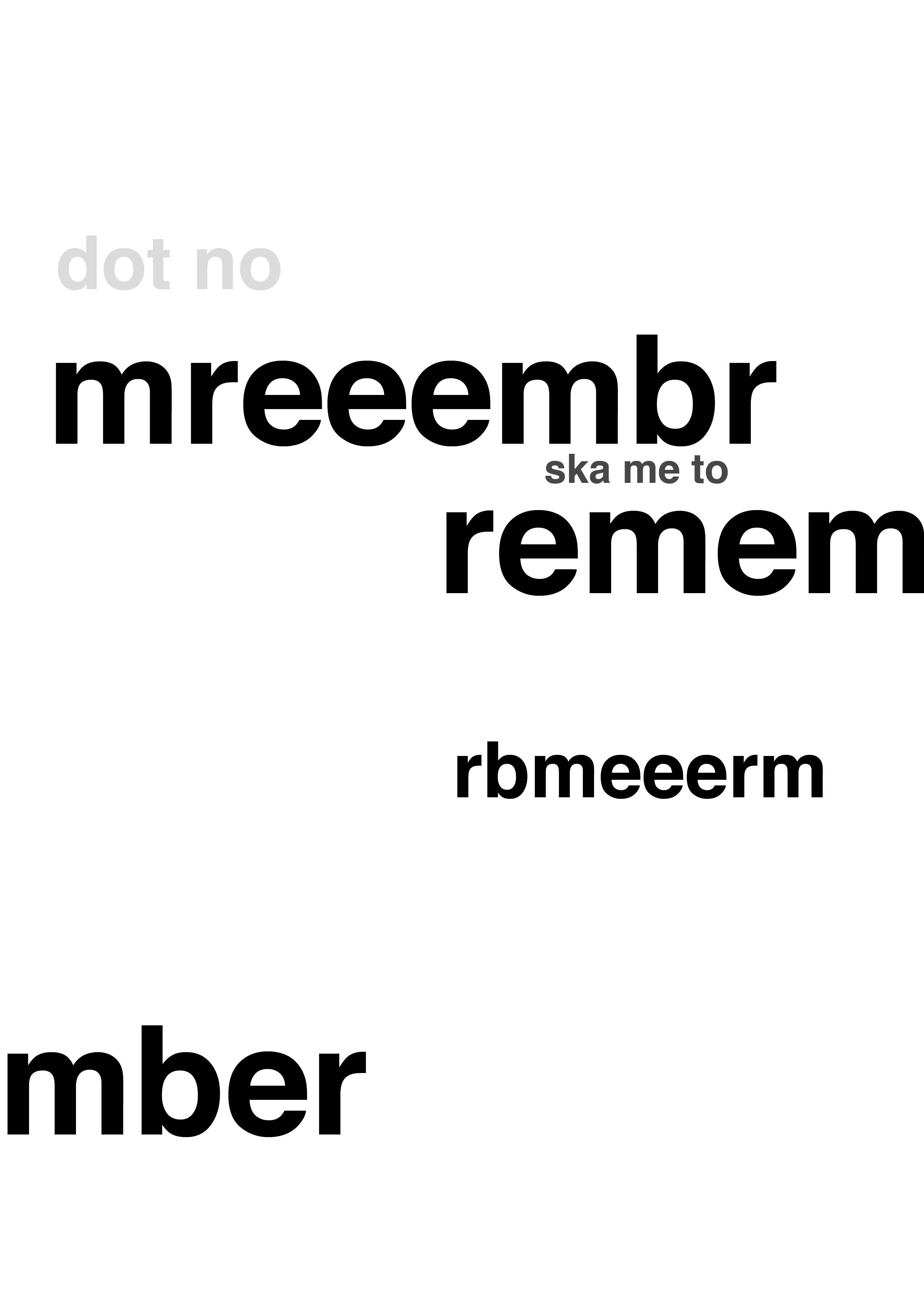
How do I use typography to communicate these emotions, troubles and lack of connections to the world around? I felt that it would be good to really stress the word Dementia, again not the task but I had not read it properly at this time. So I began with heading straight to illustrator and trying to stress the type by taking elements away as if the type were disappearing like I imagined the memories would of anyone who is living with this disease. Immediately I could see that this was not working for me and if I think back to what I have enjoyed in recent weeks it is the unknown and the experimentation that results in some of the more interesting ideas and this was just not working for me.

Back home and connected to the internet I was able to re-watch this weeks workshop challenge and the lecture from Kristoffer. He spoke about the traditional type and this sparked another idea. I knew that I had a set of characters that I would be able to experiment with. I did not think that I would print with these but thought about Photographing these in a may that would communicate stress or the idea of the disease at the centre and confusion of words and letters. I tried to imagine what would be happening inside the brain, what if there were letters and words flying around and trying to make sense of these to give clear sentences and communicate effectively. These photographic experiments again did not entirely meet the brief set but allowed me to generate an idea and visualise something and try to give some idea about the lack of communication and the distortion that I was trying to convey.


I had really enjoyed this process and it was great to photograph something so small and challenged me but this was not the direction that I wanted to go, I tried to experiment further with the composition and really threw the type around the table. I wanted the confusion and the sense of communication struggles to shine through but this was too neat and clean. In the below screenshot I had painted in the EMENTI from the word, the blue ink on the D & A gave me the idea of making the word stand out in the confusion of all the scattered type. This was just not working for me right now, I needed to have less of an idea and find a process that would enable me to experiment with type in a way that would give the lack of communication and confusion that I was looking for.


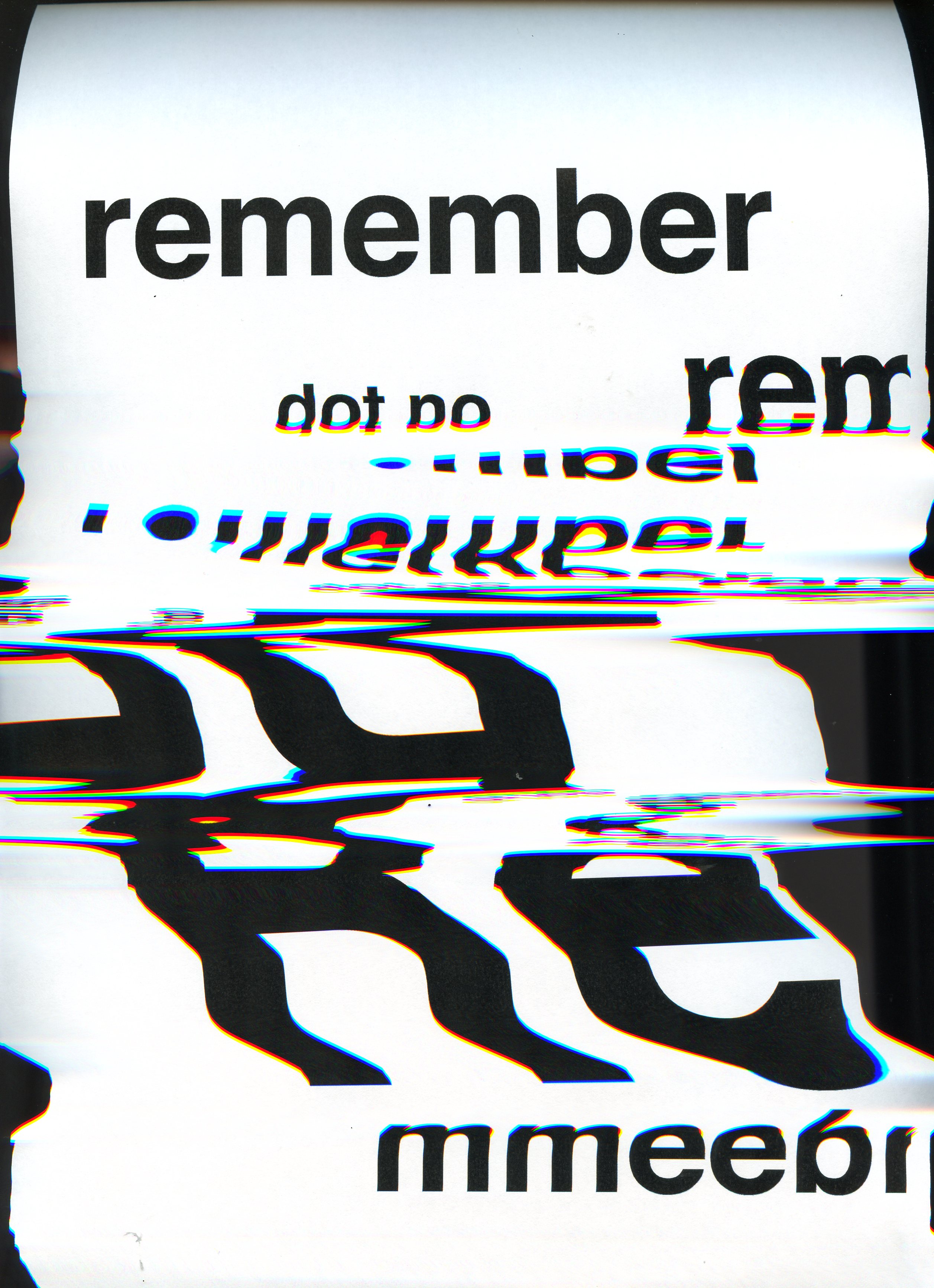
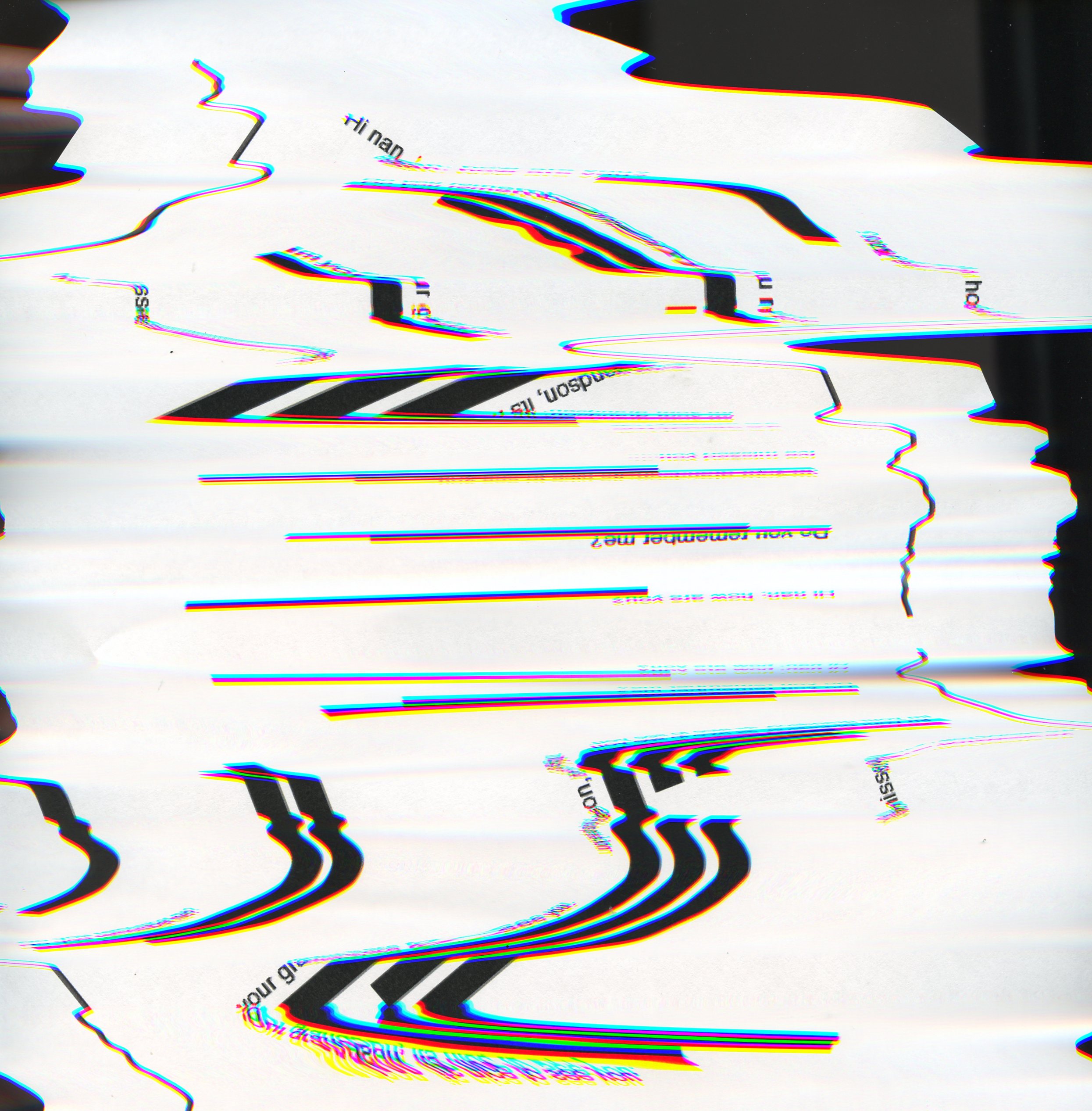
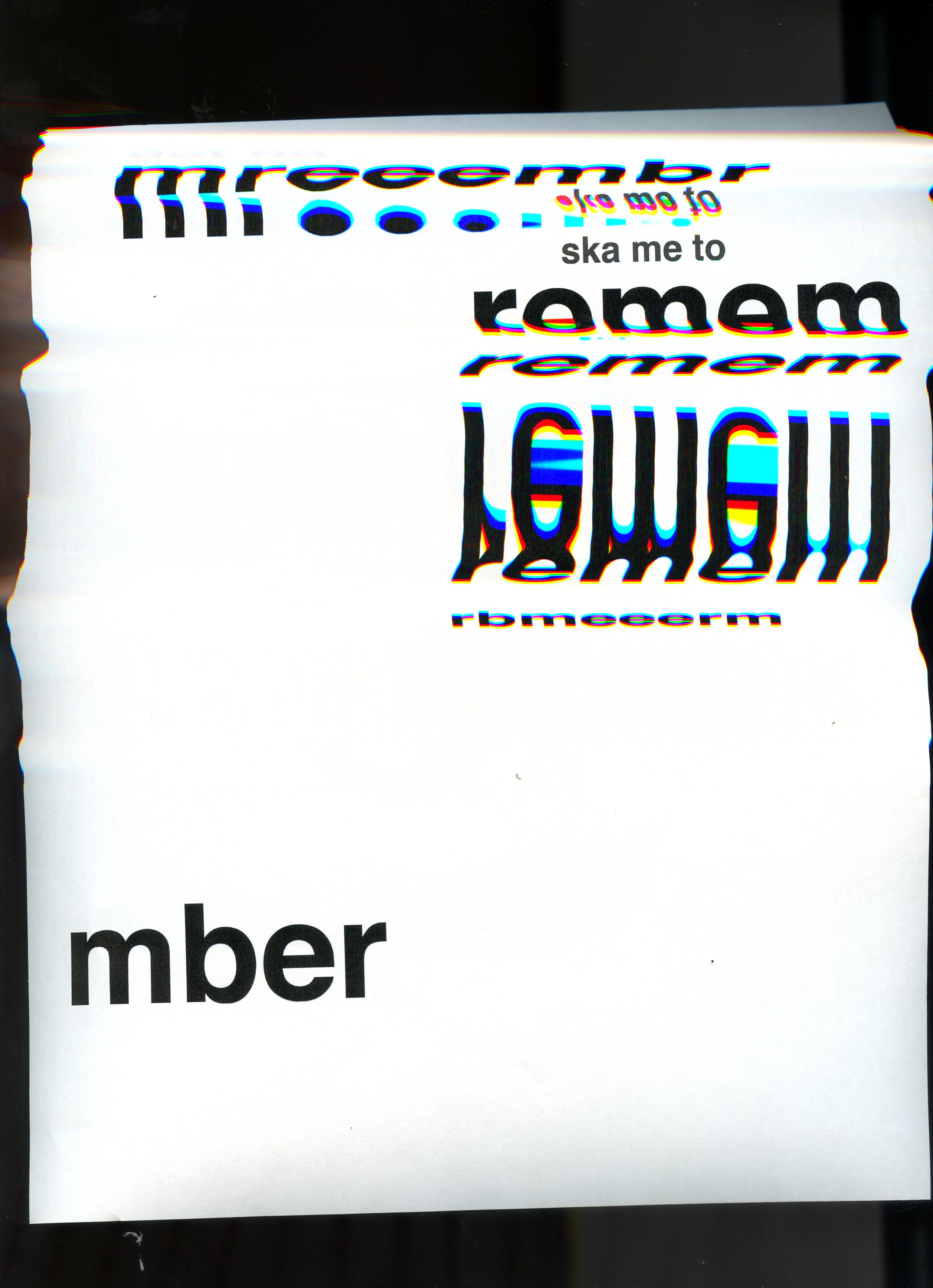
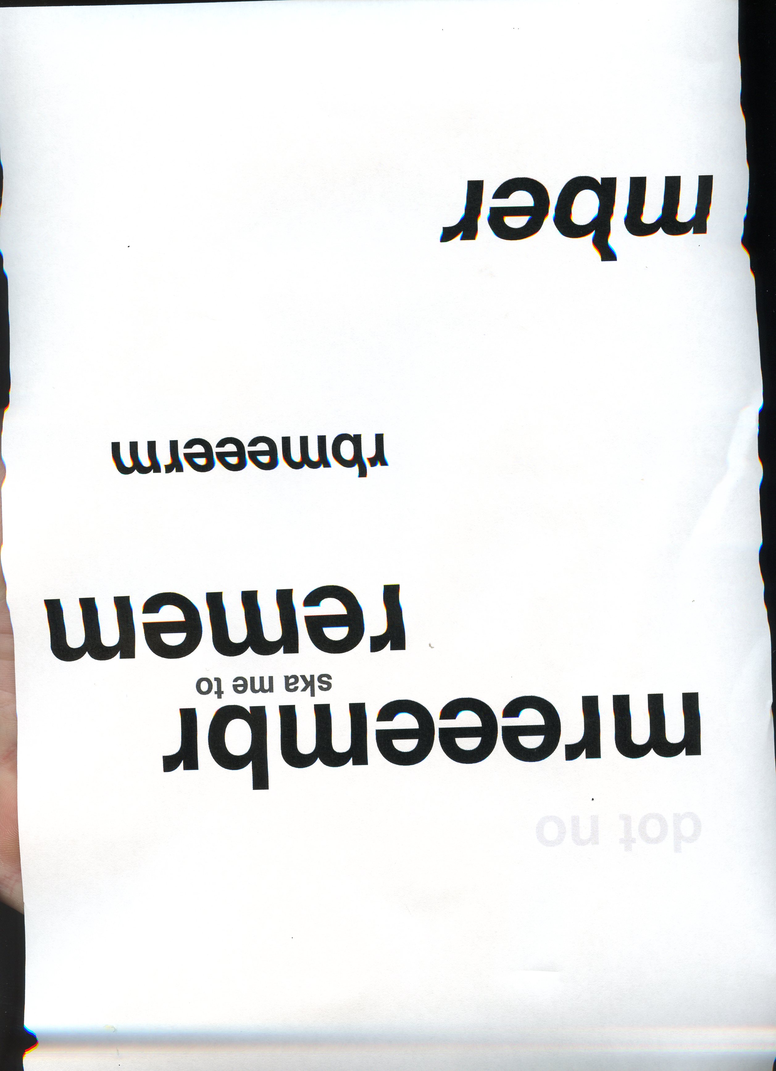
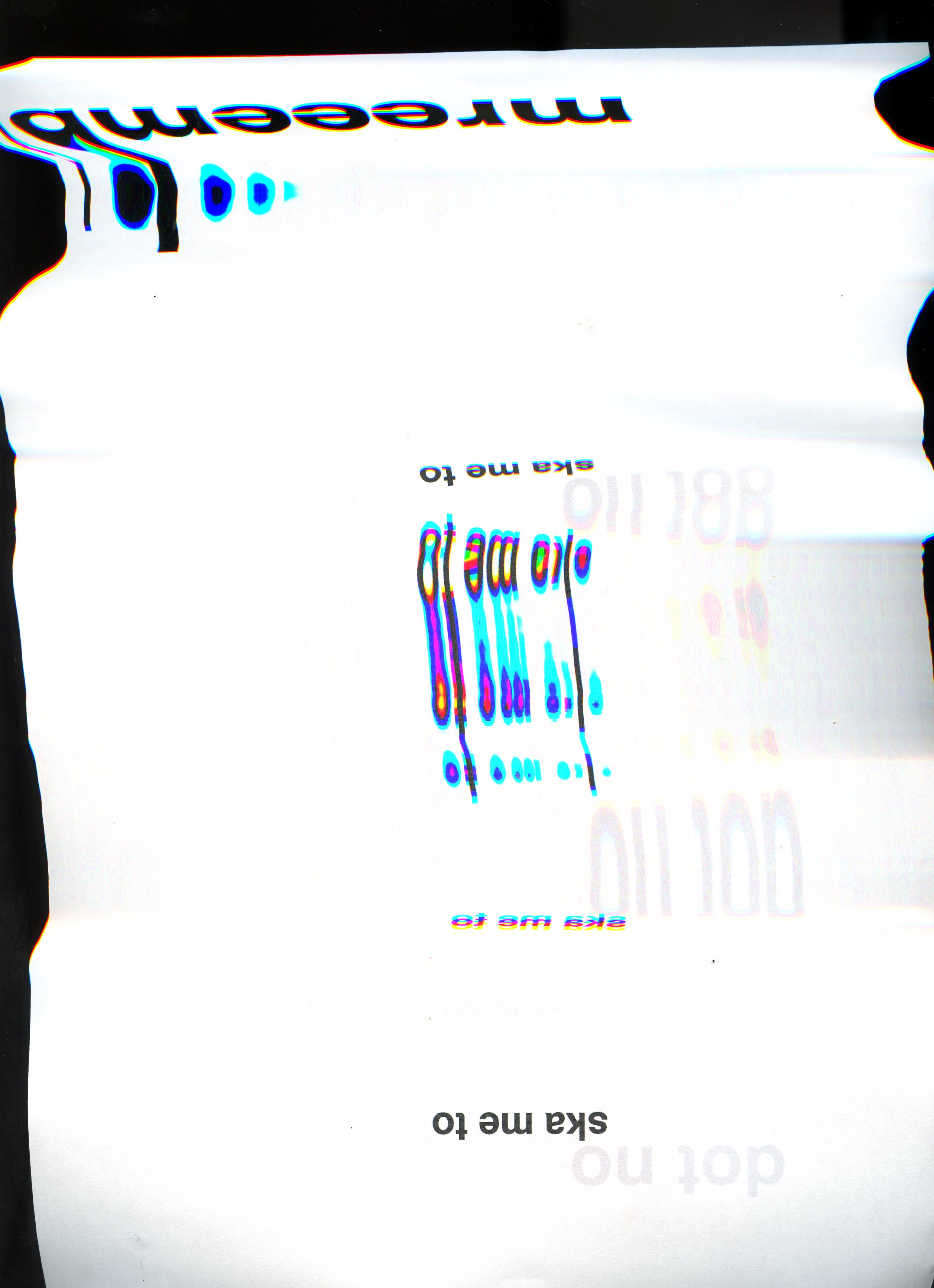
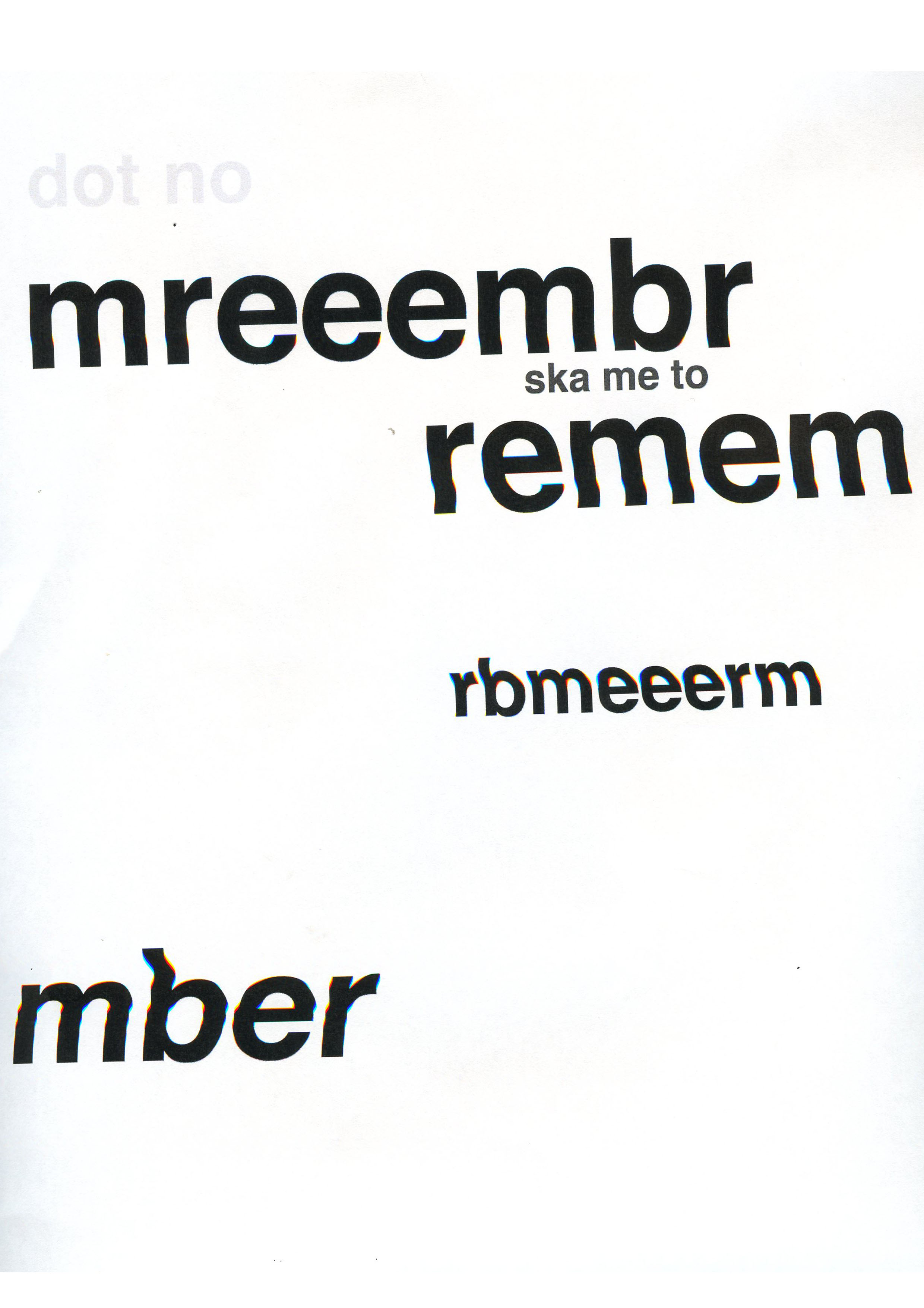
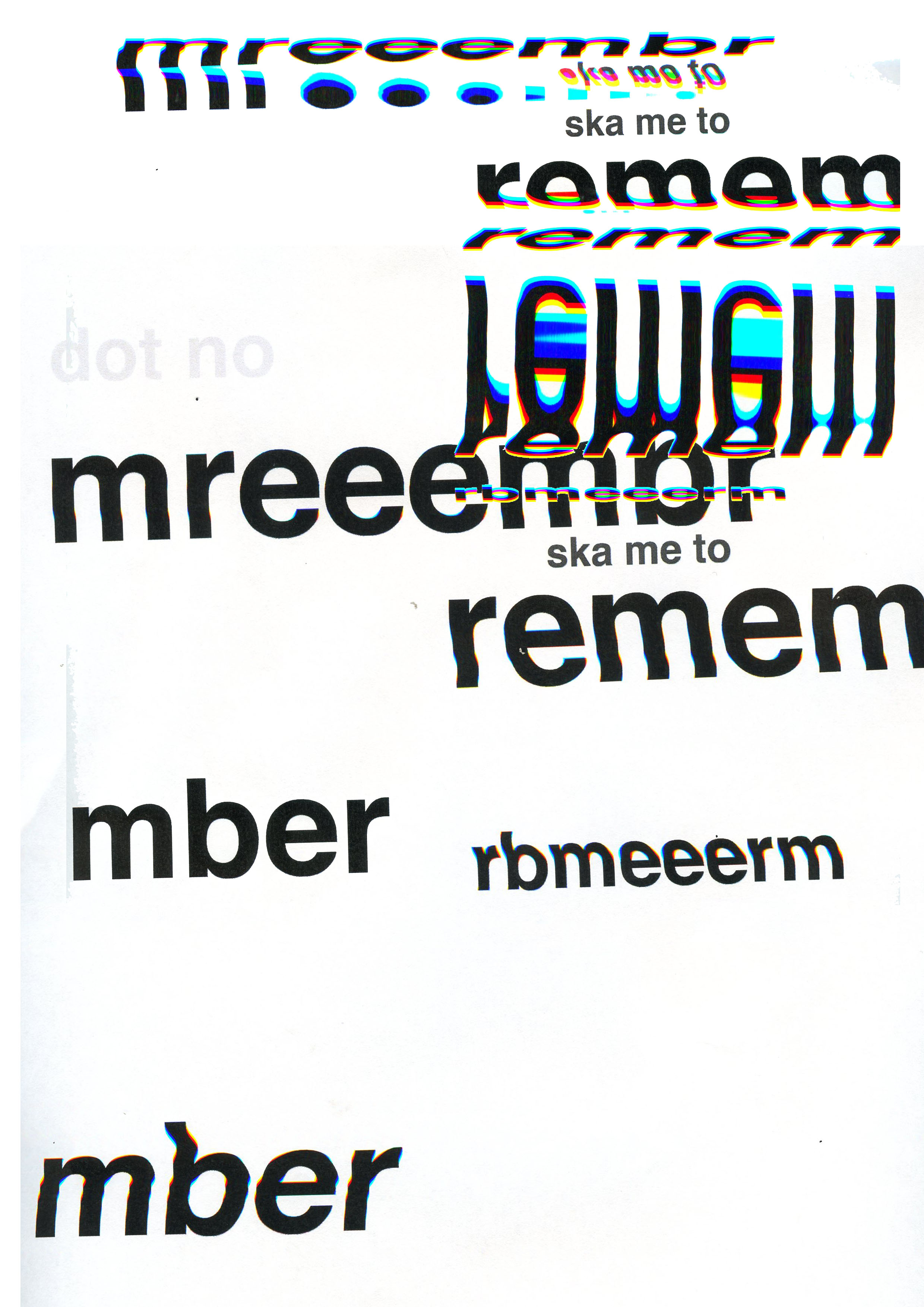
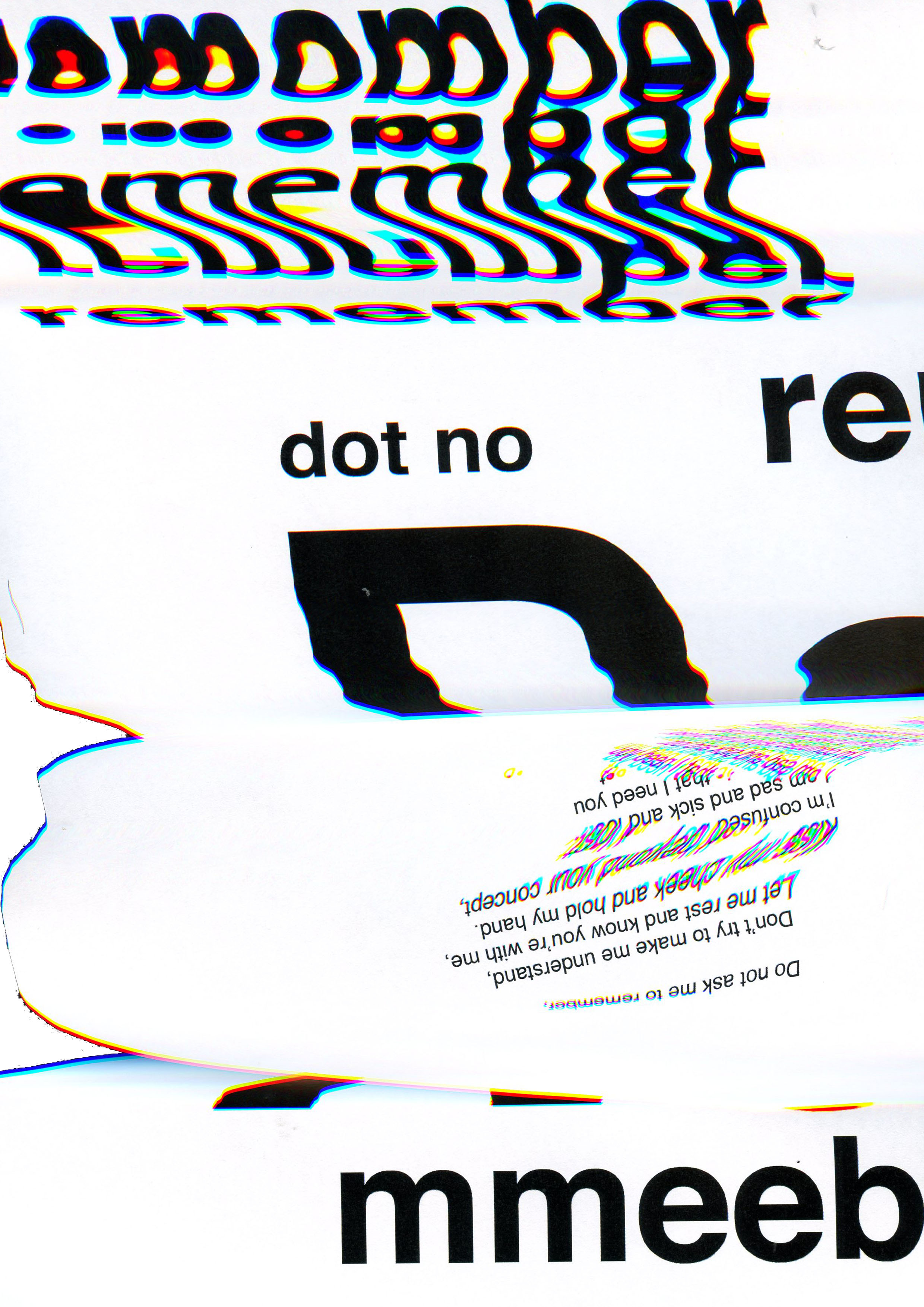
Using the scanner as a tool had been something that was sparked by this weeks lecture. Kristoffer showed an image of a type wheel sat on the light of a scanner. I began to think about how I could manipulate the image and distort the type in a way that would be unpredictable and enable me to truly experiment and develop a process of unknown results. At first, I started with the word Dementia and had used Illustrator to lay out a series of pages, aiming to create confusion by moving letters into positions that questioned the legibility of the word. During a conversation with Harriet Ferguson of Pearlfisher, I was able to challenge my ideas and she was able to help me reflect on the process of using the scanner and how it would distort the type. I knew that my set type would not spark any real creative juices but I was hoping that the scanner and its unpredictability would. I also printed out a series of symptoms, just from a word document to see what would happen and to see how the scanner would react with the type. Within these experiments I had also set type that refected a conversation, there are a series of questions going unanswered by the placement of black rectangles. This idea I thaught did give me the communication confusion I wanted but was not entirely on breif.
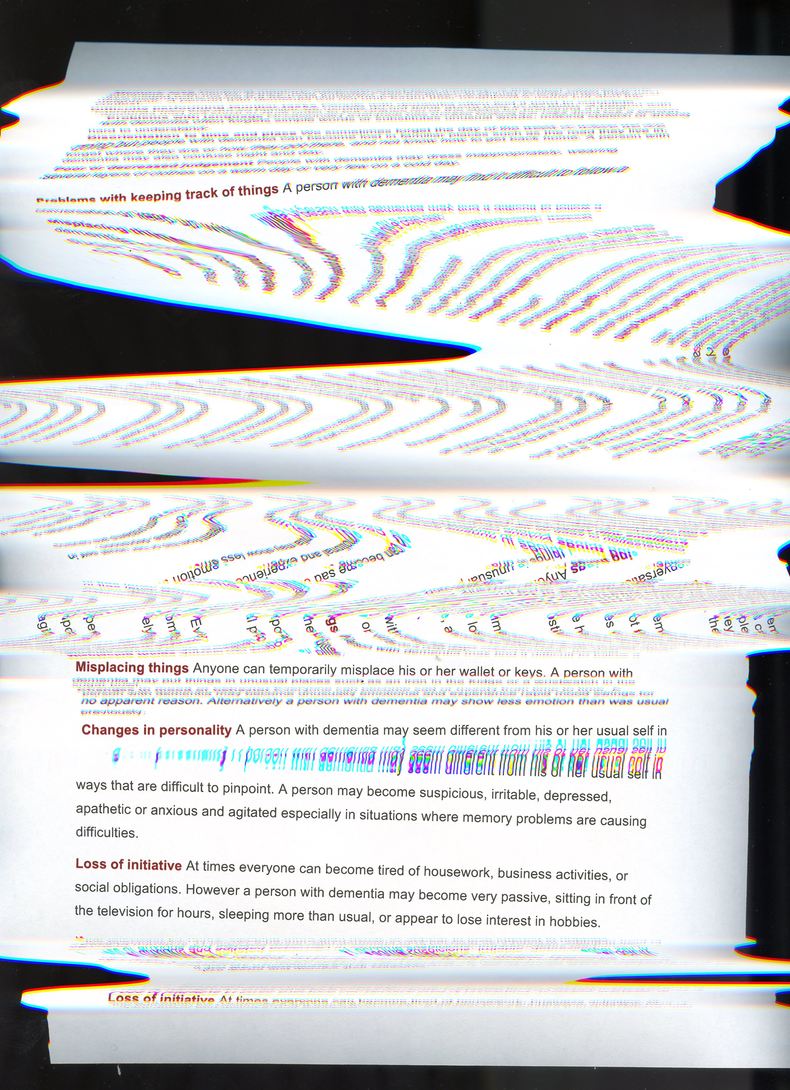
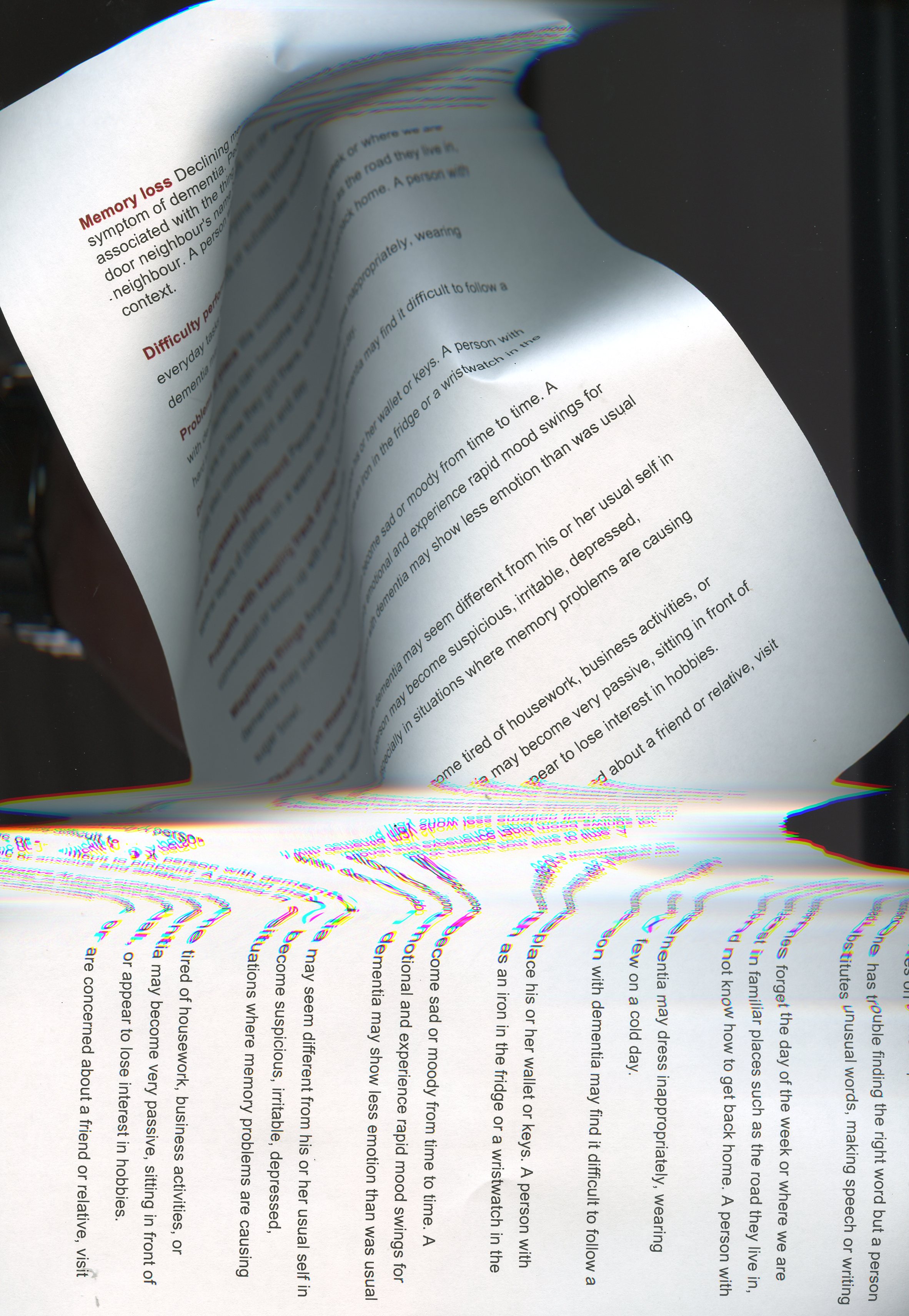
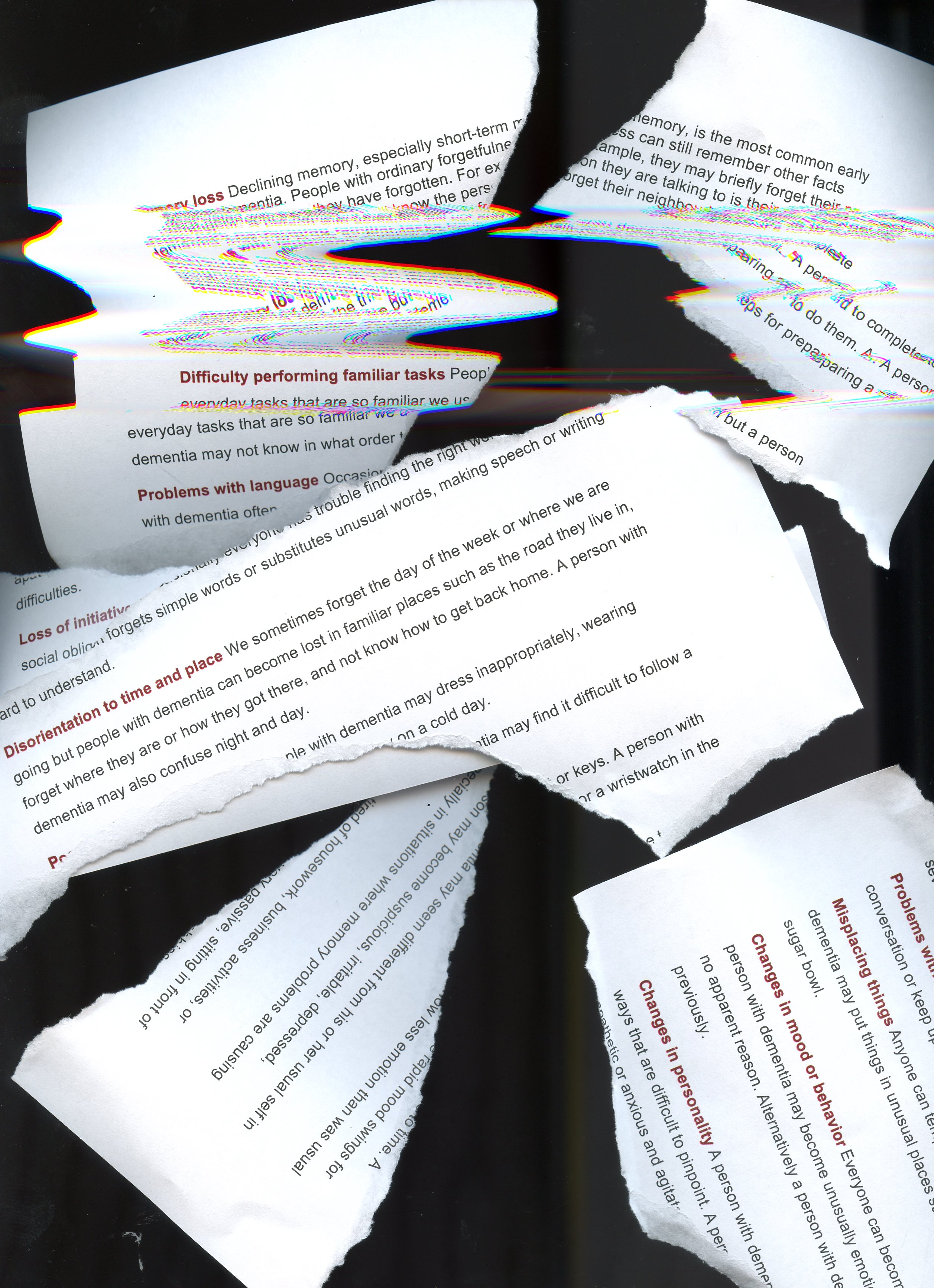
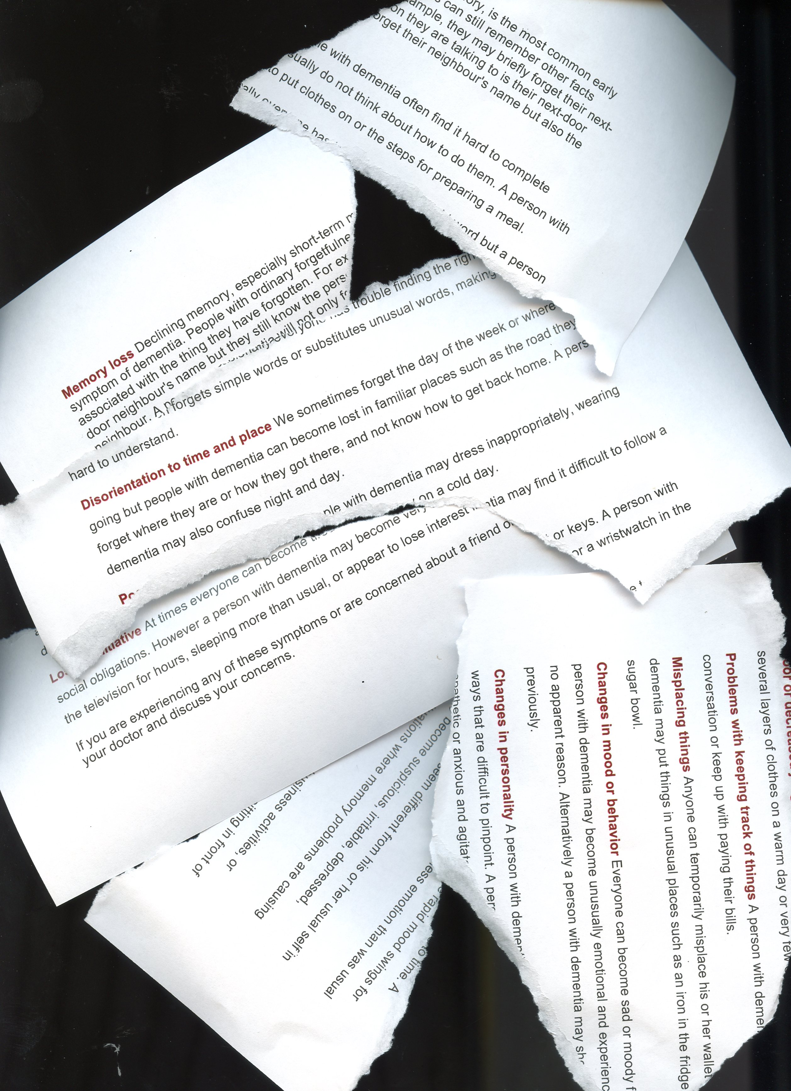
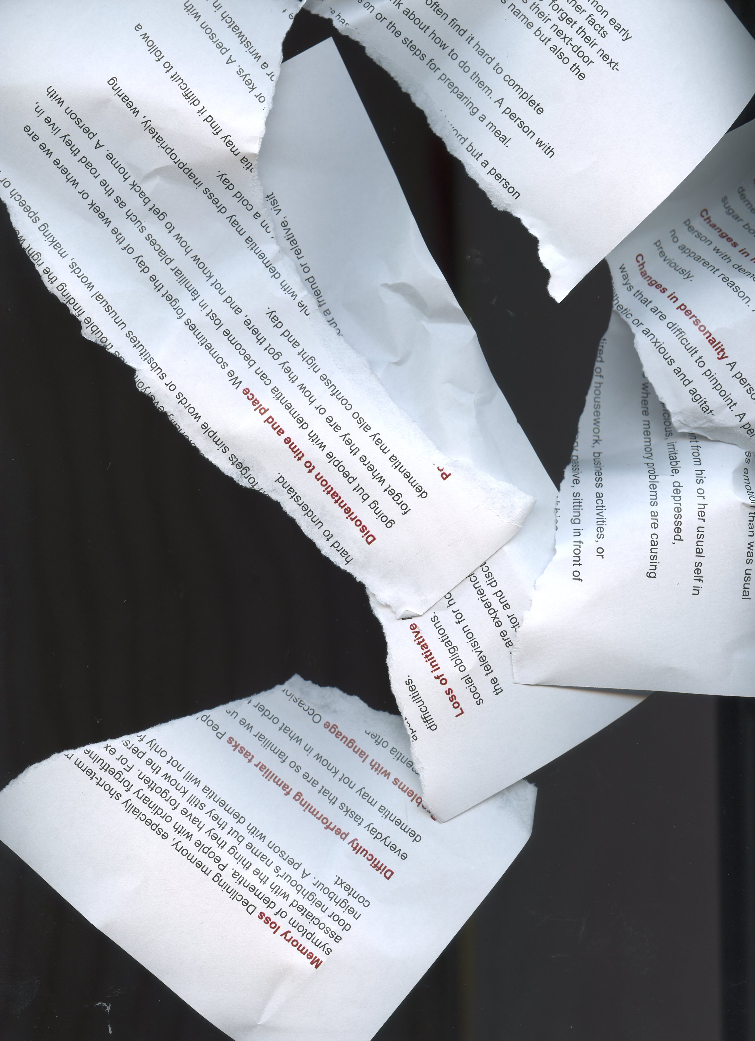
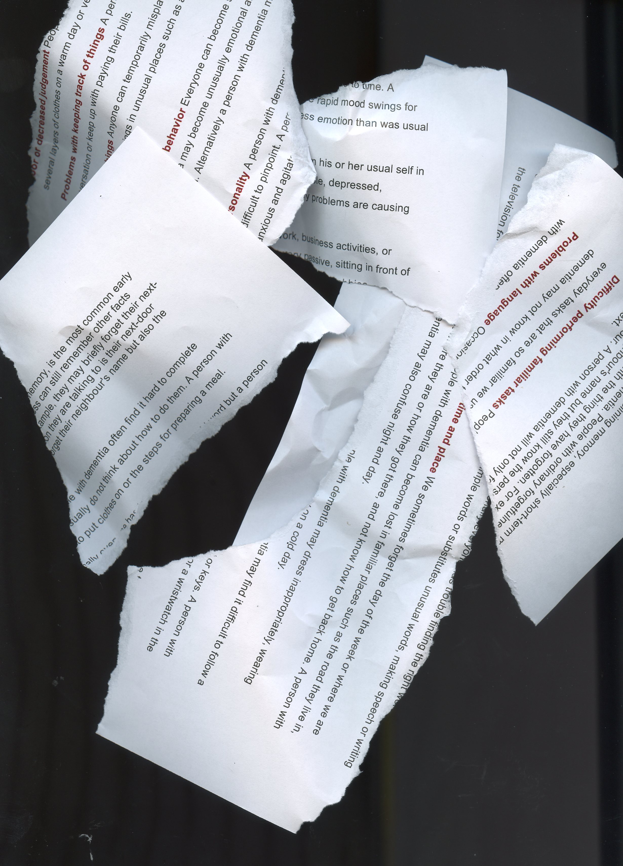
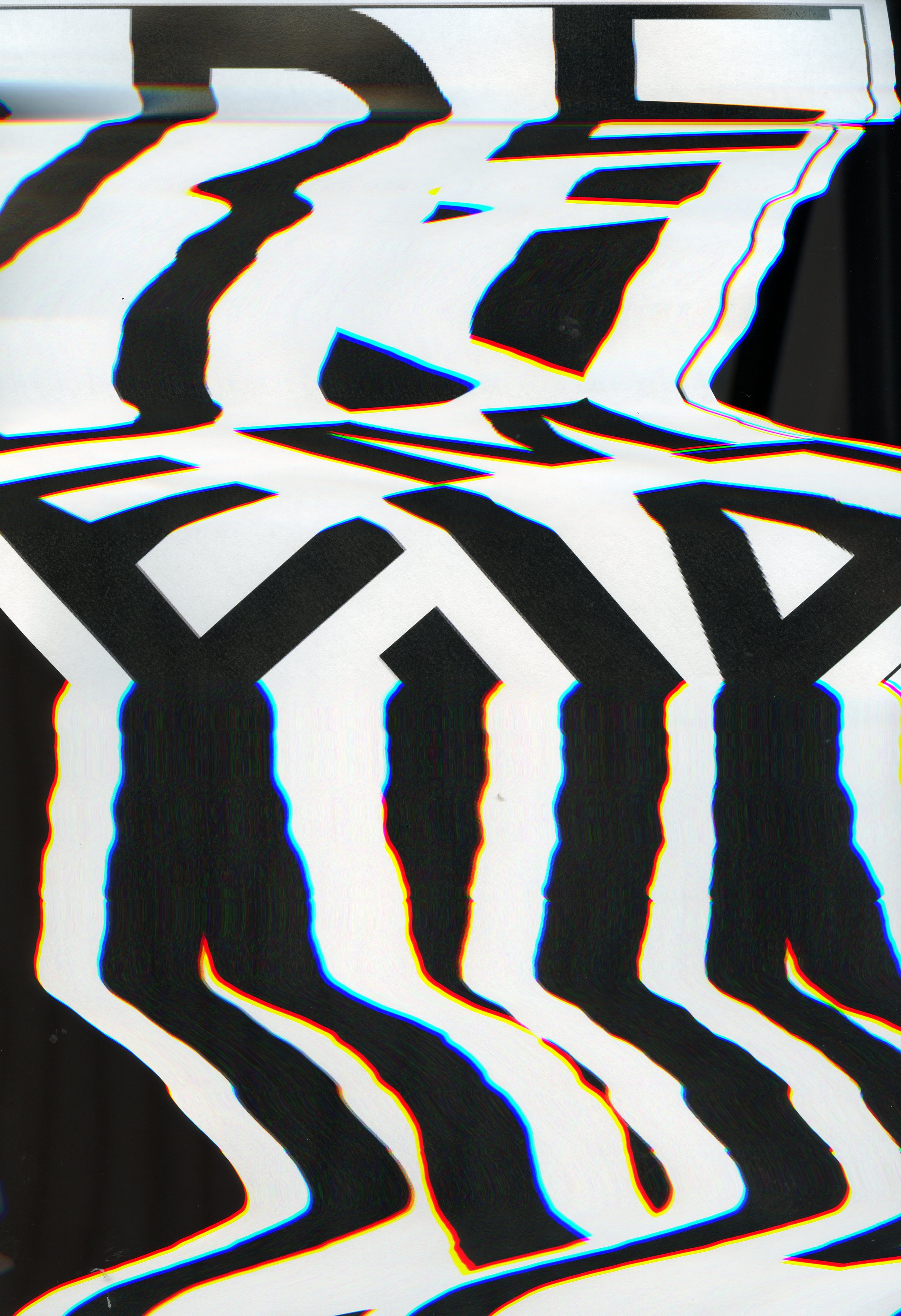
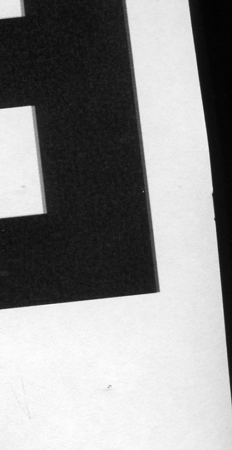
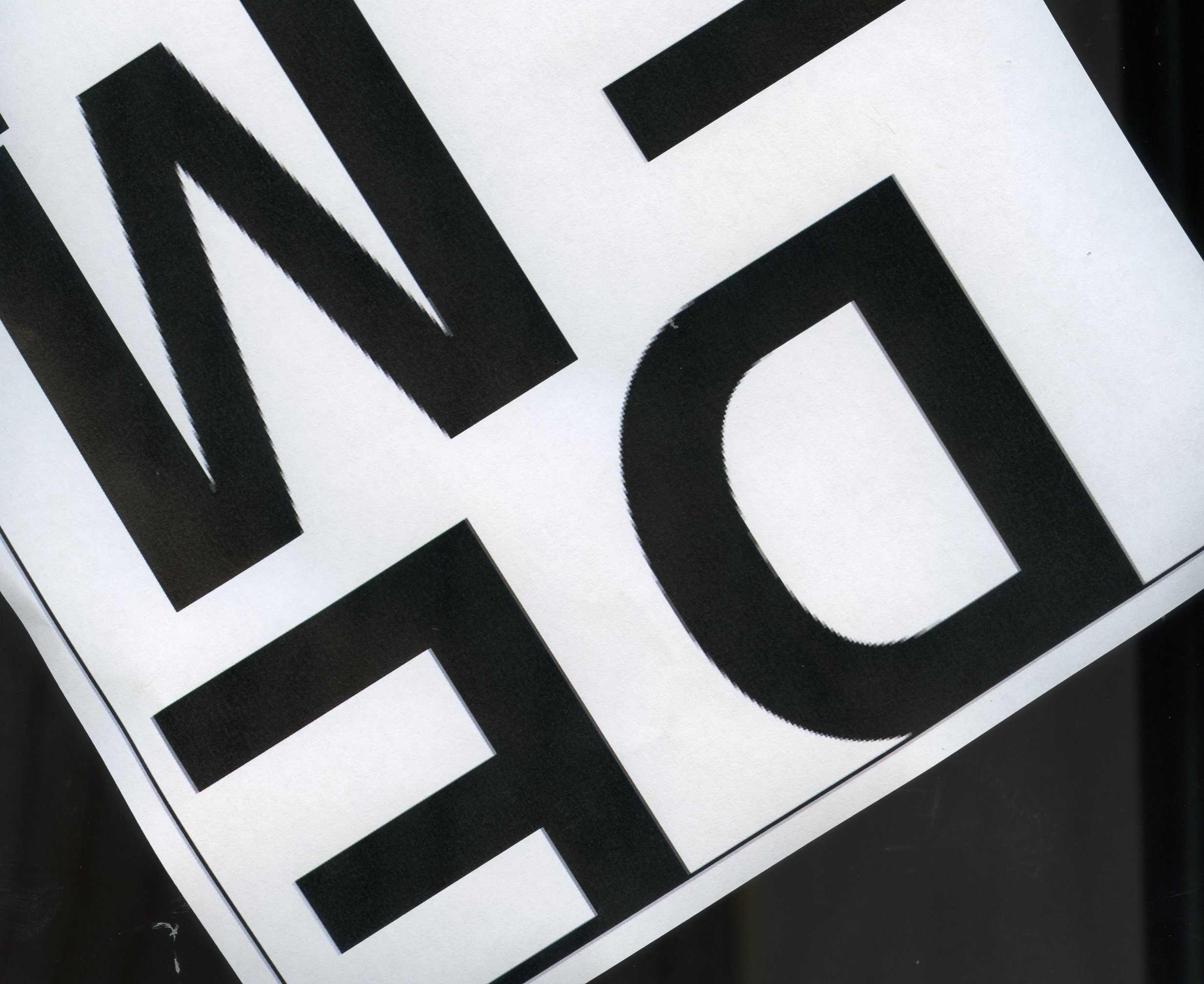
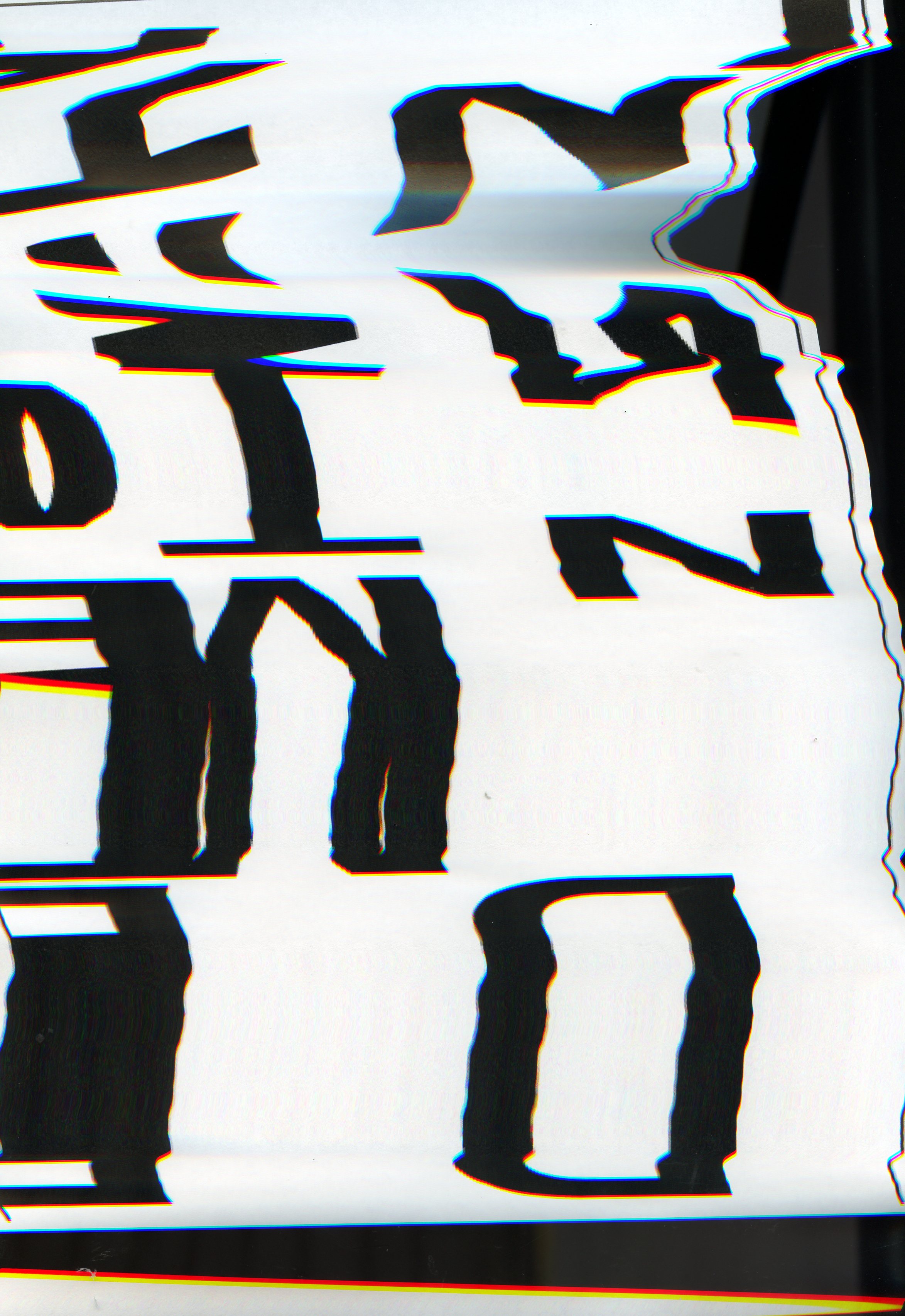
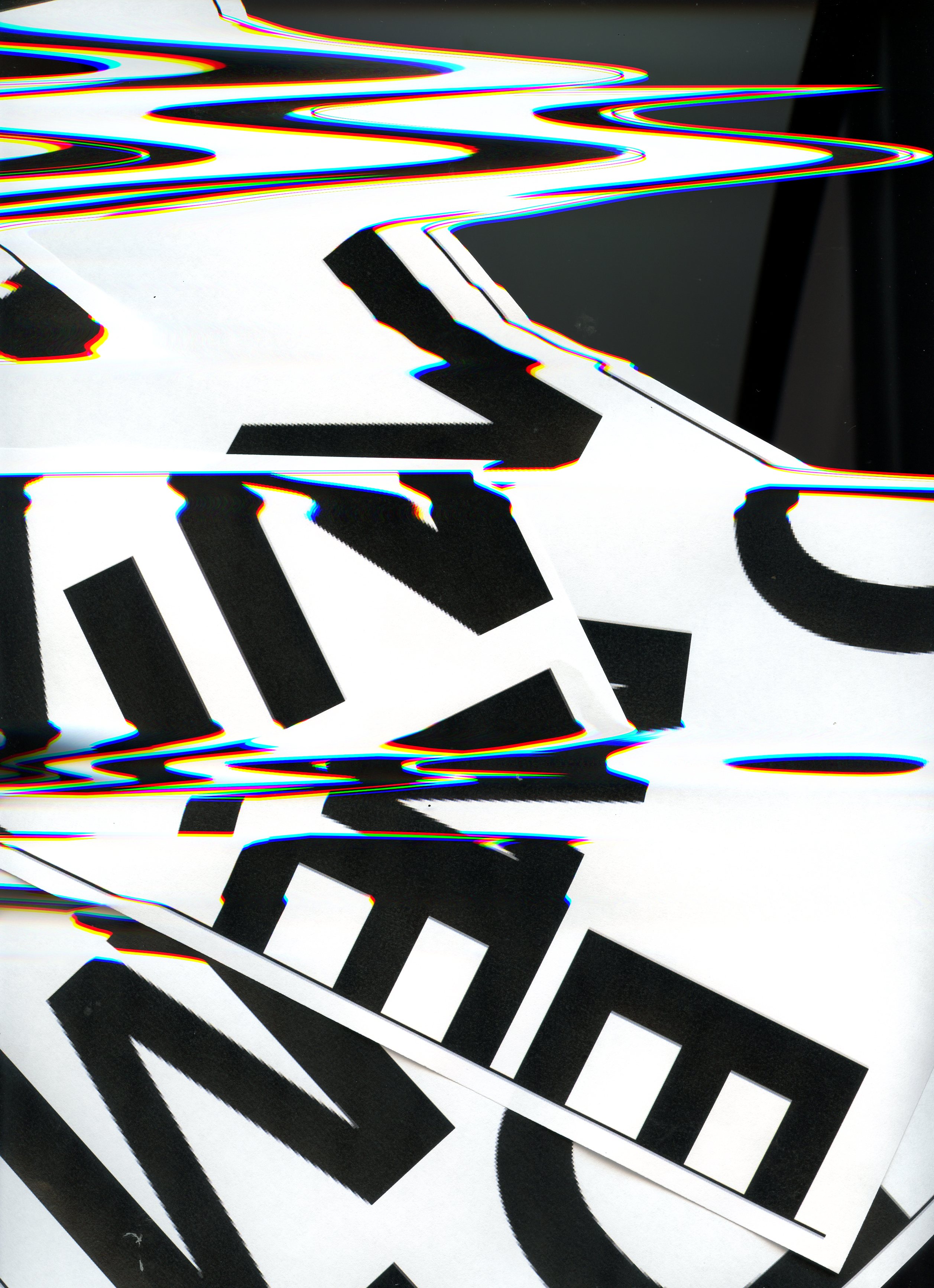

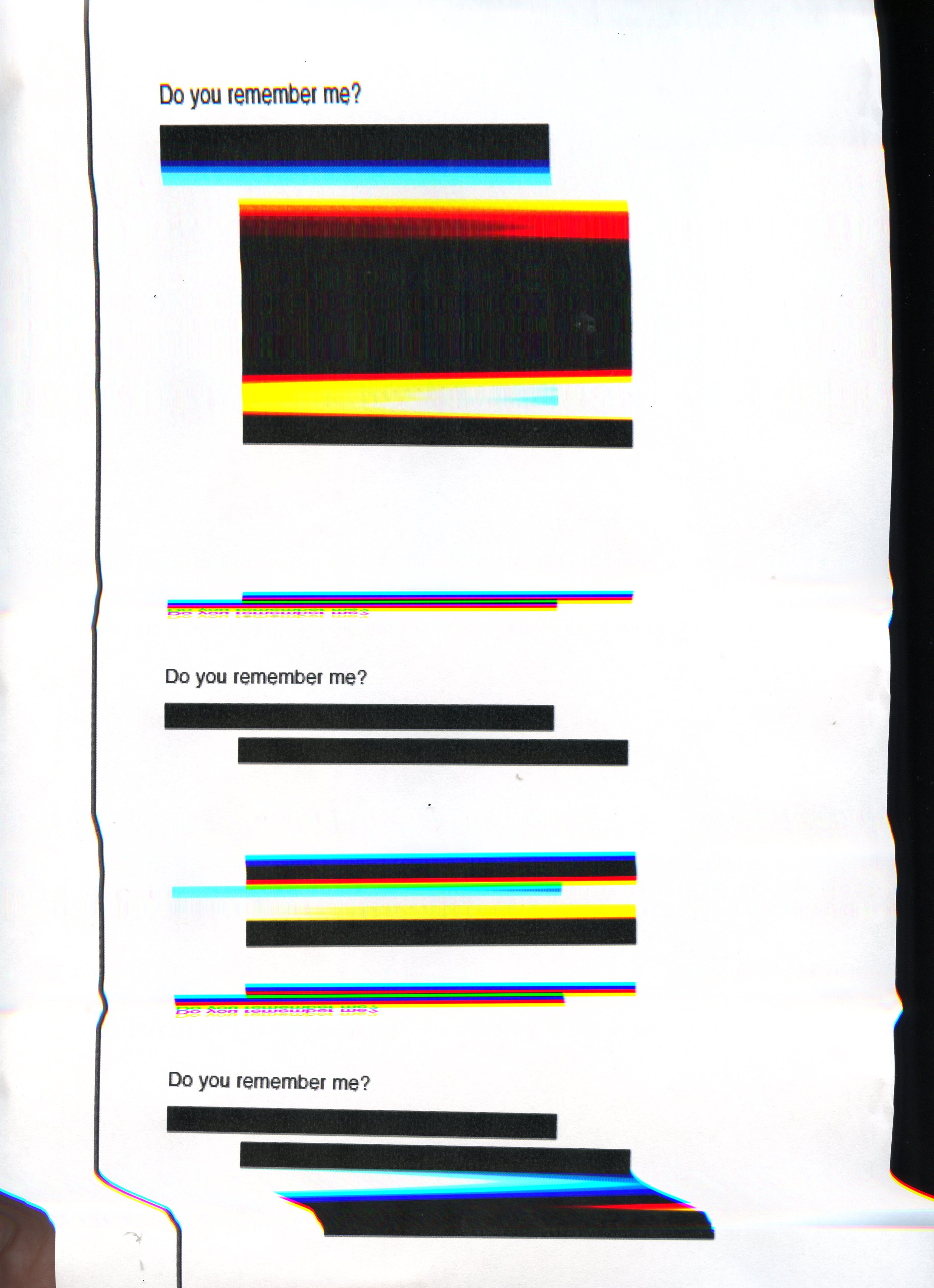
I felt that I had some success here with the scanner, okay the first few examples with the symptoms did not produce as interesting results but I felt that the word Dementia had been distorted and the whole communication of the word was really distorted. Maybe to a point where it is no longer legible but then I thought about the conversations, or lack of I had over the weekend with my grandparents and at times there is this messy confusion and lack of clear communication. It is a challenge to read between the lines and decipher what is being said. I thought that maybe in these scans the message was really lost at that I needed to go back and set type that would aim to give a clearer message and convey emotions but with some elements of distortion. I really struggled to set and produce type that on screen would give me the emotions and empathy that I really wanted to convey. I was really hoping that the process of using the scanner would give me more than what I was able to produce on screen.


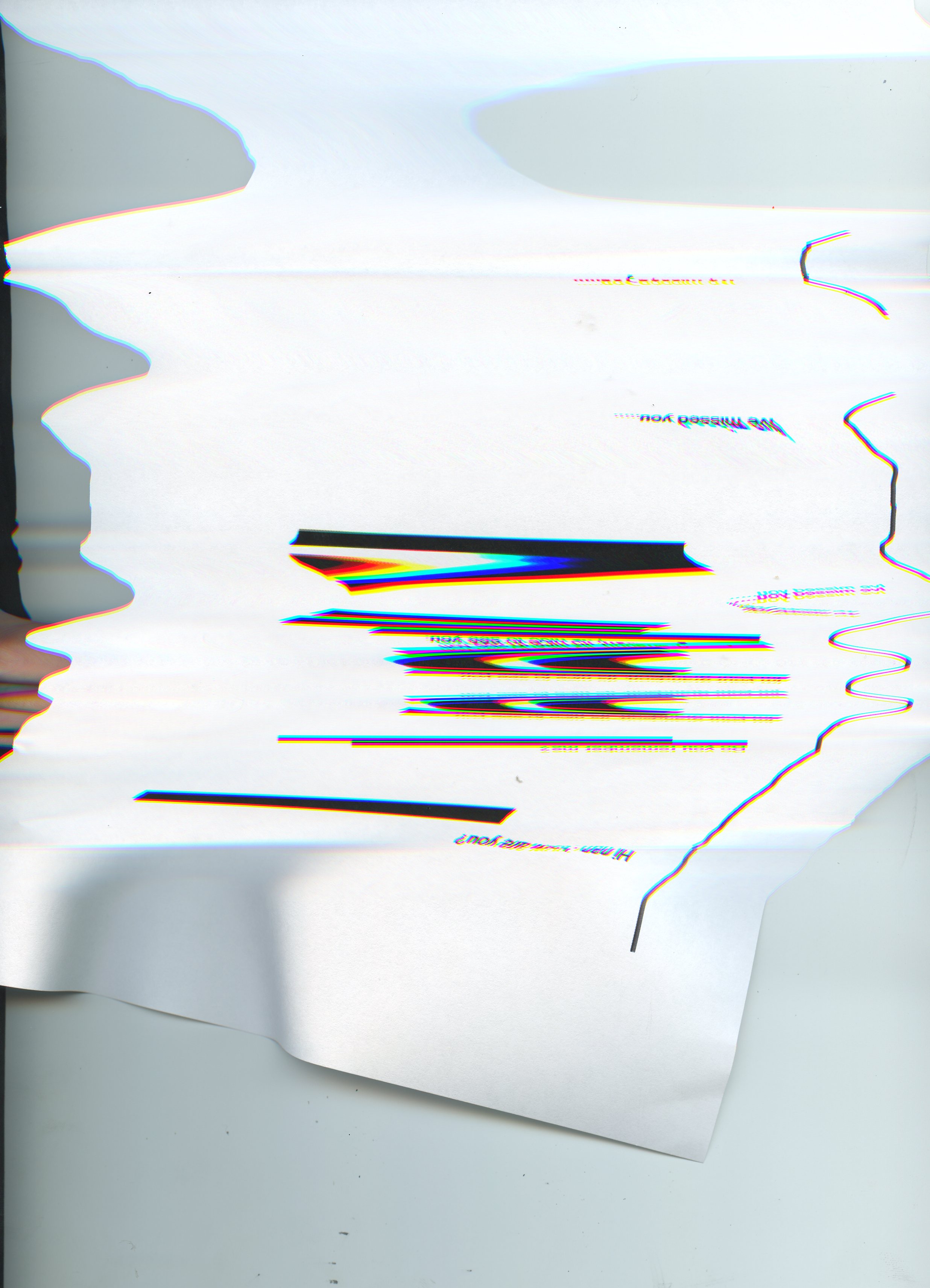
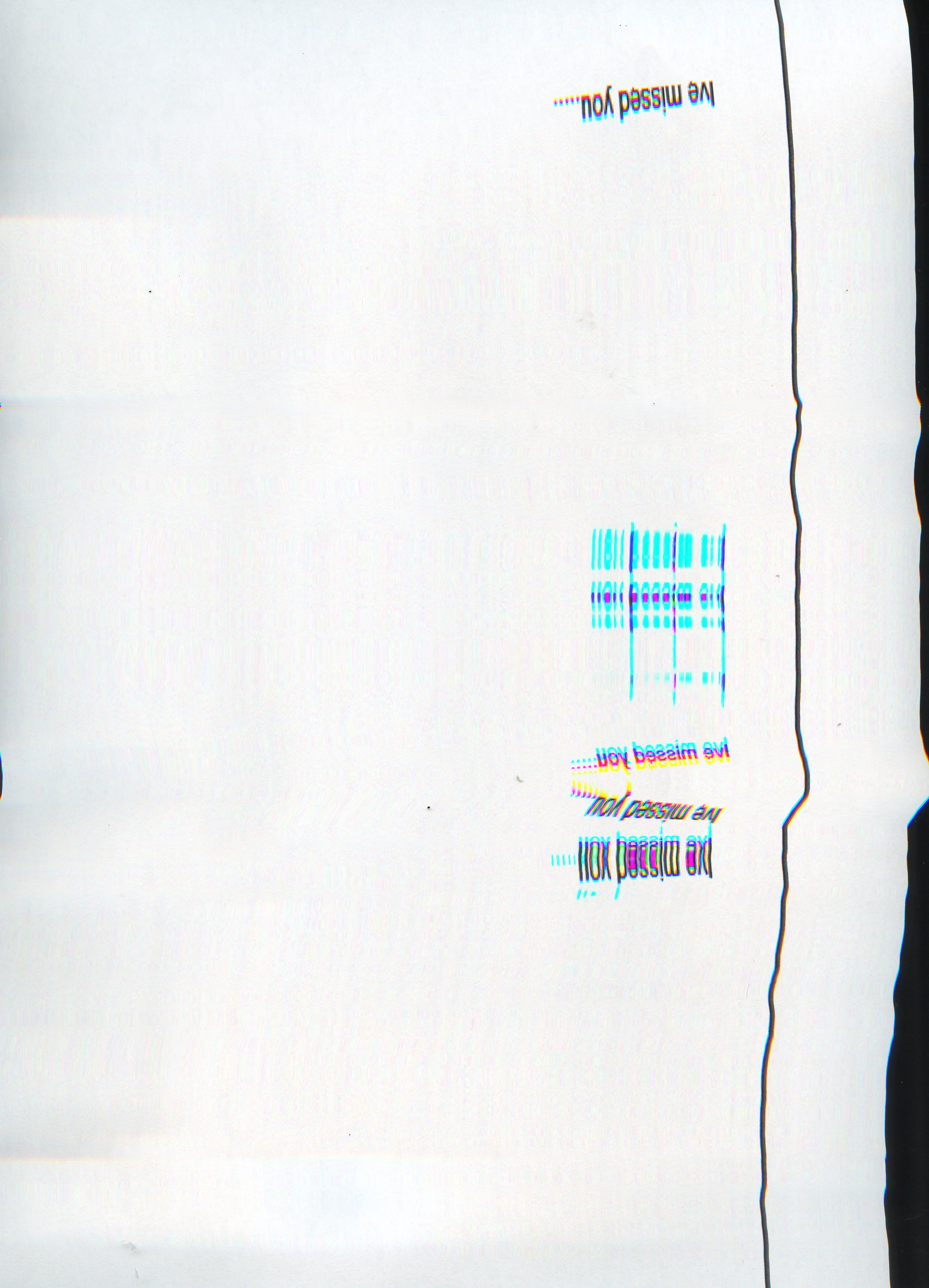
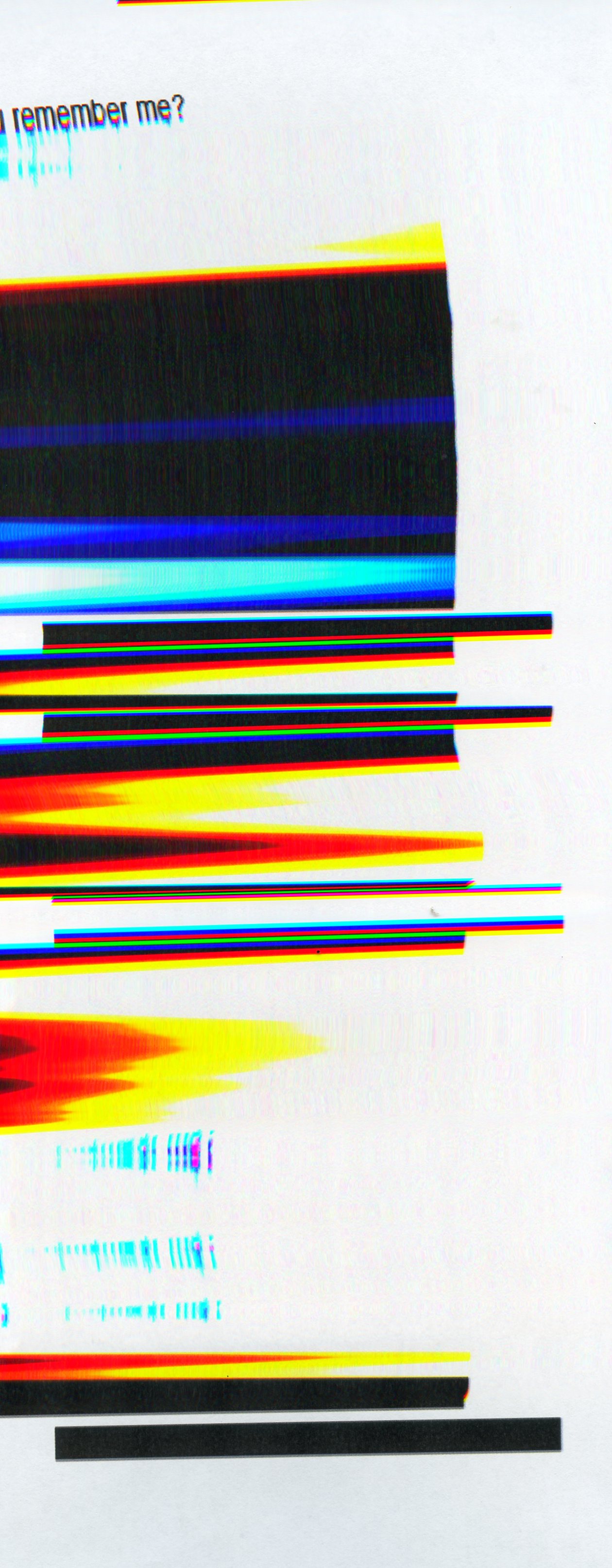
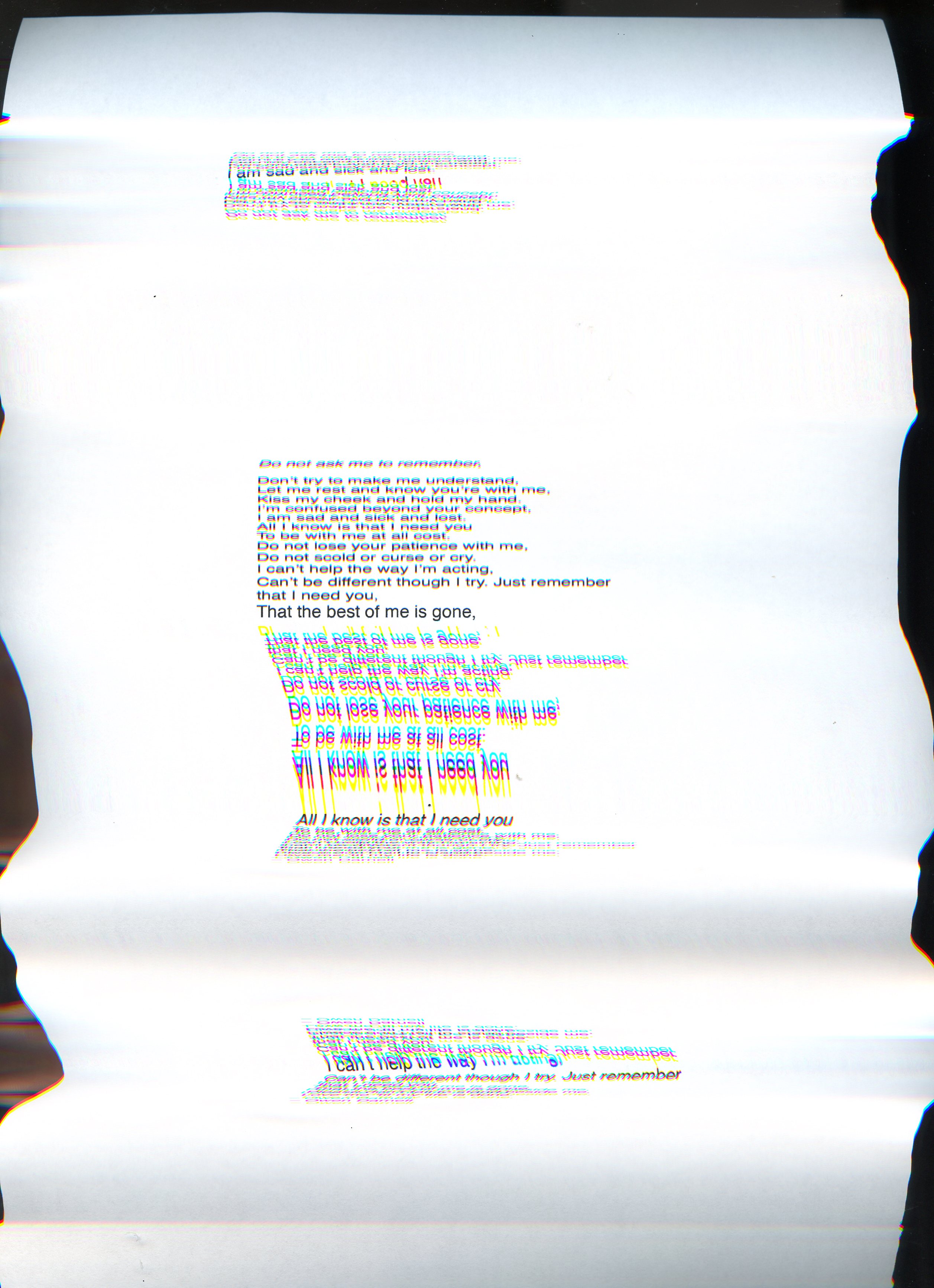
I had taken a poem from Owen Darnell about Dementia and what appeared to be a first-hand experience. I used the idea of repetition and tried to apply rules to these layouts but again I was not entirely happy with what I had on screen. Nothing was giving me the sense of emotion that I wanted. It was all too clean and easy to read. As the workshop challenge asked, I had set the poem and the first line. I believe I had created the emotions and tested the communication with the first line but still, it all seemed a little flat.

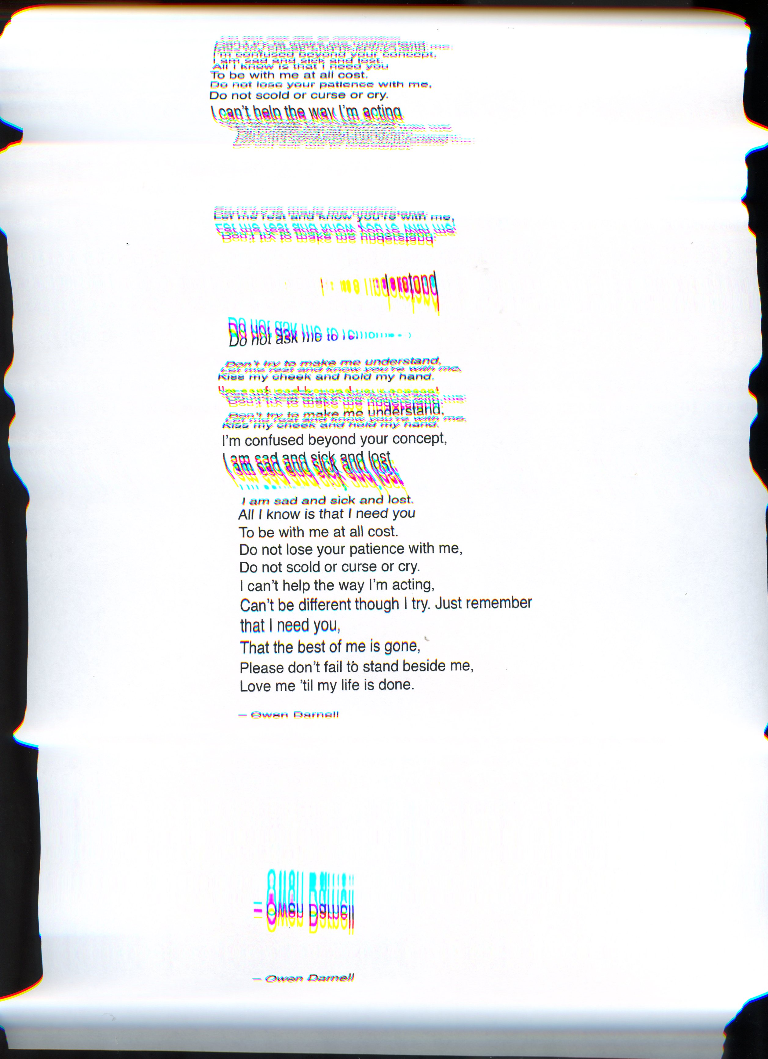


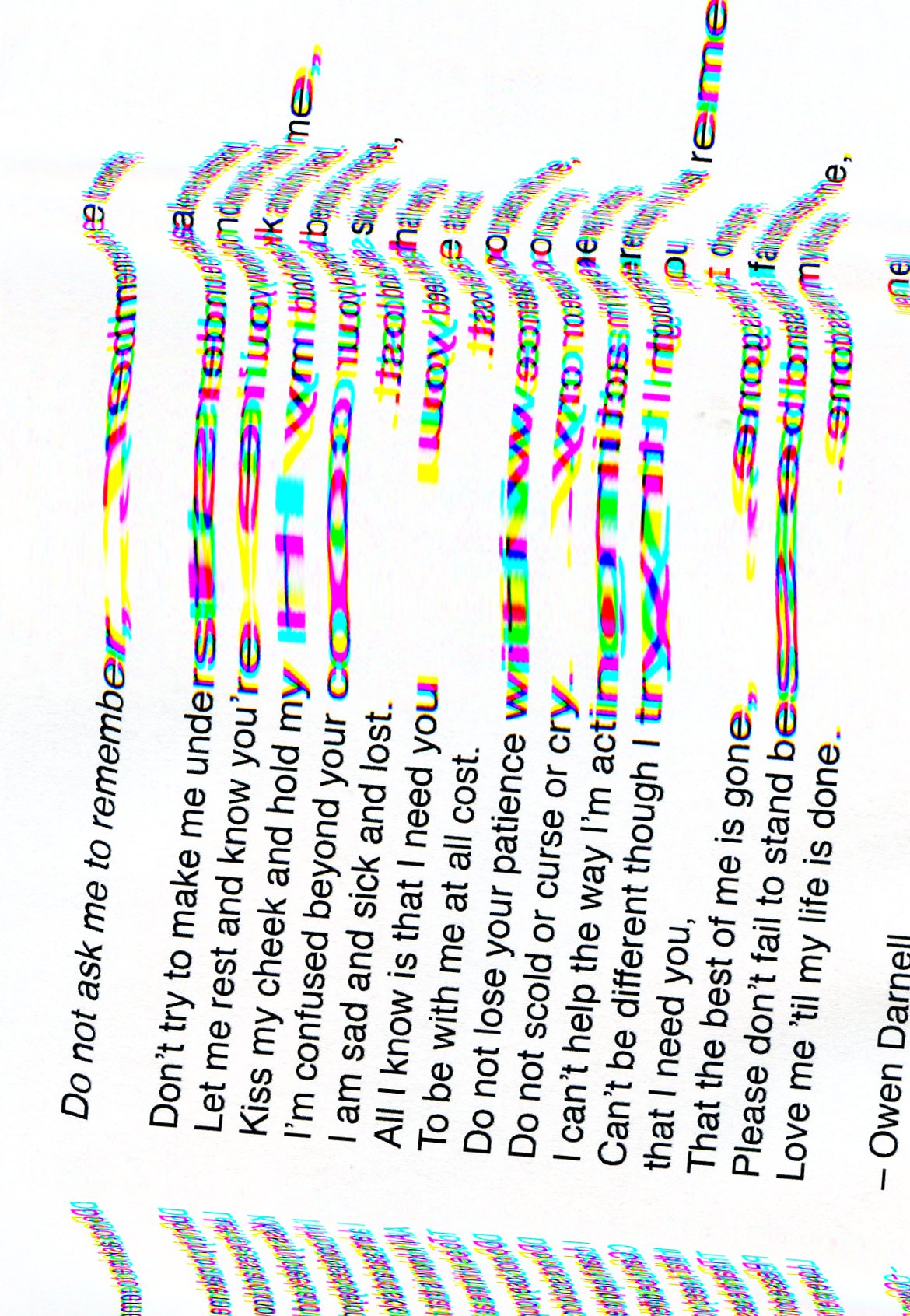
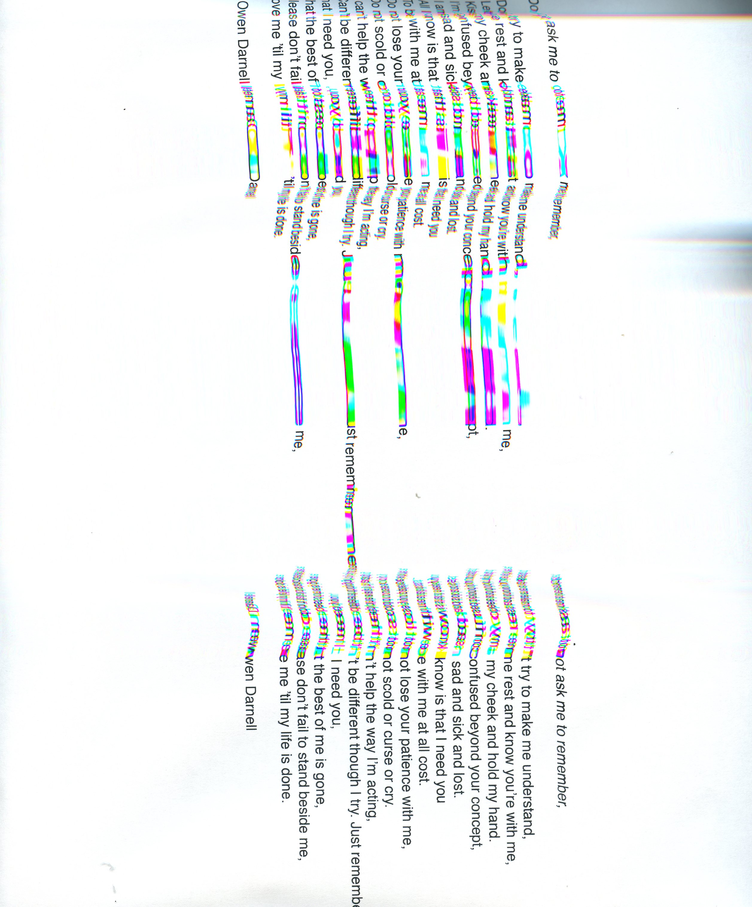

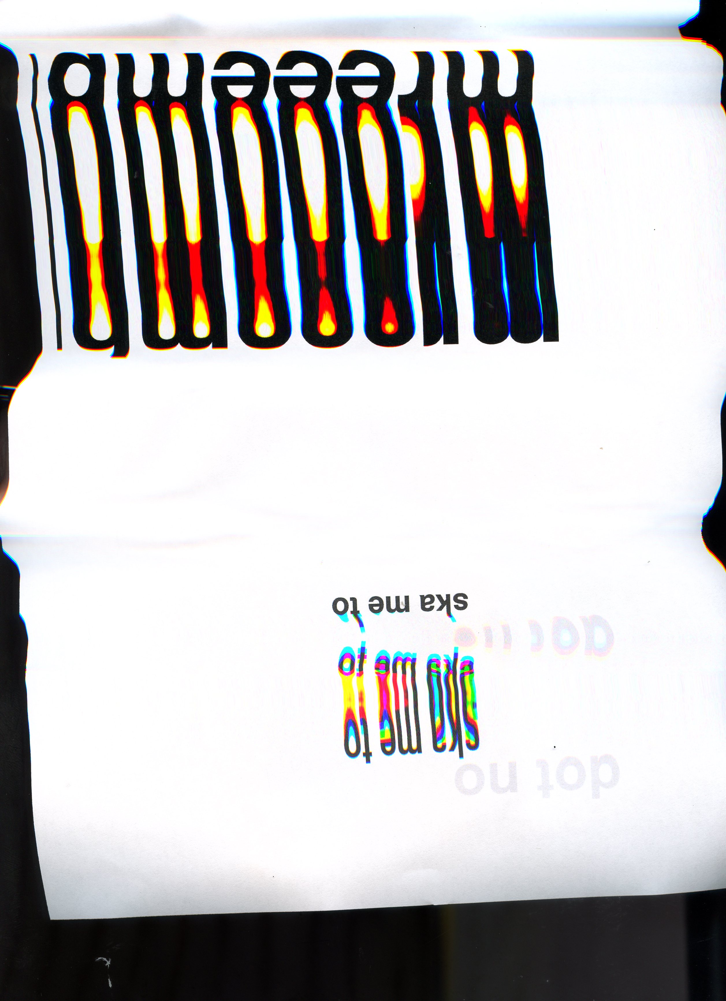
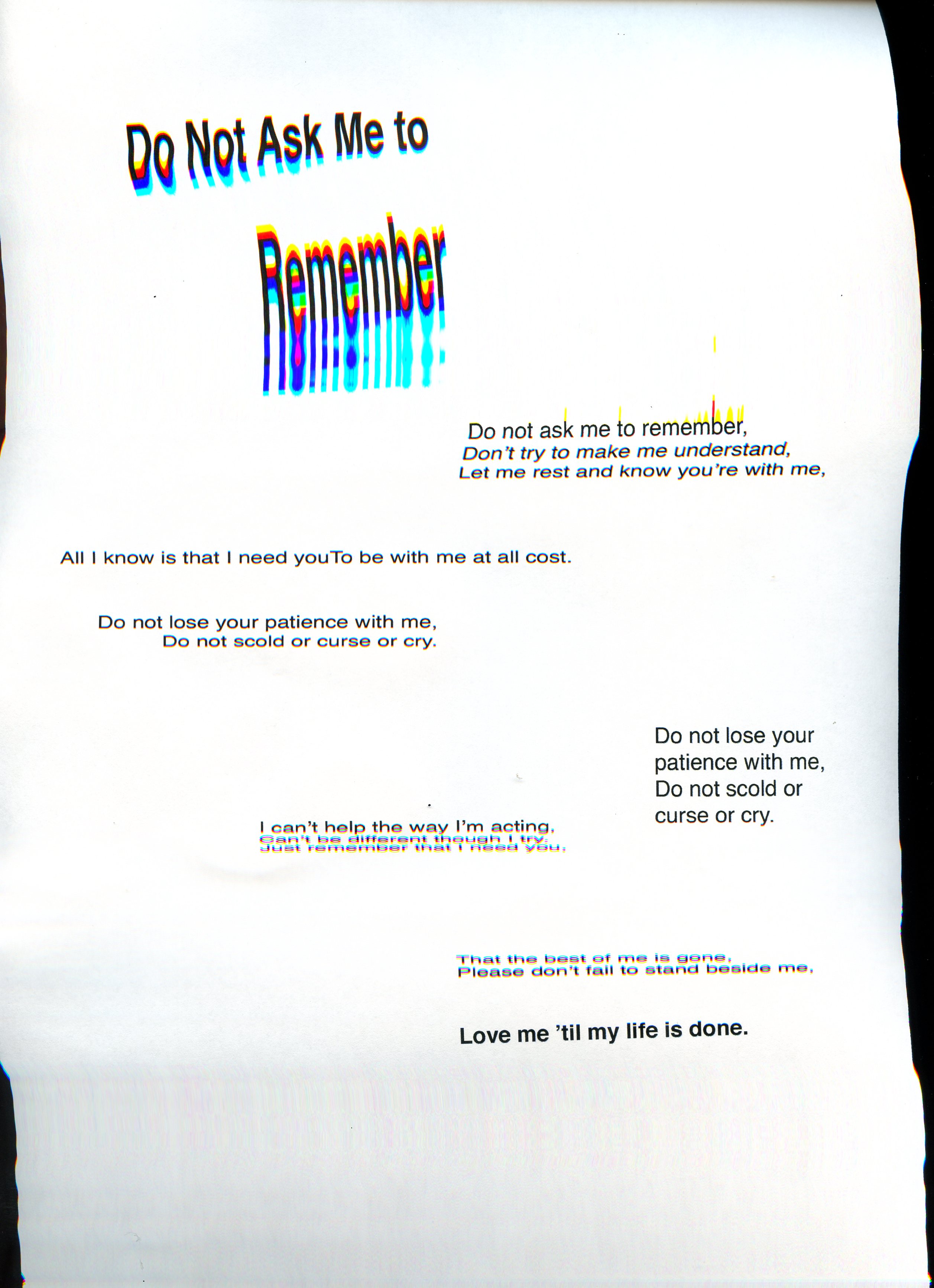
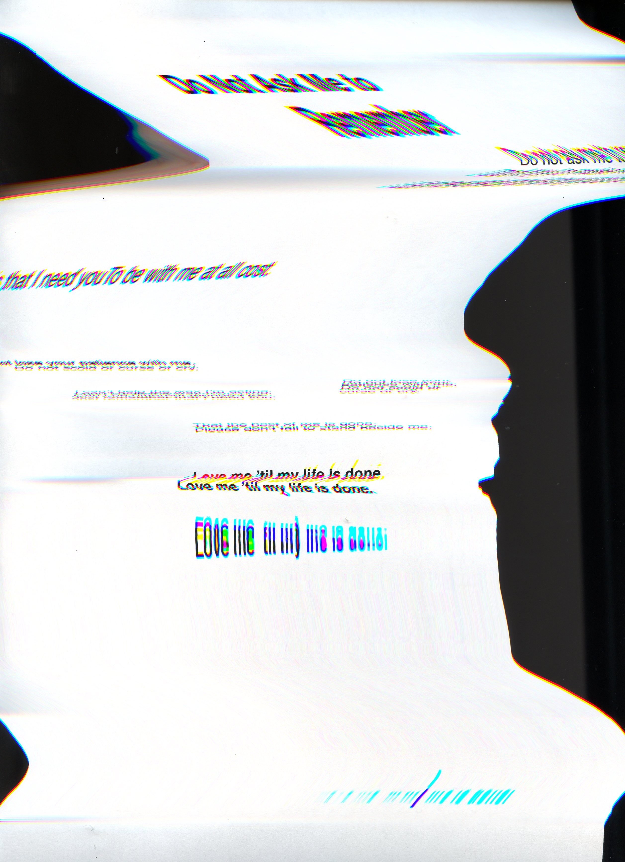
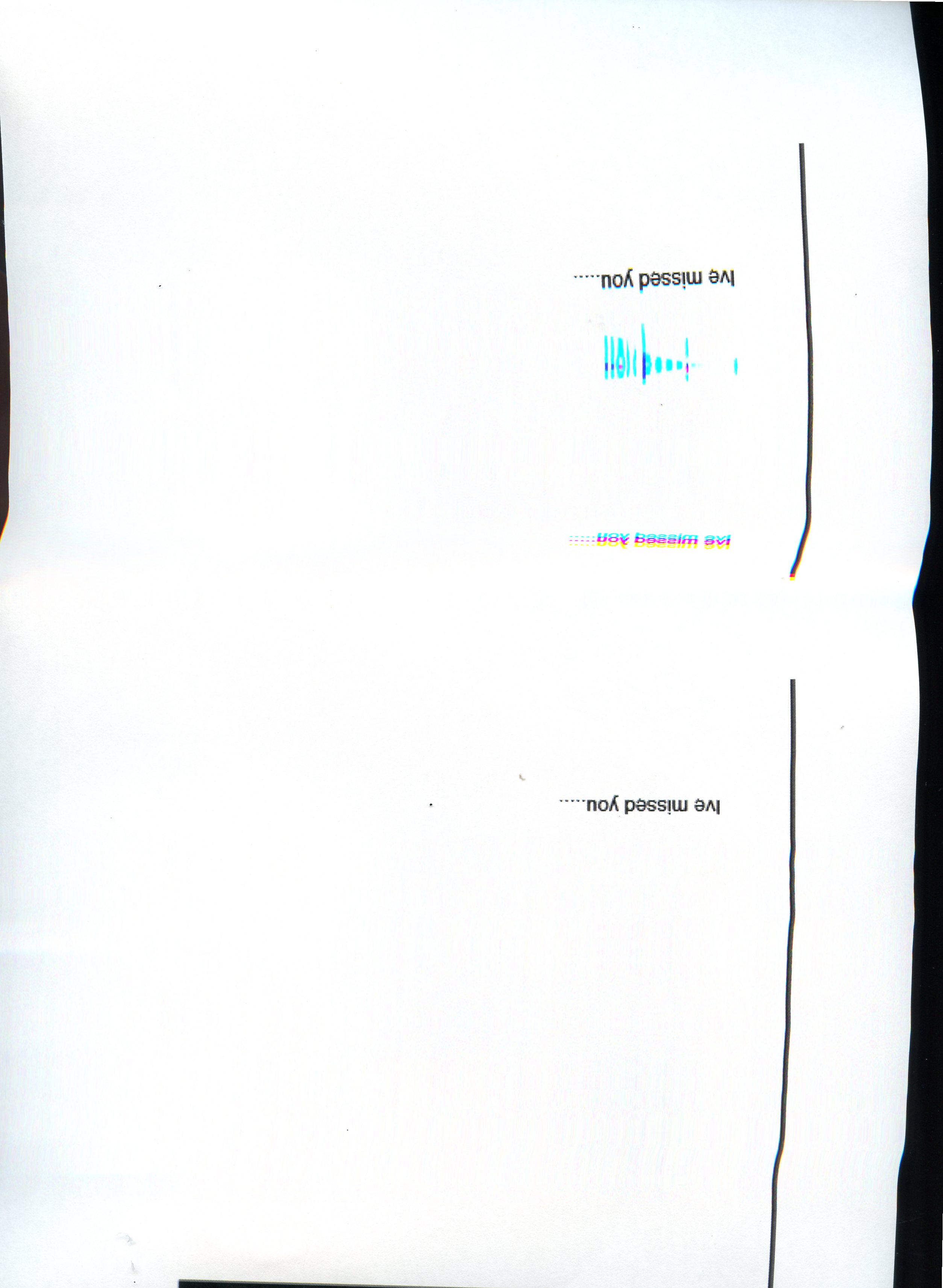
I was starting to really enjoy this process, I had built up an understanding of the scanner and how I could move the image to distress and warp the written word. I started to follow specific lines of type with the light and hope that it would stress and stretch the words. I wanted to retain some clarity and enable the type to be legible but I definitely wanted a balance of this and the stress and lack of communication. I was really focusing in on the concept of all the elements are there, the knowledge is there but how it is accessed and processed would cause this distorted message. From these scans, I was able to try and clean them up and maybe even combine scans to produce a series of images that would give me the clarity and confusion that I wanted. In the examples above I had already tried to combine the first line with the body of the poem in the scanner but for the next round of this process, I had decided to use Photoshop to edit and bring these images together.
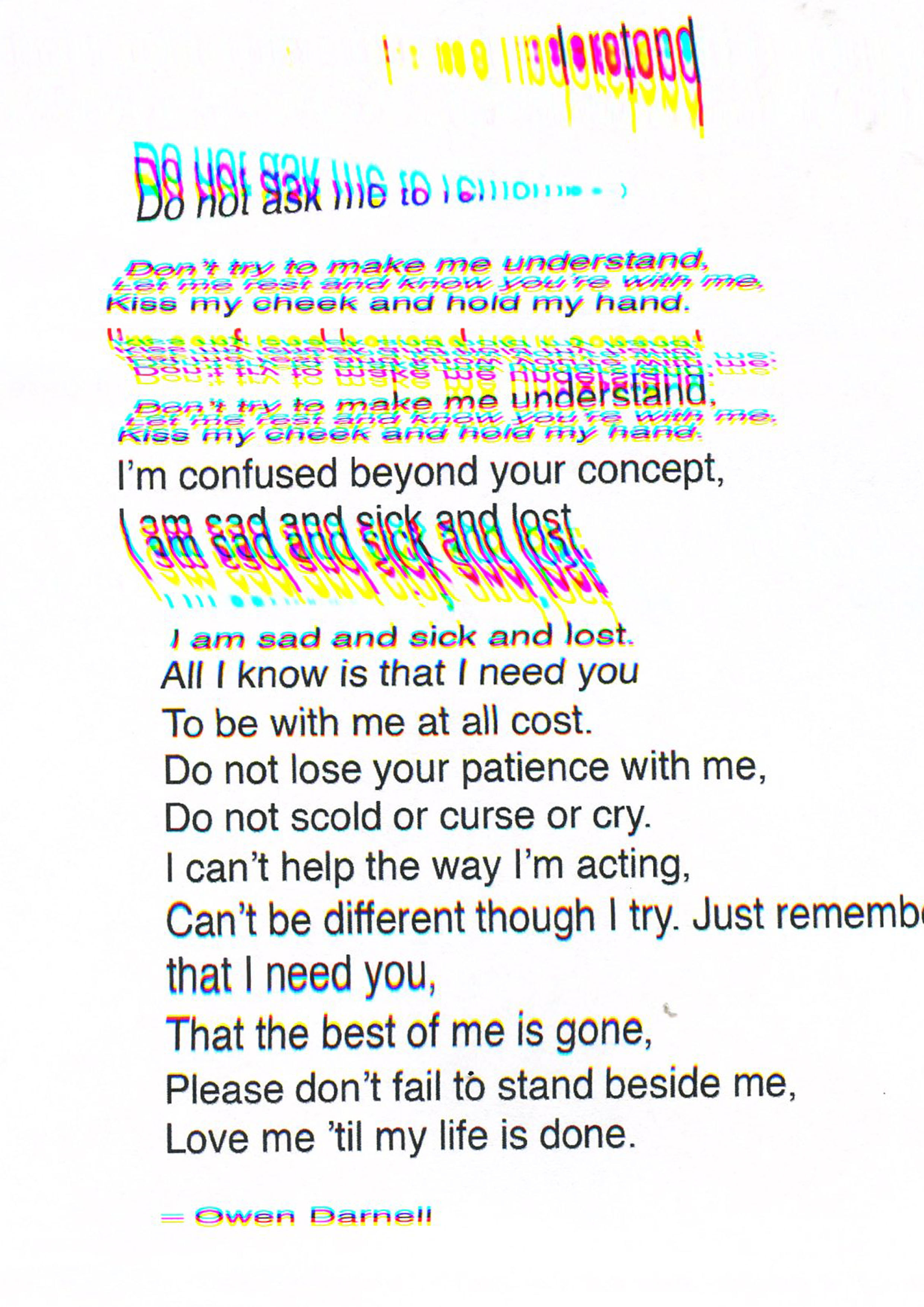
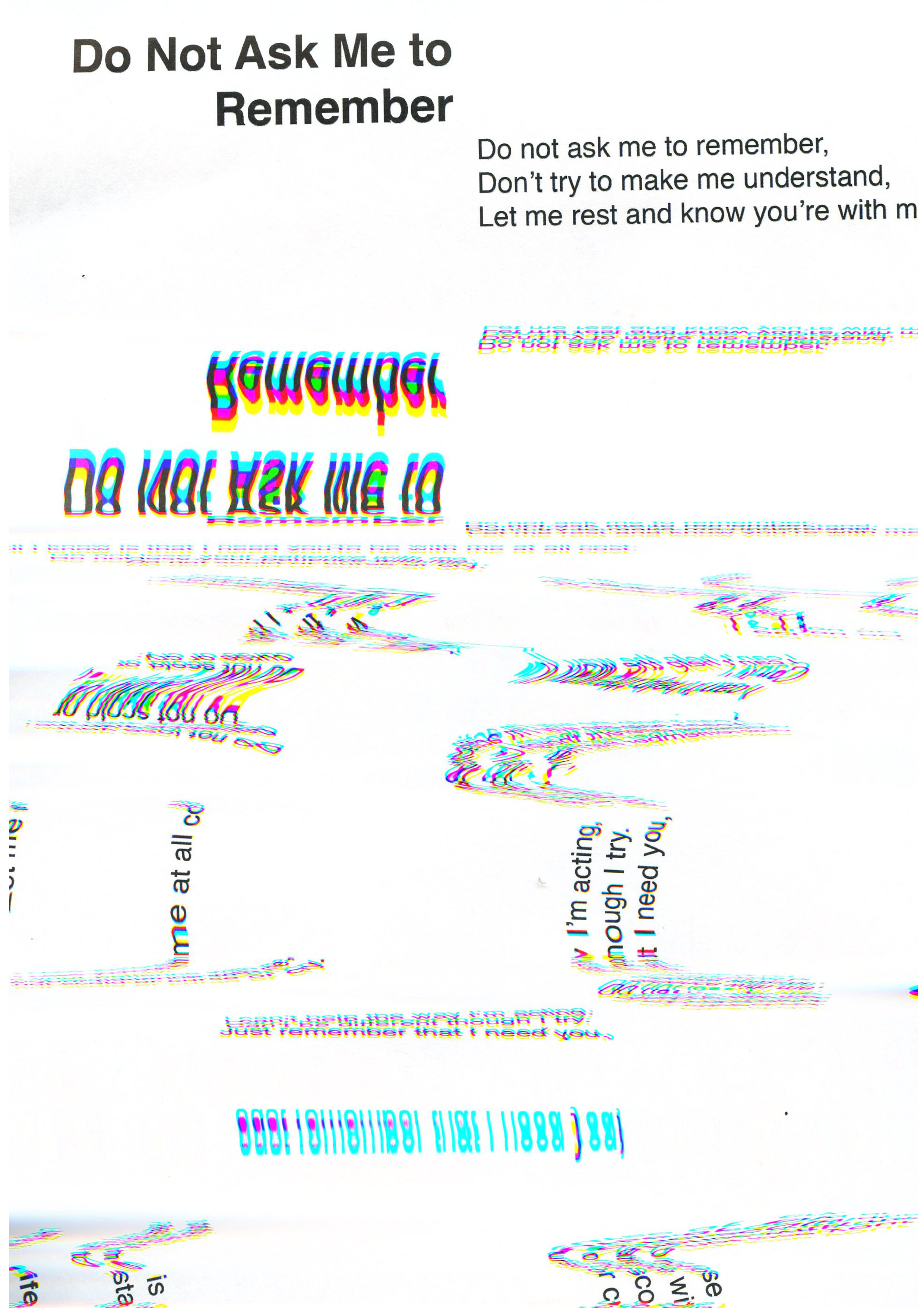
As an exercise in communication and using type, I have again enjoyed the process of not knowing what the end outcome will look like. I certainly feel that I need to develop my skills in setting large amount of text and really understand the rules when it comes to this. I also believe that I should coninue to improve my skills in type generally, it is something that i really like to use and experiment with and throught this exercise I believe that I have developed my skills but in less formal ways. I need to broaden my skills with the application of type and how things like the typeface can convey messages. I should have gone further to try a range of typefaces in this exercise, that being said the process again has been the part that I have learnt from the most. I feel that I am starting to develop a working pattern that allows me to crate more interesting and diverse work. I am no longer focused on the digital and obsessed over what the end outcome will look like I am enjoying the journey towards something. To go further would seem to stretch this idea too far. There are images here that convey the message of the poem, with the comfusion I really needed. The scanner has given me colour and texture that I was not expecting, it has been unpredicatable and i have had to respond to its outcomes. Having these visuals enabled me to make further design decisions

This is so powerful Jamie. You are really engaging with the content and striving to find the right processes to convey your message. This really works because of your personal connection. You demonstrate such a variety of testing- photography, digital manipulation, scanner manipulation. I feel moved by the message of the words and I feel a connection to the visual outcome through seeing your process and development. Well done – with limited time too. You deserve a break at christmas!!
LikeLike
This is really old but Jake Tilson was a pioneer in abusing the photocopier in the 80s at the RCA
http://www.jaketilson.com/art/terminator/book/index.html
LikeLike