This weeks lecture was a great insight into the world of type and how each location has been branded and has a sense of identity through its design choices. Having spent time in London, New York and Paris, each has a very distinct feeling and this is evident in their tube stations. Each shows a rich history and engineering. Changes in type and branding over the years have given each their own recognisable visual language. New York and its use of Helvetica resembles a national pride and the typeface has been used by so many big and well-loved brands, from American Airlines, American Apparel. It seems so ironic that New York should choose such a typeface, with the bombardment of advertising and billboards of times square, is Helvetica that unambiguous that it does indeed stand out from a crowd of screaming brands fighting for your attention. The underground system in New York, like London, uses a schematic diagram to guide its users around, couple this with a colour coding and clean typeface each has usability at the forefront. Paris, in true Parisian style, has been in slight defiant to completely change its network. They too have adopted the schematic diagram style of Harry Beck, and to they have a sense of usability to their typeface once underground. However, the arches guiding you into the system is true to their history and has been left unchanged. This I think has become a part of their visual language and stands proudly in defiant of complete change. This is the way we like it, and this is what we will do. I like that about the Parisian culture, while people are in a rush to get around there is no sense of emergency like there is in London and Newyork.
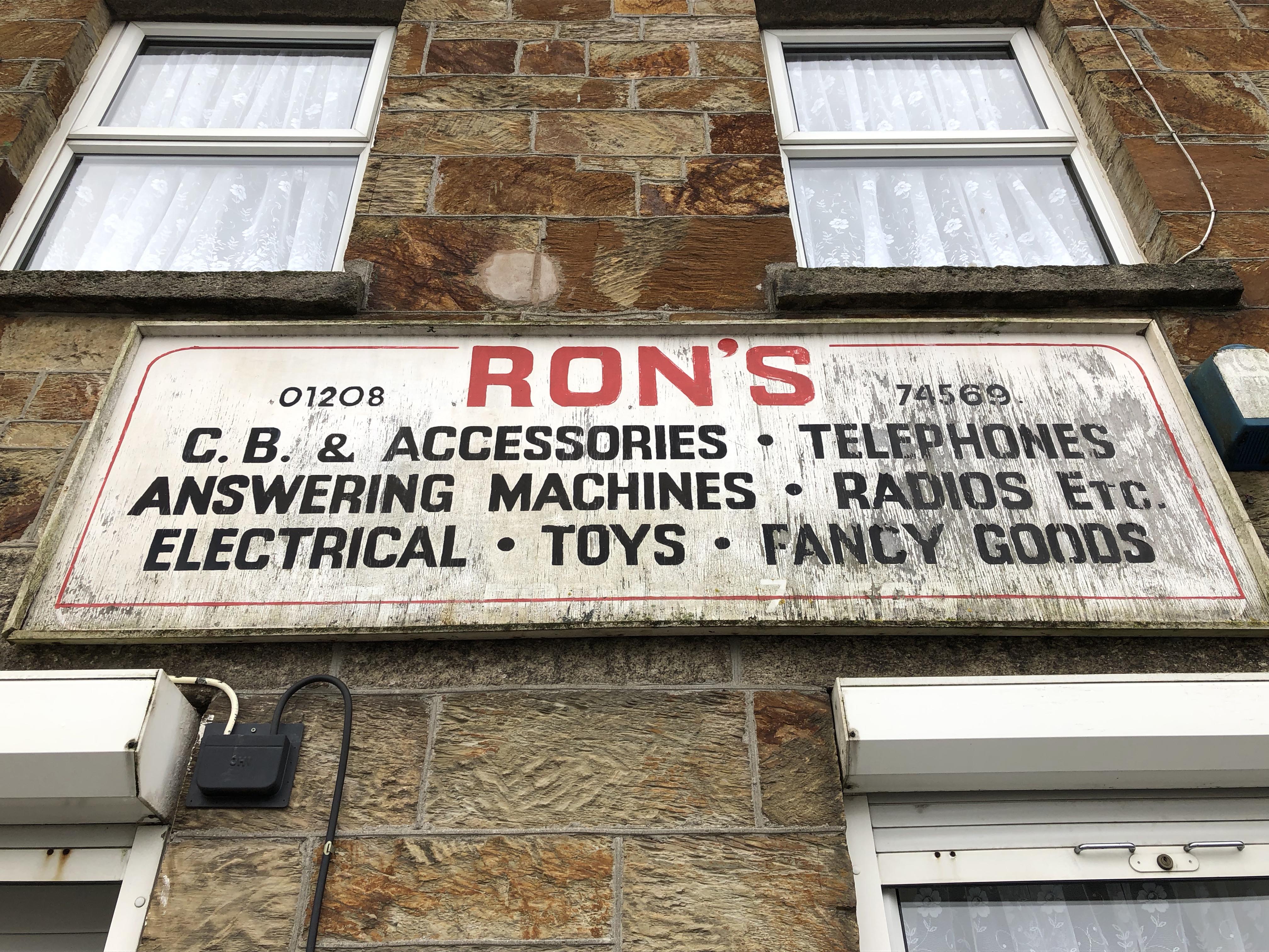
The focus for this week’s tasks has enabled me to explore the ignored a concept that had previously been delivered. It was an opportunity to revisit an idea that I had not fully investigated. In the last module, I had highlighted the Cornish language and how it was being hidden in plain sight on street signs. Something that I would have liked to explore is the lost signs of businesses that no longer exist. This had been sparked by one sign that I see each week and wonder how long it has been there. Maybe since the ’70s or ’80s, however, the change in buying habits and a huge shift in social economics means that Ron’s electrical appears to be out of business but the sign still sits as a memory of the previous occupants of the premises. The sign sits above an end terrace house and promises the consumer all their needs for Telephones, answering machines and radios. Rons even sells fancy good, enticing a high-end user. Ron’s store has moved premises, across the road but the old sign still sits proud and in great condition.
With the tone set for this weeks challenge I then began to wander around town and try to seek out more of these lost signs or try and find examples of typography that would give me a tone of voice or a visual language for the town. I soon began to notice through the high street, in natural spaces and on historical sights a common theme of stone engraved plaques or monuments. The Beacon nature reserve was opened in 1994 and proudly boasts a large stone, engraved and painted to this effect. The stone announces the area as a nature reserve and was so declared in 1994. The beacon site is home to a history of Cornish farmland and bear fighting. It also is a memorial to Sir Walter Raleigh Gilbert, the monument is a celebration of the lieutenant and his dedication to the East India company. The monument is engraved stone, on three sides telling the story of the heroic efforts of his actions.

Black engraved letter forms similar to those found elsewhere in the town. 
This B is from the plaque proclaiming the area as a nature reserve. 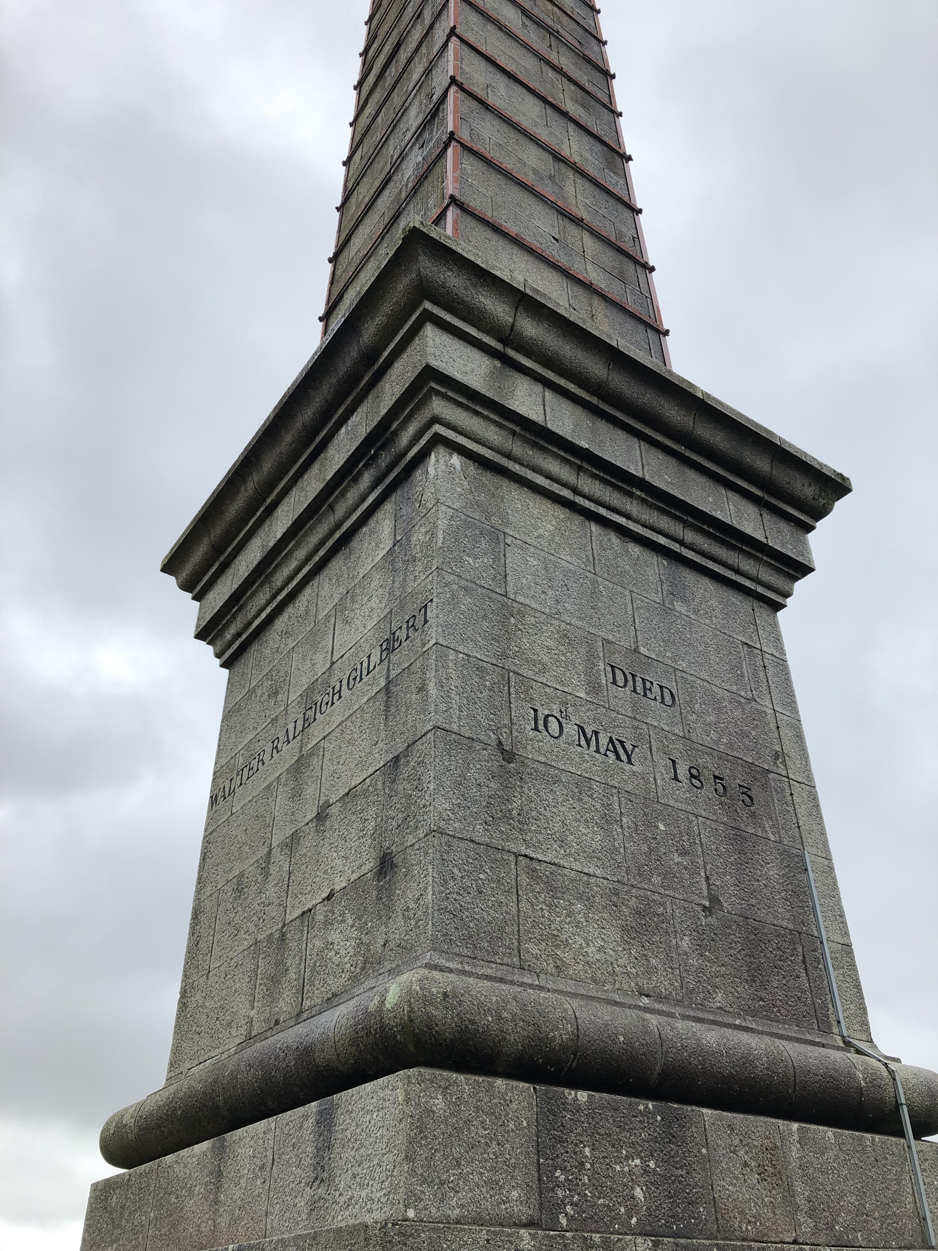
Bodmin Beacon, a monument to Sir Walter Raleigh Gilbert. 
This one was not at the beacon nature reserve but has some similarities to the style and use of material that I found of interest.
I really started to think of this engraved stone as the voice of the town, it highlighted the history and the personal touch needed to create these letterforms. I began to investigate the early settlers to the area and the town can be traced back to the 10th century and monks. This would explain the number of churches in the area. These beautifully engraved letters have been carefully crafted although In some cases there really is a sense of hand made a slight error of hand can be seen, particularly in the B shown above. It adds to the unique letter and to the character too of the area. Further investigations highlighted more stone engraved signs in town and out on the Camel Trail, an old railway now cycle path that still connects the town to the finishing village of Padstow via Wadebridge.
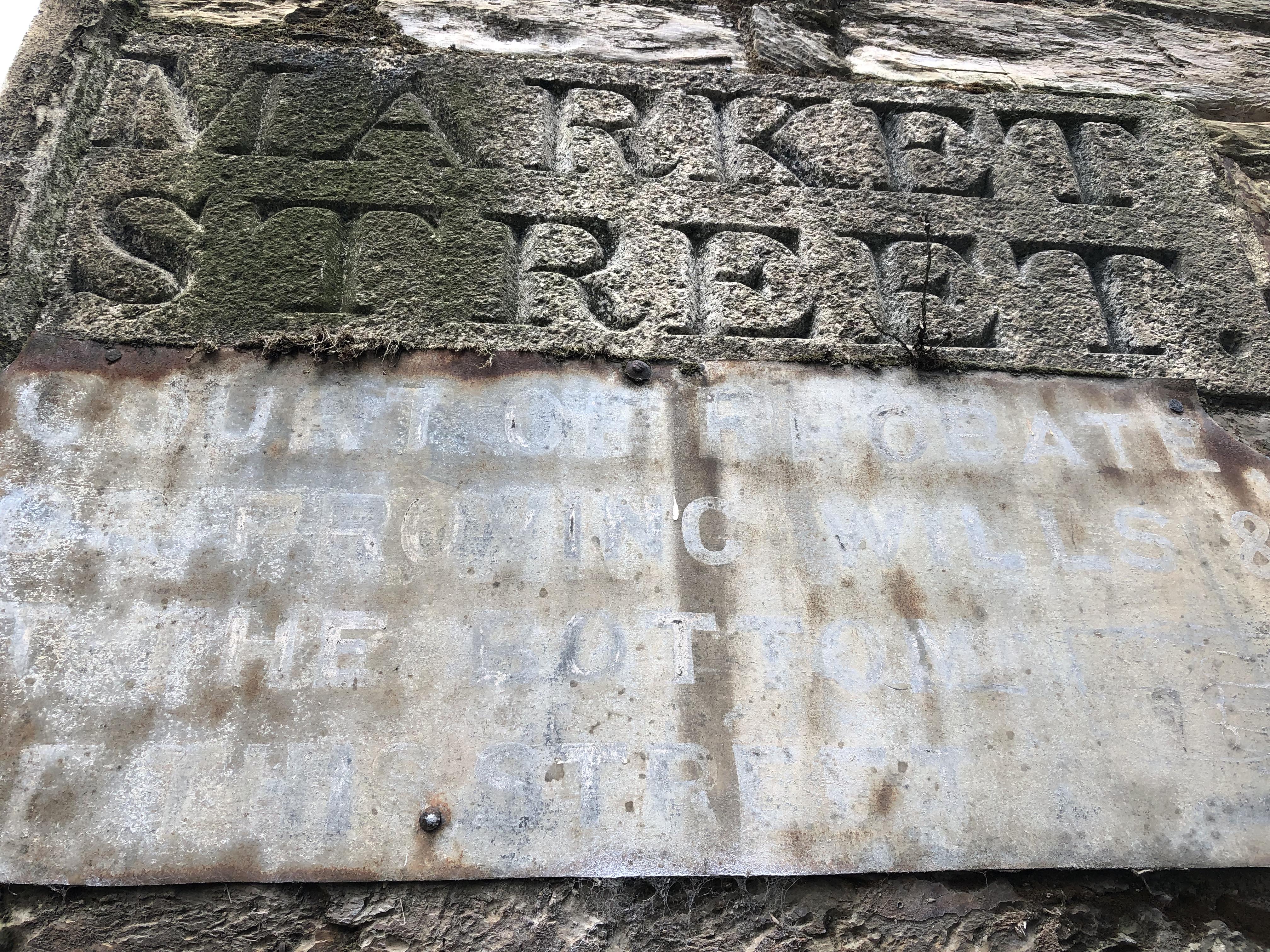

The Market Street sign formed part of the cornerstone of a building and unsure of its origins I would imagine that this has to date back to the 18th century when the town had undergone some redevelopments to cement its place as the centre of the county. The engraved stone plaque for the Camel Trail appears to be of a similar style, in stone and type to that of the Beacon Nature Reserve Plaque. I began to wonder if they had been made by the same person if this was a style choice, a conscious effort of design to add consistency to the area and give Bodmin an identity that seeks to take influence from its Celtic and religious roots. To put into stone a permanent feature to mark a significant area of the town. The material here is a statement in itself, in an interview for Google design, Nick Benson tells the story of the craftsmanship and a true labour of love to create typographic forms in stone. Benson states:
It’s funny because when I see the old stuff, Roman or even Assyrian, when I look at cuneiform — stuff that’s got 4,000 years on it — I can walk up to a tablet like that, and it’s as if I’m standing over the shoulder of the guy who carved it. It has such immediacy to me. I understand the steps that were taken to make it, and in the physical form that I’m looking at, and it’s like, “I see how he did this. Check this out. Look at where he’s going with it. Hey, check out at the end of the inscription.” I don’t know. I tend to think of it as not so distant even though they’re ridiculously old pieces of work. I look at them as something that was carved yesterday.
I find it interesting that despite the clear age difference between these examples around town they give the town a feeling that it has barely moved on in centuries. Maybe in some circles, this outlook is true but the stone and typestyle cling onto the traditional and regional influences. Another example of this was a plastic vinyl print at a petrol station. The banner was advertising the Cornish Guardian. A traditional, decorative C and G adorn this modern media.


I find this interesting for two reasons, the type style for one clearly reflects the rich history and traditions of the area but the use of the banner material has a complete contrast and it felt wrong. It seemed that the material was offending the angular, decorative, type. The digital version of this once handwritten style, for me just did not work. Maybe it was the contrast in this brand and identity logo for the newspaper with the sans serif type below. A decorative, history-laden typeface with an unambiguous Helvetica, Arial non-intrusive type. Once again the media of which the type was set had spoken volumes about the message that was being portrayed. I seemed distant from the content of the message but began to consider a deeper sense of design choice with each example that I found. Like the stone, the vinyl banner had been designed with the intention of longevity and standing strong to the harsh weather conditions of the Cornish climate. I found more examples of the type that was of interest due to the use of material but It was not until later reflection did I conclude this. The Camel Trail still has one remaining station that aims to hold on to traditions of the steam engine and the industrial revolution however the signage is very clean, modern and feels disconnected from its situation and location.


Typographically these signs have similarities to the Johnson type from the that is used for the London underground. I wondered if this was due to uses of the train line in years gone by. There used to be a direct train from St Pancreas to Padstow, connecting Londoners to their second homes in Cornwall. Was the type style a choice of familiarity and connectivity to the capital? On this walk on the camel trail, I started to notice more examples of type and too began to take an interest in the signs that had started to decay. Making links to the use of material I reflected that some of the examples had intentions of longevity, I found examples of type carved into stone, pressed into metal, painted on chipboard and even cut out of wood and painted.

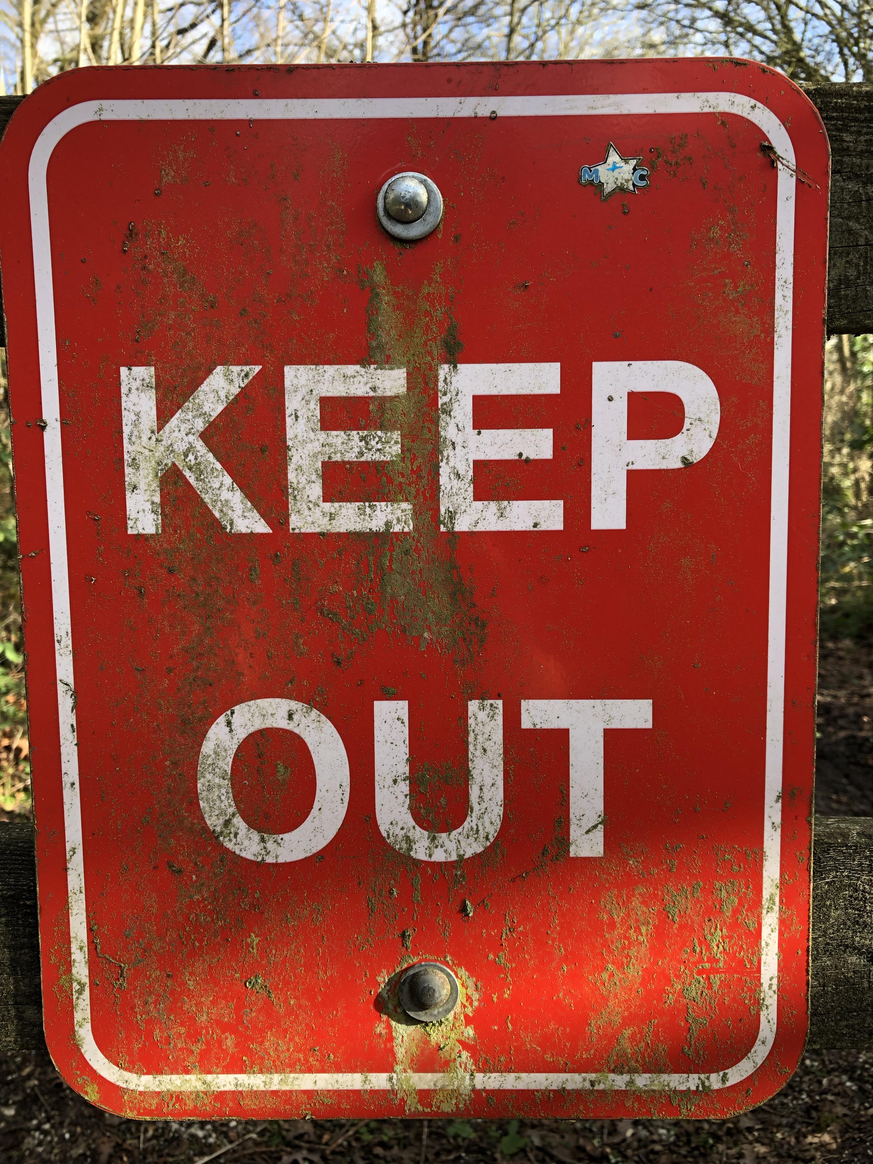


The above examples all have the agenda of information first but each has been considered to the use of the material. The decay of the danger and keep out signs was a particular interest, the idea of these signs at one point no longer being eligible and then losing the impact of their importance in informing the audience of keeping safe or private land. With some slight decay but more interestingly is the Anglers Association sign that has been hand painted and appears to have a consideration of perfect letterforms. This was not a sign thrown together to ward off dog owners or identify the use of the land but I think more importantly there had been a real consideration of its legibility and longevity. It appeared to be painted on a manufactured board but sandwiched between the fencing slats. It was at an eye level that most people would see and the bright white background adds a clear contrast to the back type but also against the green surroundings of which it sits. While this sign too will at some point need to be replaced due to its degradation makes me reflect the time it had already spent informing people. In contrast to this is a Metal, engraved and embossed and layered plaque that gives direction and distance information while using the camel trail. The texture and decay of the sign were interesting to me with this one. I think too was the graffiti tag that had been branded over this sign in a contrasting yellow, had the author of this tag considered their use of colour? or just an opportunist and had claimed this sign as theirs in an unconsidered manner?

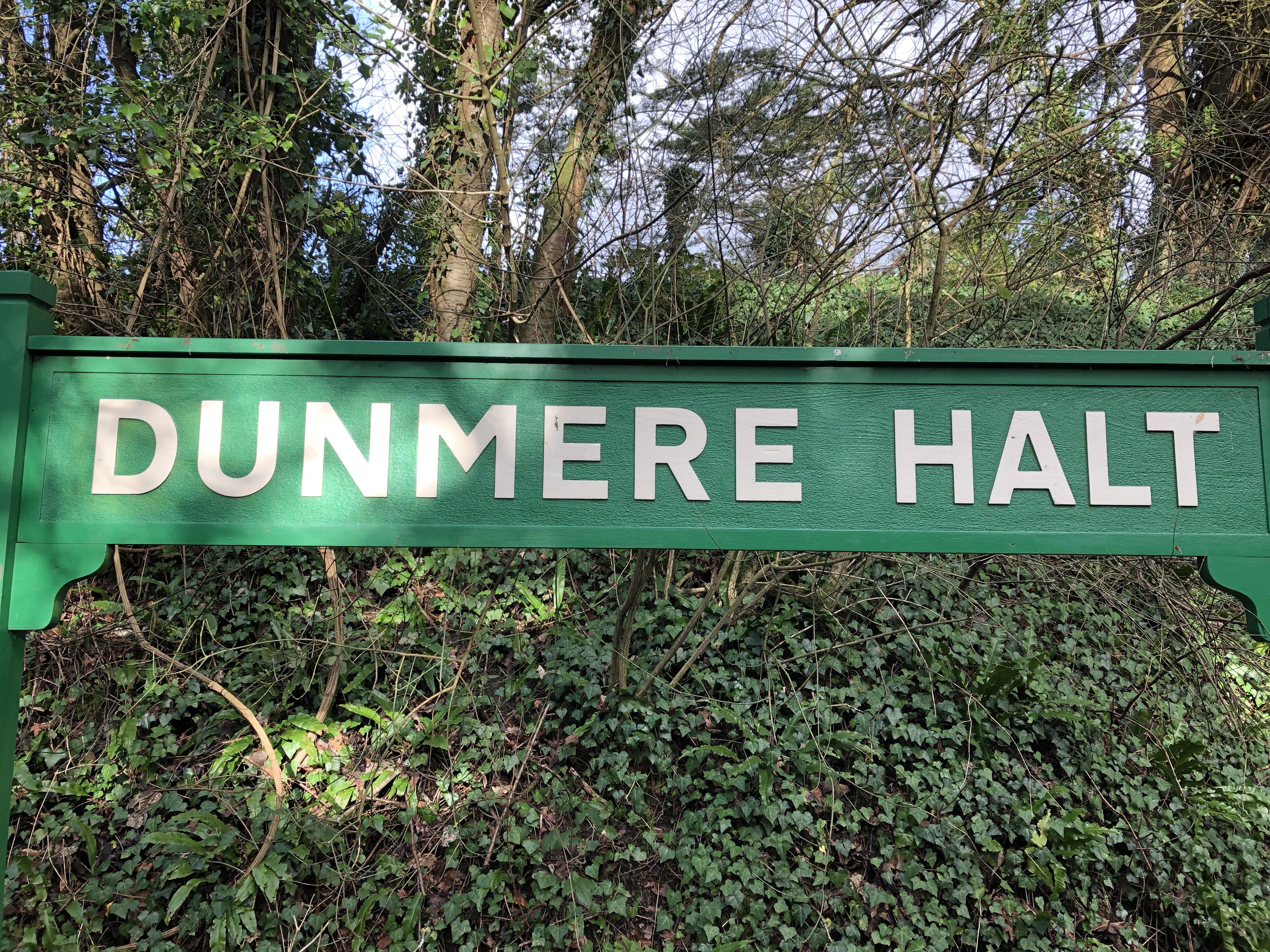

A considered design decision could be seen within these old station signs, painted wood was a nice nod to the origins of the path and to the history of the location. The typeface too I felt was similar in ways to that of the Johnson type that reflected the link to the line back to London. This weeks workshop challenge has been good to notice what I may have ignored previously and I certainly have made a conscious effort to notice and reflect the use of type and how the material or style suggest something deeper than the information being conveyed. I had a great discussion with Joe Pochodzaj this week about such ideas. We raised the question of design decisions and the history behind the type. I have started to think about typography archaeology and what stories can be uncovered from found type. I think this has been an idea that I would like to further develop and investigate. I had started to research the local history of Bodmin as I believe that there would be some interesting stories to be told through the found type in the town. These examples that I am particularly interested in are ones that are in decay or stone engraved type. The engraved type is of particular interest as it raises the idea of craftsmanship and a commitment to information being preserved for centuries. There are examples of this in and around town that have some similar considered styles that I think could combine to give the area its own visual language. The material and process give a nudge to the history and traditions in Cornwall. I think too that the process of engraved letterforms really encapsulates this weeks title of complex simplicity. The process is in no way simple but the results are taken for granted and the information plays a starring role. This week I have taken a step back and really noticed the craftsmanship of this process and through articles have been looking at examples of engravers really pushing the boundaries of this skill. I think that I am in awe of the skill and consideration of these rules, mastering these and then really pushing the limits of the material and process. This is something that I believe I need to focus on in my work, learn and master the basics and then really experiment with the idea.
