This week I have been exploring a range of sources of inspiration and reflection. Joe and Stuart have been throwing articles and designers left, right and centre at me and this have been great to build my contextual reference points. The more and More I look at these ideas the more I seem to be confused about the direction I am going. That’s not to suggest I don’t know what I am doing, I think that having lots of reference points has been a great observation and given me ideas and I have been able to reflect on simple ideas and mannerisms of different typefaces. But it does raise the issue of originality even if the references are new to me.


Having explored just a few of the local sights and found Type, I began this week with an idea of creating a typeface that shows some historical influence and appreciation of craftsmanship. The stone carvings had been a big influence on my research last week and through conversations with Joseph and Stuart, I had discussed the complexity of material and type. I found it difficult in some cases to comprehend the use of material with the emotions evoked by some examples of the type. The main issue I had last week with this was the Cornish Guardian, a typeface with strong links to medieval England and the use of material straight out of the factory, a permanent fixture of comparison. The old and new. And too while I had found inspiration in the material from the use of wood and stone I wanted to create something this week that would pay some respects to the local traditions and some of the design choices I had noticed. This being said I wanted to bring the area up to date and felt that aiming to combine some of the sharp edges with a more softer sans serif typeface I would be able to achieve this. My first point of call was pen and paper, I had explored ideas allowing the pen and paper have some dictation of the letterforms. The paper in question was an isometric grid that enabled me to draw clean lines at 33 degrees. I had some success with this and was happy with what I thought I wanted to do, I was then able to pursue these ideas a little further. I had also found some inspiration from the old Cornish tin mines, their tall chimney and angular roof points had inspired some of my letter forms.


With the idea of a chisel in mind, I was thinking about the angles that could be made with this, I also reflected on strict calligraphy and the rules of using the chiselled tip. I believed that this would enable me to evoke the traditions of the area but I could use it in a way that would give me a slight flourish rather than a complete dictatorship of the style. During a walk on the beach I took the oppertunity to experiemnt with ideas and forms in the sand. I still wanted to keep my ideas but some were more experimental than others.


From the beach, I started to use Illustrator to bring some of my ideas to life and edit them further. What I thought I wanted to create soon started to develop even with very subtle differences. I found that through this process I have been able to generate a simple idea that has enabled me to explore a wide range of options. This was taking that very first sketch into Illustrator and using the hexagon as my main focus. I used this geometric shape to influence each letter form. Initially, I had been experimenting with lowercase type, this was due to the sketches I had had.


Further to this, I began to explore other geometric shapes and simple lines, I went back to a previous design from module one where I used the perfect circle and straight lines of Isambard Kingdom Brunel to influence my type. I believe that this is a very simple but effective, modern and clean type that has no real agenda. It isn’t as aggressive as the Hexagonal example above. While the idea of the Hexagon was something to work on I was not happy with the M, I or N really due to their disconnect to the B, O and D. I amended this with the curves of the circle to influence my type. I did, however, conclude that this was not fitting with the emotions or stories I wished to evoke. The circle type has strong lines and good symetry, Although now on reflection the kerning is all wrong, I was due to move on. Through a conversation with the group, Sian suggested that we look at the website Fontstruct to design our type. This was a great tool to stumble upon and enabled me to engerate and refine ideas using a mixture of the websites intuative use of simple shapes and the control I felt I would have by using Illustrator.


The curved corners and bold lines of this type, inspired by the experimentation of using the website, gave me a clean, strong type that could reflect Bodmin, in the ways of the strong bold characters of the type and of its population. Choosing to remove the colour fill of the shapes used presented me with a building block break down of the type that evoked a sense of futurism and evolution. In some ways, I could see this in the town with all the recent developments that have been taking place. I had to, once again conclude that while I do like the aesthetic of this one it does not reflect the handcrafted, chiselled and traditional form that I wanted.


From the readable and clean ideas, I must have gone a little crazy with the concept of handcrafted using tools. These ideas are progressive ideas in that I added things, removed elements and really challenged the idea of legibility in the bottom example. This is something that I think I can develop further, I also need to develop a title case rather than the lowercase examples. further to these ideas I started to combine the more clean lines and the angled edges shown above.
Combining this idea of a chiselled edge and the thick strokes here I was able to work towards something that was getting closer to my idea for the typeface. I will aim to develop this concept further and really challenge the conformity of each form. While I believe this will make for an interesting outcome I do not wish to distort the character of the type as this could be seen as a negative reflection against the location. My type thus far are heavy and strong characters, as suggested above this could be seen to reflect the population but I also think that I should add some contrast to the weight to further highlight the diversity of the area. Okay so it may not be so diverse but with the influx (myself included) of people settling here from further north, the Cornish language and traditions could be seen to be diluted.


At this point I was still unsure of the true direction, or maybe just had not yet developed something that I was truly happy with. I went back to pen and paper and started to use the grid as a guide to the design of the typeface, I still wanted the idea of a slab, heavy type to reflect the use of stone and too to reflect this I wanted to incorporate a cut corner. I had a moment of procrastination and had a look through Instagram and Pinterest at Type and then opened up Illustrator once more. I knew that type was made some basic shapes and it is just a matter of how we link these ideas together. I started this time with these shapes and set out placing them together with no real intention of forming a letter but what become was the start of the O, that then transformed into the D and the rest seem to flow into place. I quickly noticed a few errors and misplaced shapes but once I had rectified this I was starting to develop a type that I was happy with.


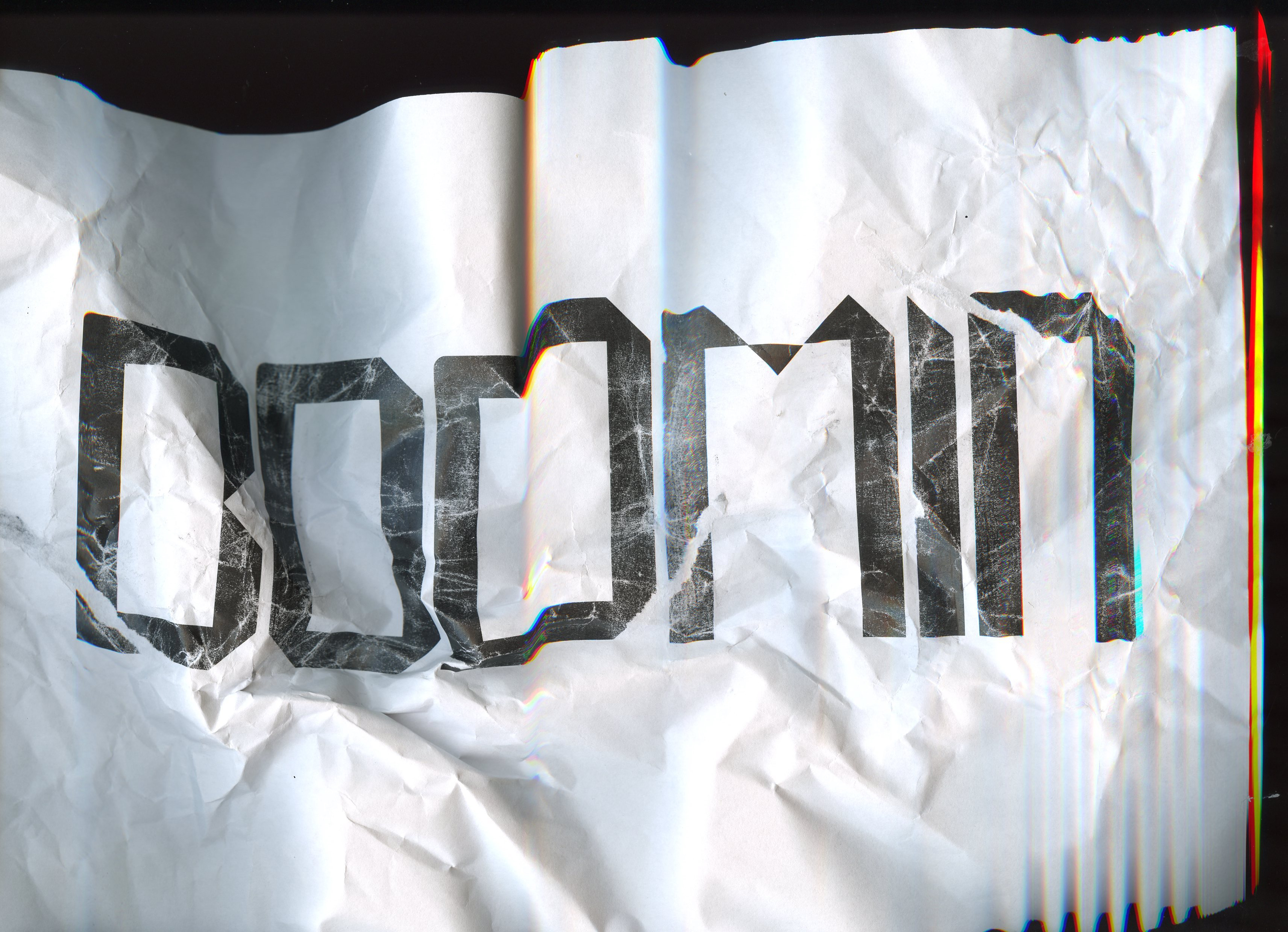
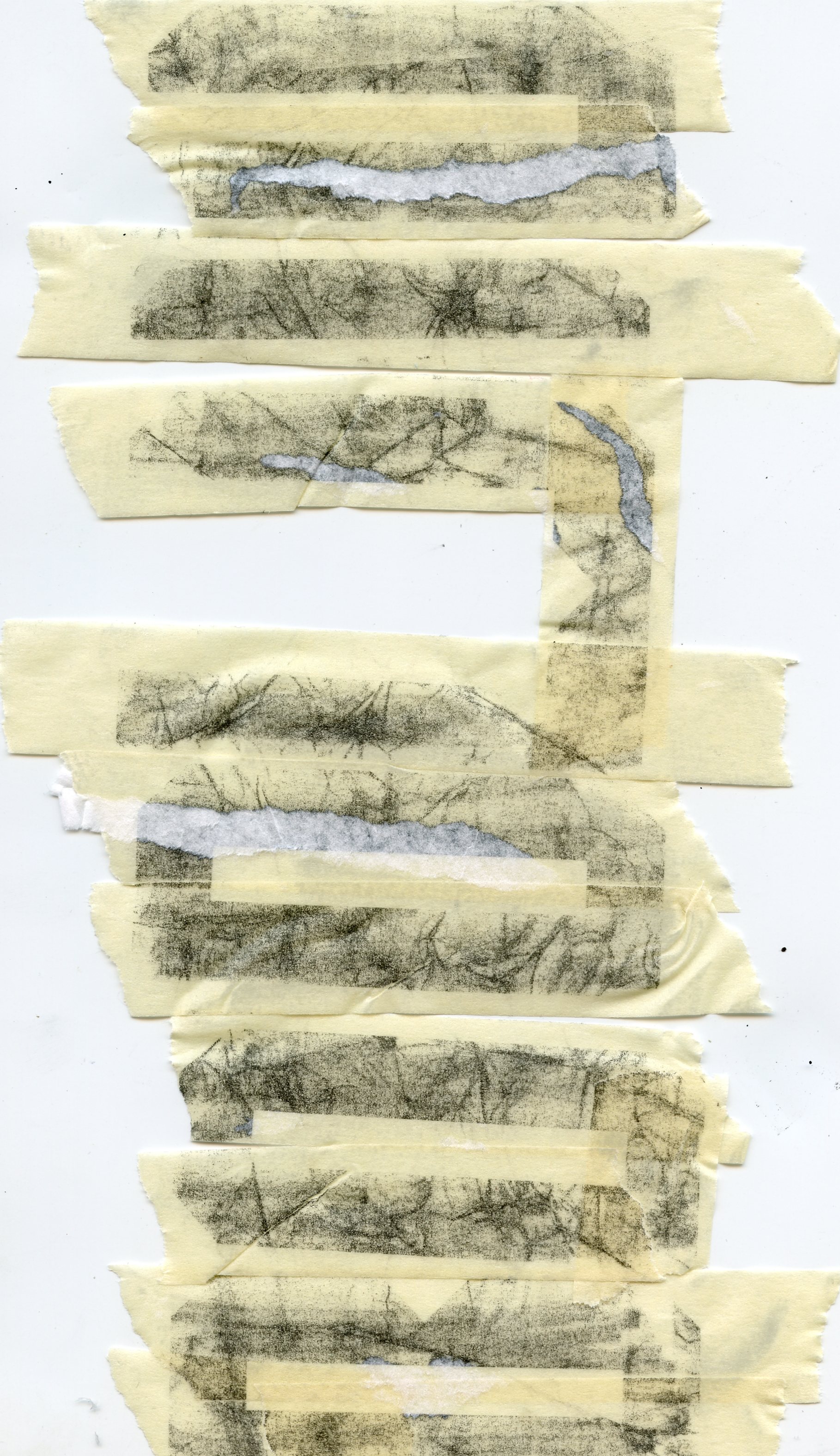
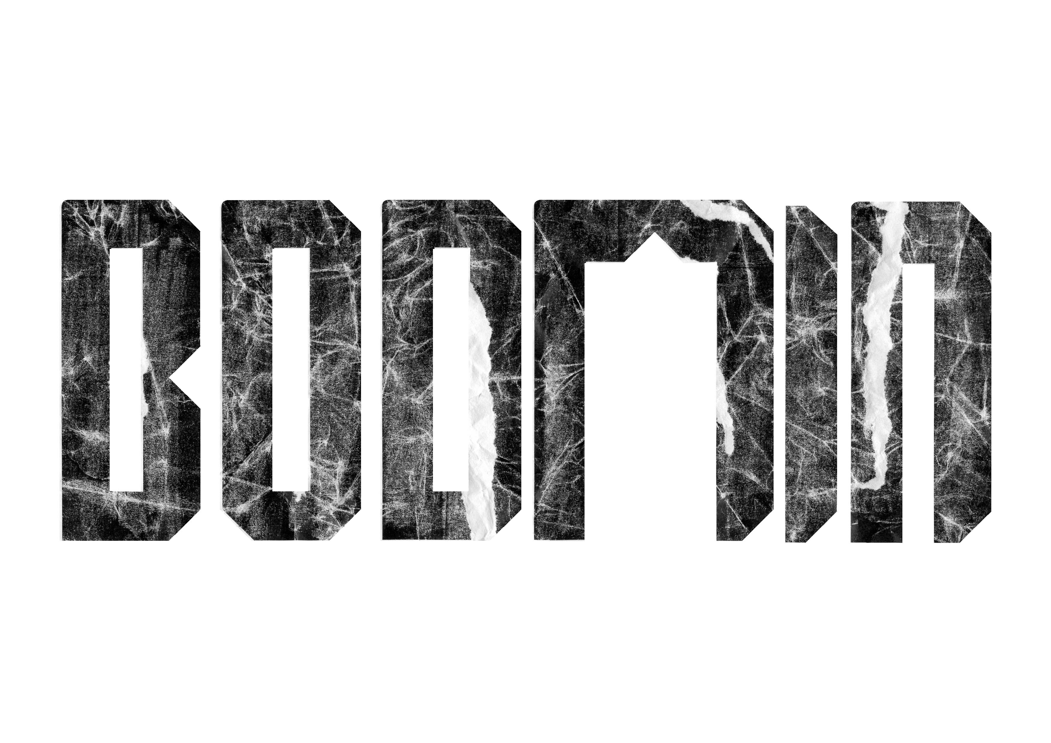
I was beginning to get into the rhythm of this idea and thought that I was working towards an outcome that held the principles and ideas I wished it to. Feedback from Joe and Stuart was that it could be perceived as too digital and that I should explore the idea of bringing in the handcrafted element and the ideas discussed around hand-carved work from previous weeks arose once again. To do this I thought about ways I could make the type imperfect or distress their form. Tracing the type on the light box did nothing to really excite my intentions so I reverted back to a process used in previous weeks and scanned the type. This too went too far and distorted the type beyond what I wanted. I wanted the distressed and weathered look I had seen in some of the examples around town. I screwed up the paper, scanned it and then went on trying to remove the ink from the page using masking tape. This process give some unexpected results and brought back some inconsistencies and certanly demonstrated a way of human error in the type.


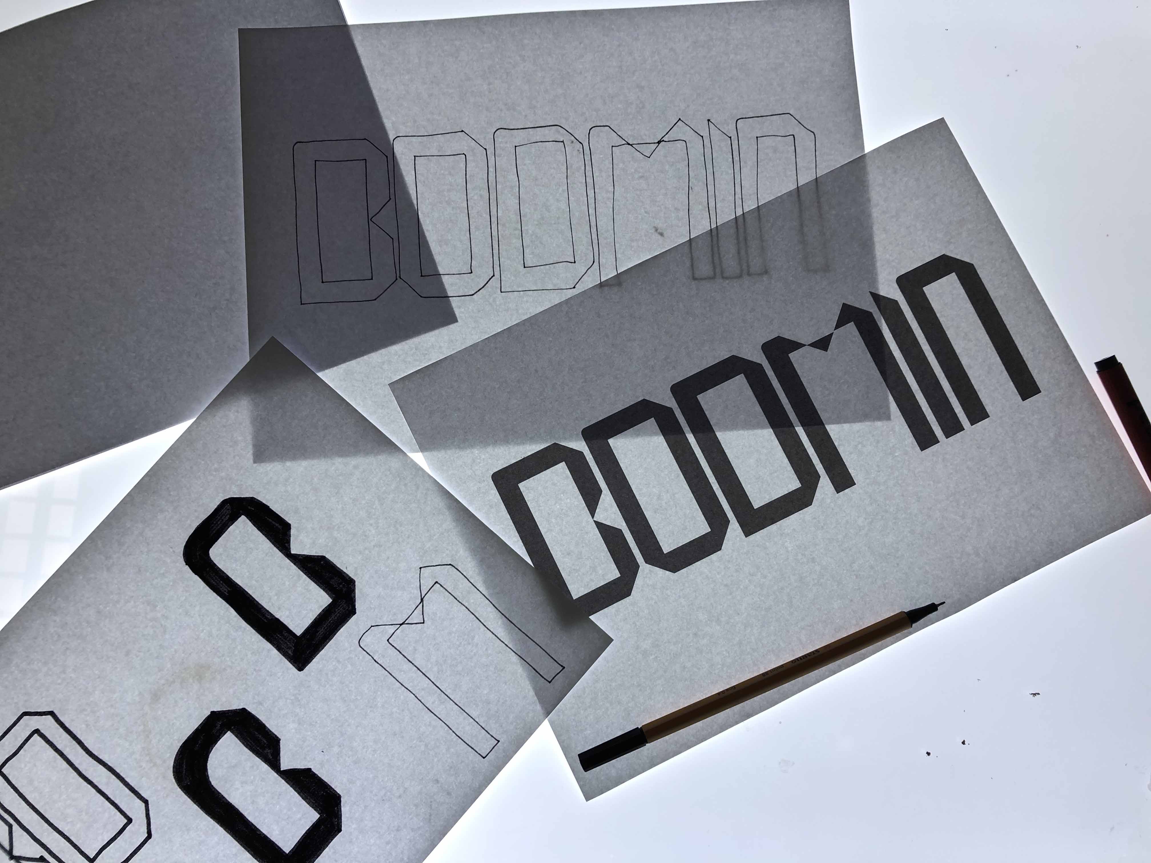


Further feedback from Stuart and Joe I had gone back to my designs and aimed to take away the digital and the forced style of the M, I and N. I however did like the aesthetic of the scanner and the distortion of the clean lines. I also added some weight to the characters however I later noticed that this is inconsistent across each letter. I still felt that the B, O and D were the better characters, the I and N soon started to belong but I was having some real trouble with the M.


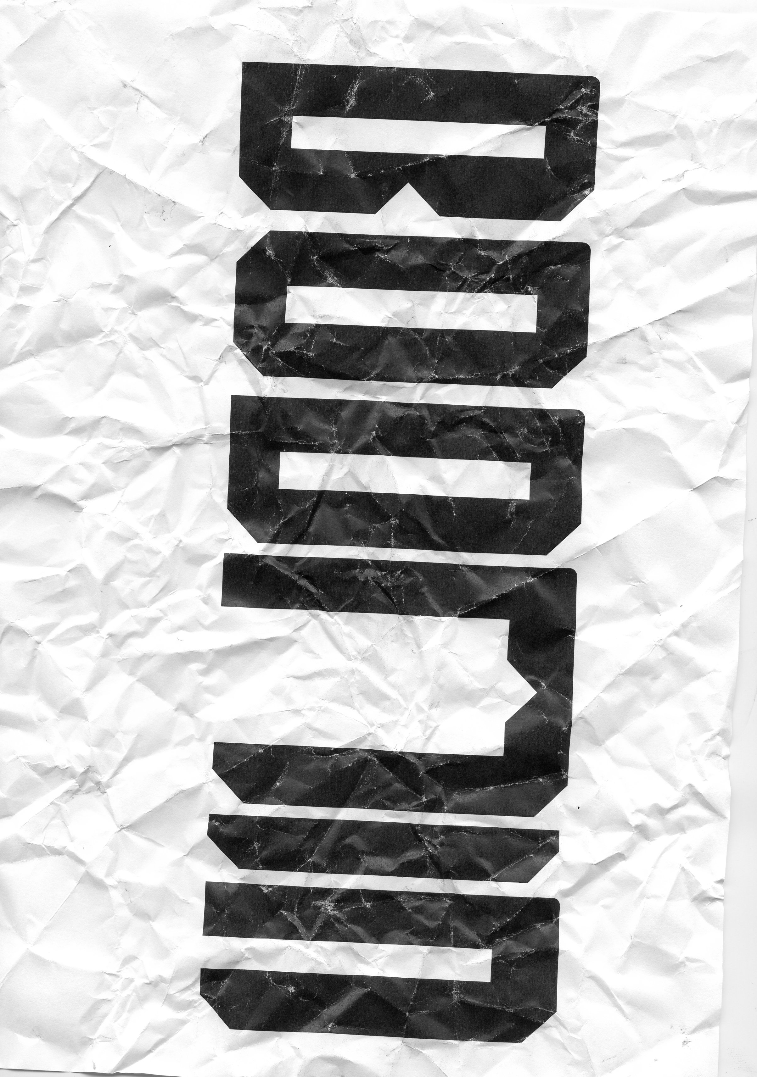
Once I was happy with the typeface I soon set on with destroying or distorting the type using the scanner and masking tape. I took the opportunity to scan in the masking tape as the ink was left behind, I thought that this was an interesting idea and creates a very distorted view of the characters.
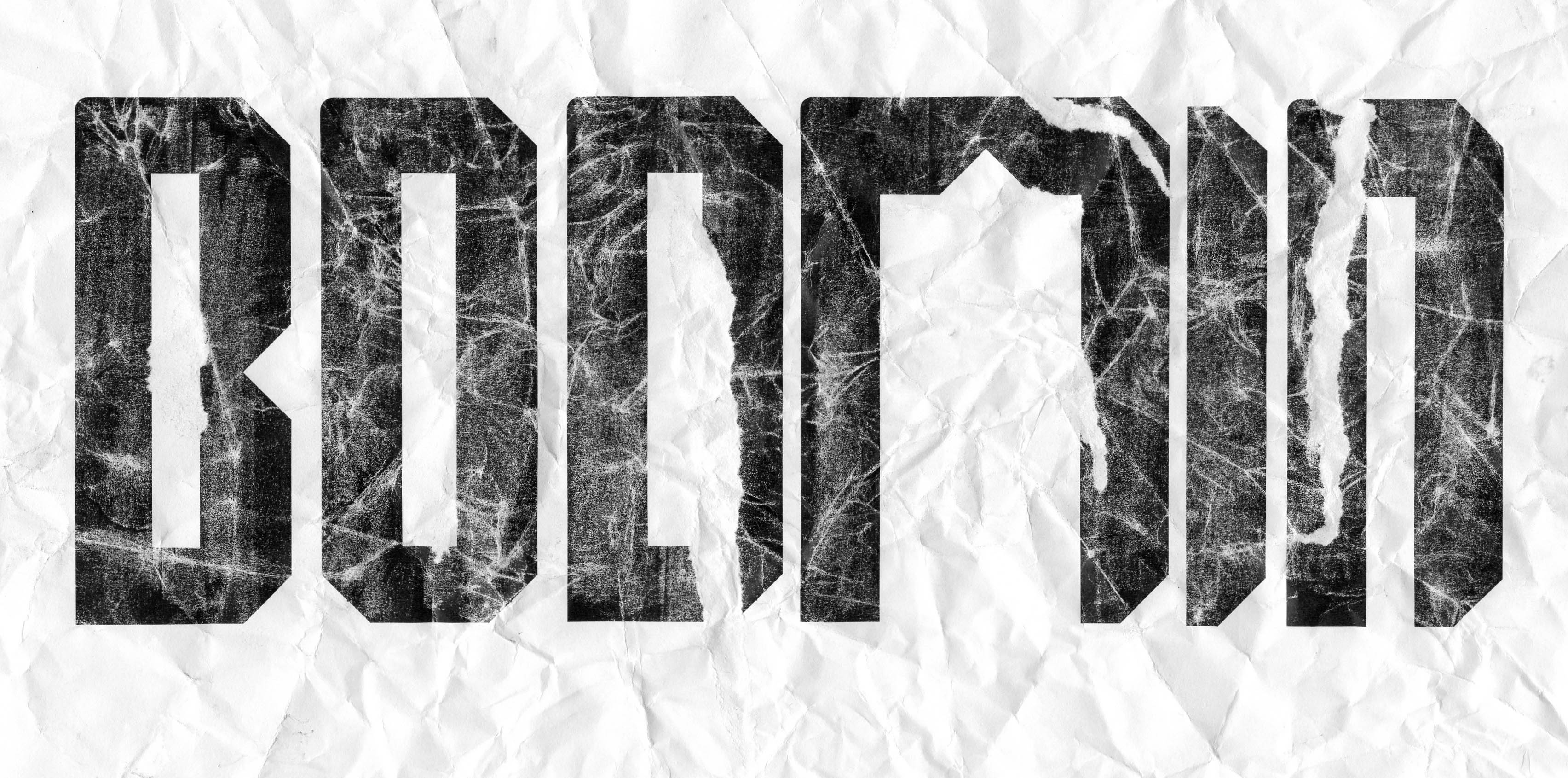
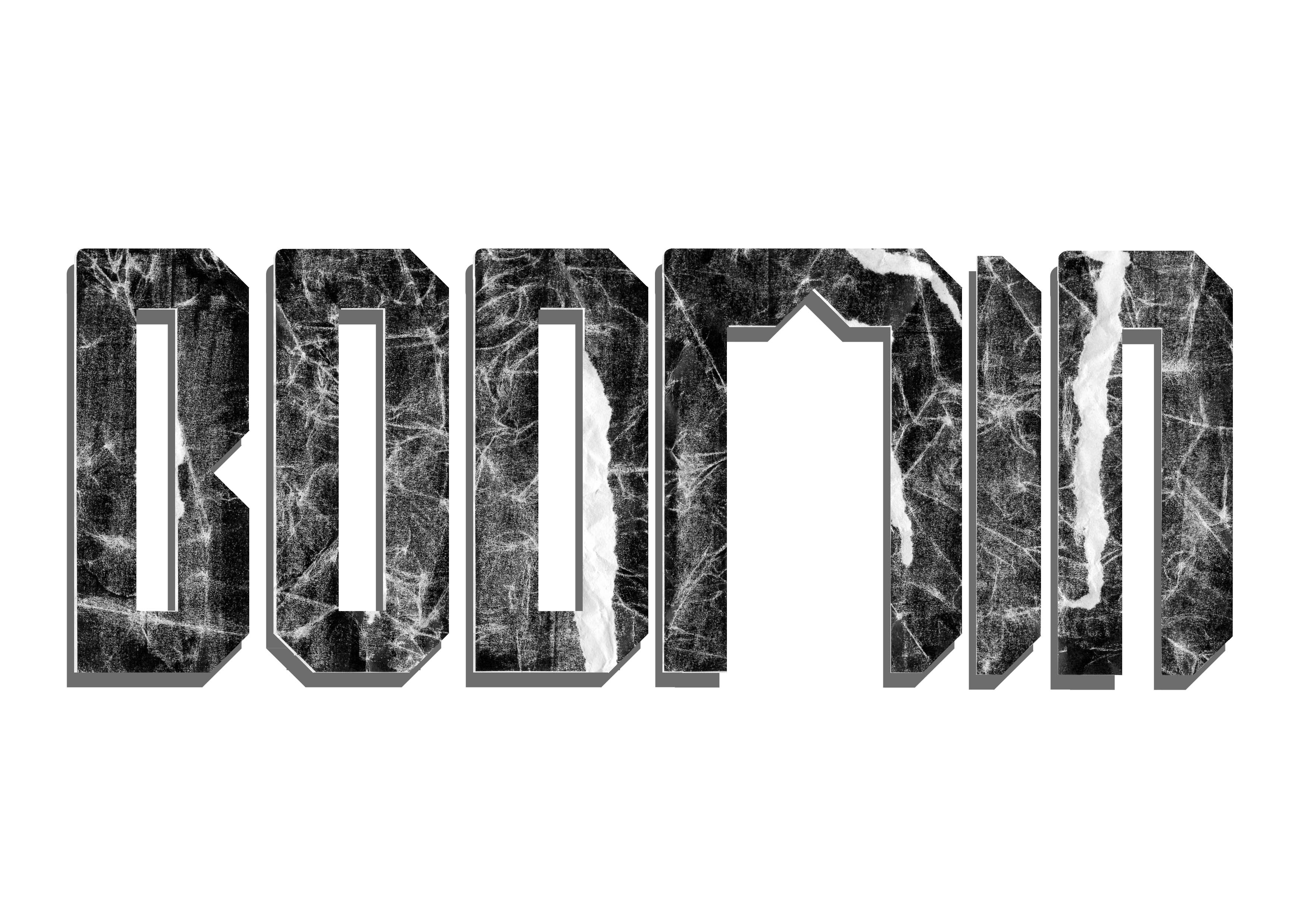
After many issues with my blog this week I have tried to keep a track of my progress but there may be some missing processes / steps. This being said I am happy with the end outcome. The idea of a chiselled, hand crafted type that draws influence from the Cornish tin mines and shows some distortion and erosion, I believe my outcome demonstrates all this. I will aim to amend some of the weight issues, there is a slight difference in centre spacing in some of the characters, however I must conclude that this does also reflect a human touch, a slight error only noticeable to those who seem to pay particular attention. This week has been good to explore my practice, combing the hand drawn, digital and the process of hand. I am starting to find a rhythm within my work and setting myself rules and boundaries has inspired a lot of my work this week and is reflective of what I set out to achieve in this module.

