

This week has been full of reference points that I should consider in the writing task. Each of these points shows consideration and an appreciation to designers who we consider to have an element of craft within their design. The work of Uniteditions celebrates the branding guidelines that were printed with meticulous detail. The books are a celebration of the immense detail that designs pay to ensure that their work is flawless.


During a conversation with Joe Pochodzaj this week I highlighted my hate for the flood of Instagram liked the design that lacks true depth and guts. To me, it is art for art’s sake. Design for design’s sake; is something that looks mediocre but mindless scrolling and double tapping encourage this behaviour. I am interested in the work of the greats, the Jan Tscholds and the Paul Rands, I like the approach to design by ‘non-designers’ such as Harry Beck. I appreciate the experimentation and the limitless boundaries that the Bauhaus endorsed. Working within a few basic principles, guides and ideas designers can and have produced some amazing work. I am not suggesting that the designers of now are falling short of these ideas, there are of course people who do push ideas and have something to say and provoke a conversation through their design but It would appear that these are few and far between. My first point of call this week was to reflect on the books I own and what would I like to see on my shelf. This sparked a few ideas but mainly had given me the oppertunity to just sit and enjoy the design and layout of these books.
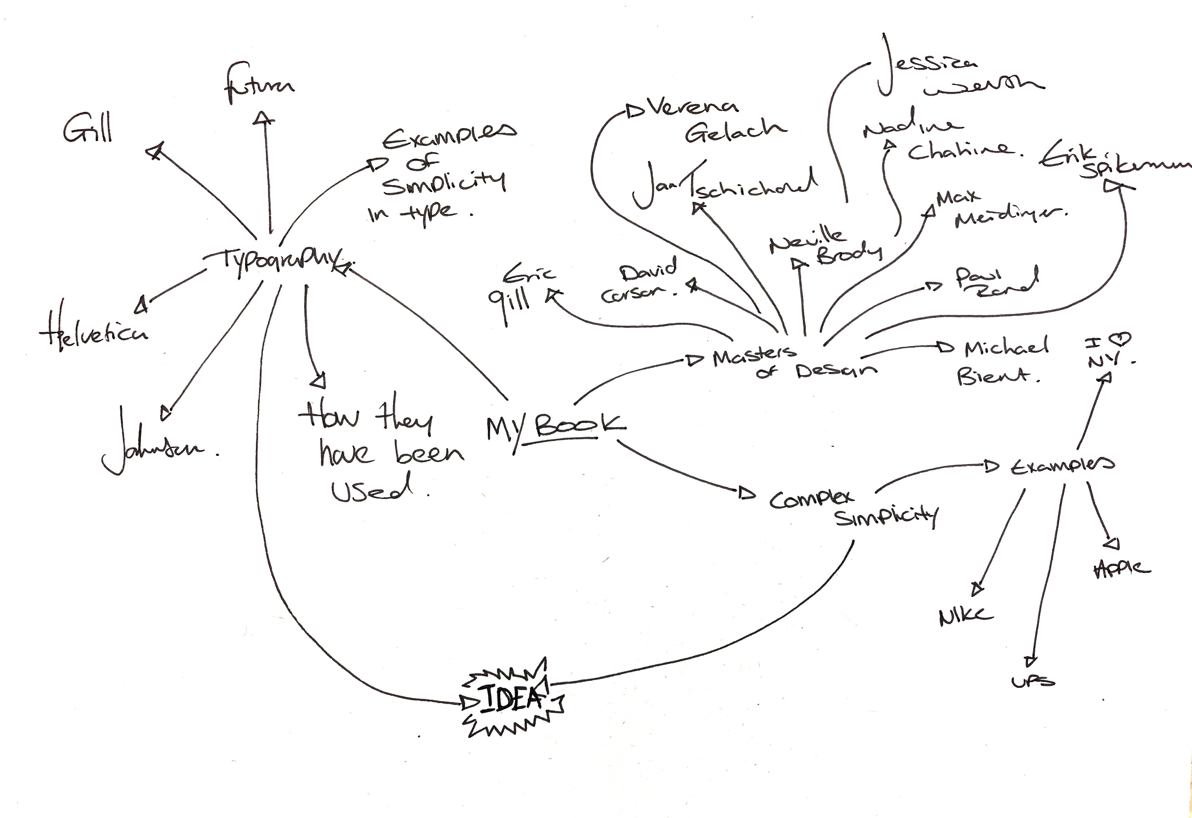
I wanted to focus my idea this week and identify one designer to look at as this would enable me to write more concesely and develop my written work alongside the visuals. I thought about a range of ideas but had decided that I should focus my attention on Jan Tschichold. His work has been a huge influence to many designers and I believe that I have a lot to learn from him and the principles he has written about. I started to sketch out some ideas for my writing this week, this was before I had identified my focus but I will take some of these ideas and implement them into my work.
The book; Die Neue Typographie outlines the rules and guides for the application of type within Design. Trained in traditional calligraphy, Tschichold understood the principles of legibility and hierarchy of written communication. He later suggested that his rules were too confined and that they should be used with some sympathy. This is a book that I would like on my bookshelf and one that I feel I need to learn from. I have been fascinated with Tschichold’s work since my BA, his work on the penguin book publishers logo has remained broadly unchanged, this is a true testament to the designer and to the publisher for not wanting to change this icon of design. The beautiful simplicity of the illustration is instantly recognisable, set using strong colours, that at the time must have had more consideration that what some designers give to their work today. There are only a handful of logo design examples that have gone unchanged in such a long time.
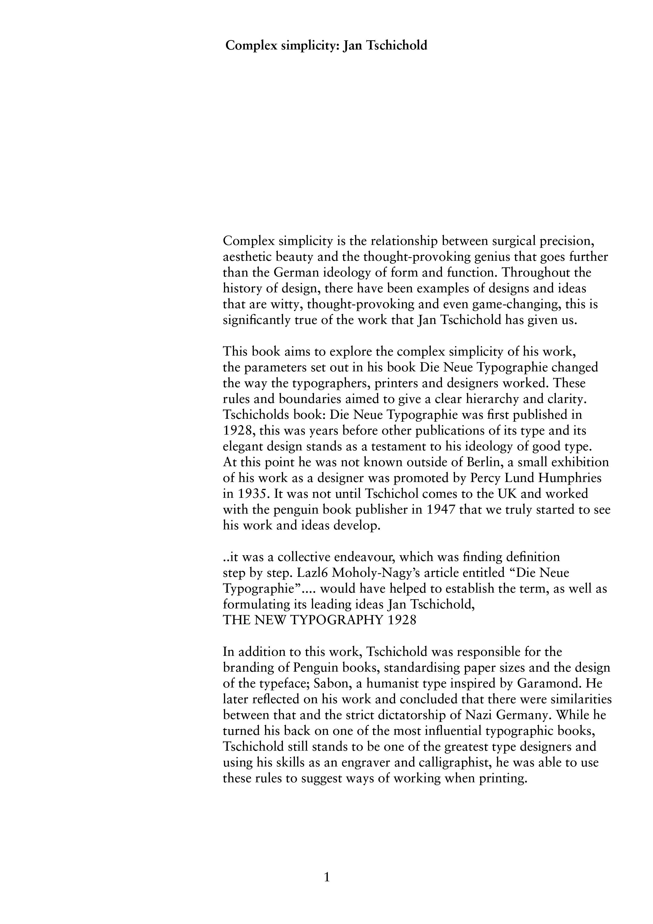
Complex simplicity is the relationship between surgical precision, aesthetic beauty and the thought-provoking genius that goes further than the German ideology of form and function. Throughout the history of design, there have been examples of designs and ideas that are witty, thought-provoking and even game-changing, this is significantly true of the work that Jan Tschichold has given us. This book aims to explore the complex simplicity of his work, the parameters set out in his book Die Neue Typographie changed the way the typographers, printers and designers worked. These rules and boundaries aimed to give a clear hierarchy and clarity.
Tschicholds book: Die Neue Typographie was first published in 1928, this was years before other publications of its type and its elegant design stands as a testament to his ideology of good type. At this point he was not known outside of Berlin, a small exhibition of his work as a designer was promoted by Percy Lund Humphries in 1935. It was not until Tschichol comes to the UK and worked with the penguin book publisher in 1947 that we truly started to see his work and ideas develop.
..it was a collective endeavour, which was finding definition step by step. Lazl6 Moholy-Nagy’s article entitled “Die neue Typographie”….would have helped to establish the term, as well as formulating its leading ideas
Jan Tschichold, THE NEW TYPOGRAPHY 1928
In addition to this work, Tschichold was responsible for the branding of Penguin books, standardising paper sizes and the design of the typeface; Sabon, a humanist type inspired by Garamond. He later reflected on his work and concluded that there were similarities between that and the strict dictatorship of Nazi Germany. While he turned his back on one of the most influential typographic books, Tschichold still stands to be one of the greatest type designers and using his skills as an engraver and calligraphist, he was able to use these rules to suggest ways of working when printing.
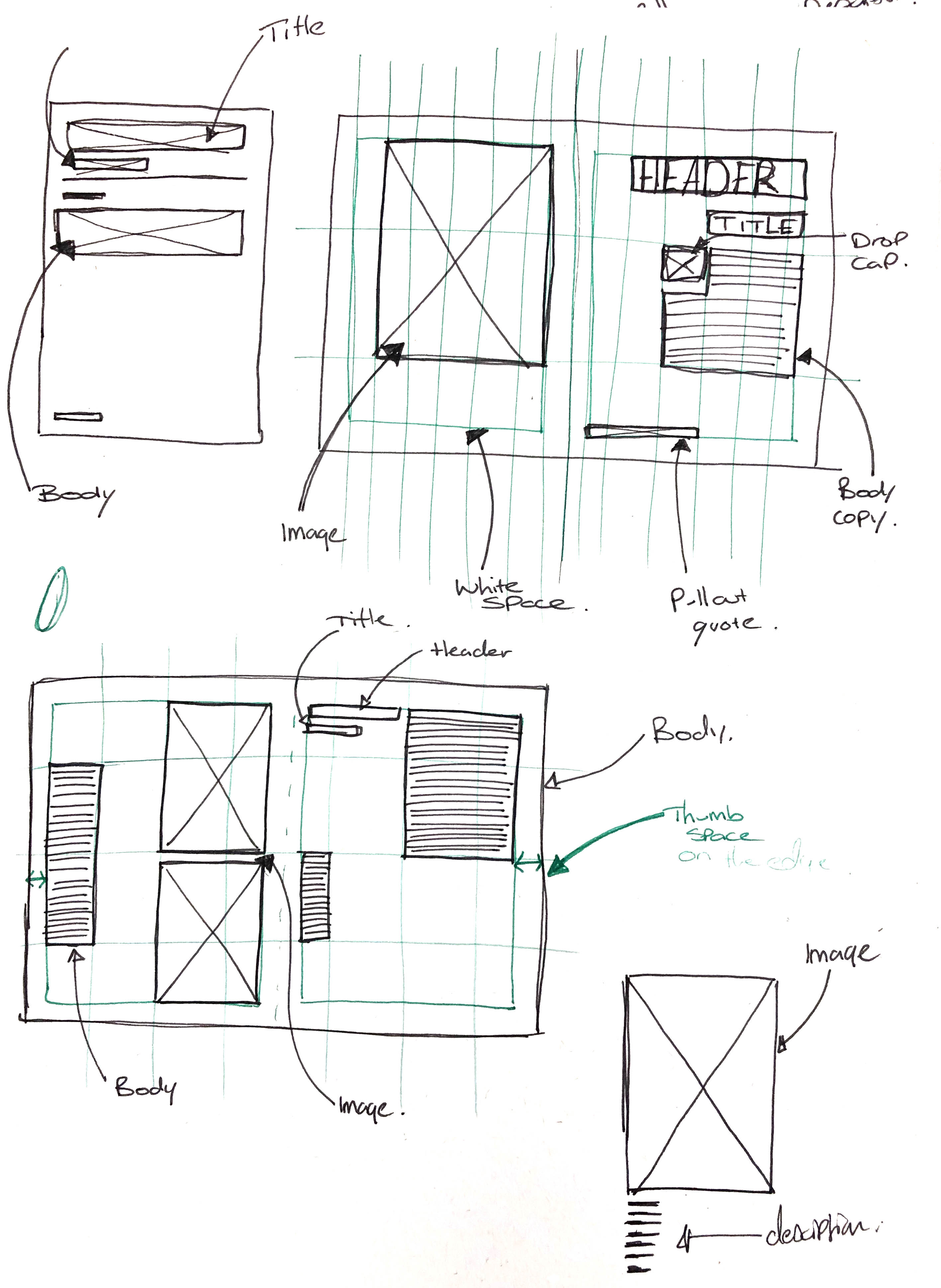
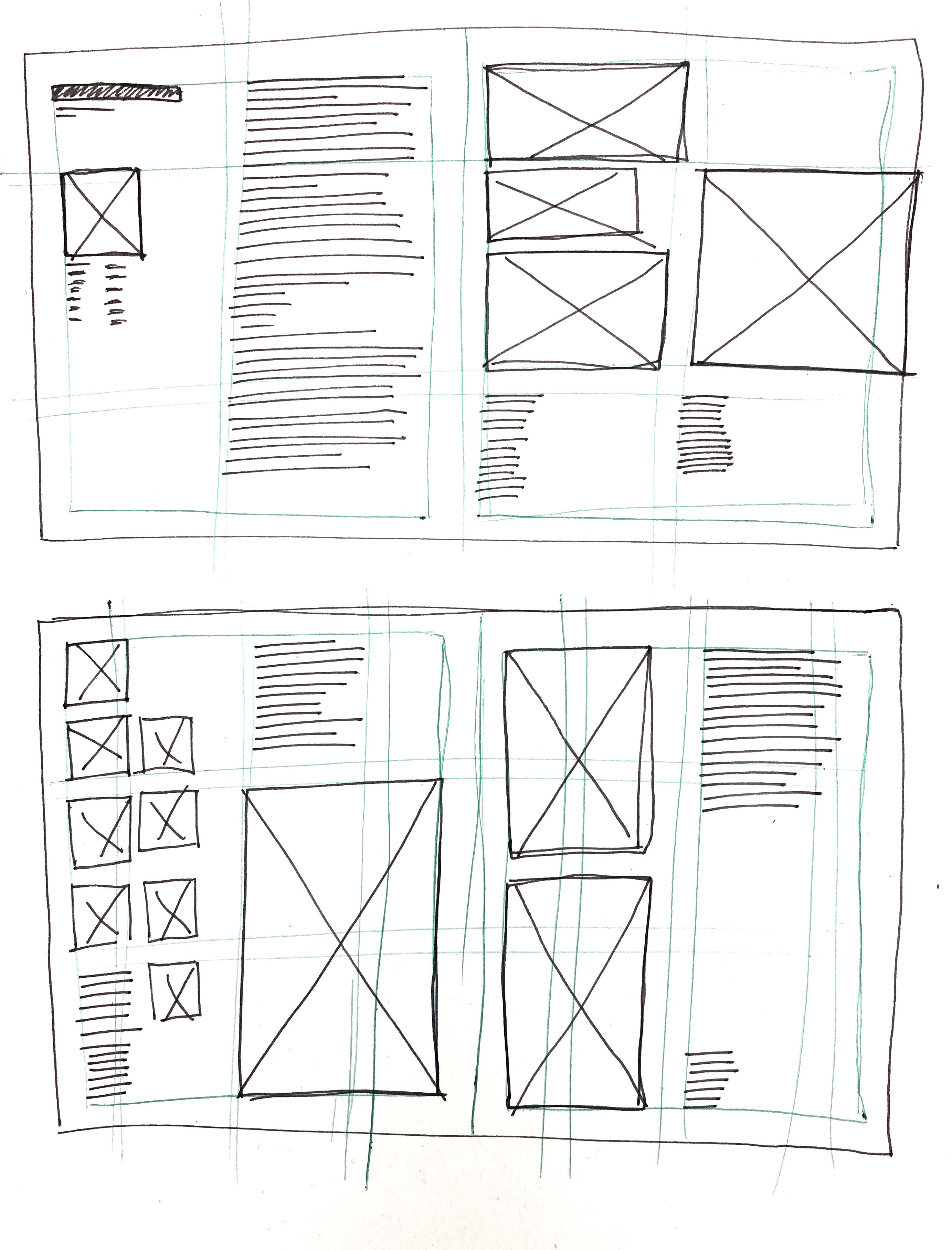
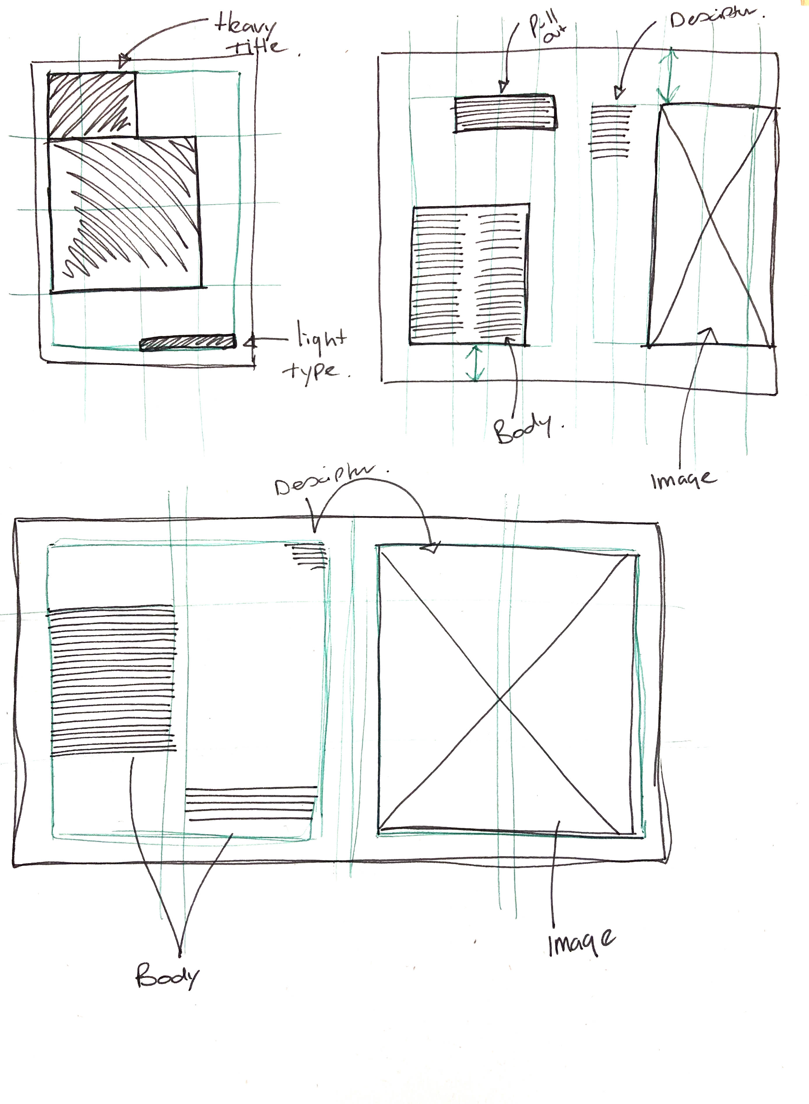
Above is an example of the type set in a grid that I believe reflects the ideologies suggested by Josef Muller-Brockmann and his book that outlines the principles of design using grids. He highlights that margins should consider the user’s interaction with the page, the frustration of covering text or image is something that can be avoided. he goes further to identify the need for a clear structure and hierarchy in information. This idea has been echoed throughout the history of type and editorial design but one that has its roots within Tschicholds book from 1928. I have set this type using the Sabon typeface that Tschichold had designed. I have written this from the perspective of an intorduction or forward to a book that would investigate and discuss the cultural influences that his work had, the book would aim to discuss the complex simplicity of his work and make refernces to the work of other designers that have been inspired by his work.


