Being strapped for time, I need to make the best use of any opportunity to get some work done this week. Parting words from last weeks webinar was: it’s incredible what you can achieve when you push yourself with little time. (I’m paraphrasing). It wasn’t until Monday that I was able to get back into my sketchbook and re-think the visual for this project. I didn’t necessarily want to start over completely, but I did want a fresh perspective on the project. I liked the typeface and colour. I knew that these elements could work; I just needed something else. For a few weeks now I have been trying to think about the title of the project, to give it a name that has meaning, communicates what the project’s intentions are and does not focus too heavily on Bodmin as a location. This project could be implemented in other areas. And as I have been reaching out to others, I have been made aware of similar projects and ideas that exist in specific locations. In each of these examples, the place has not been the name or title/name for the project. Something for me to ponder.
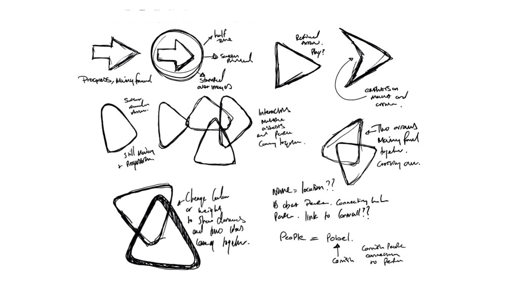
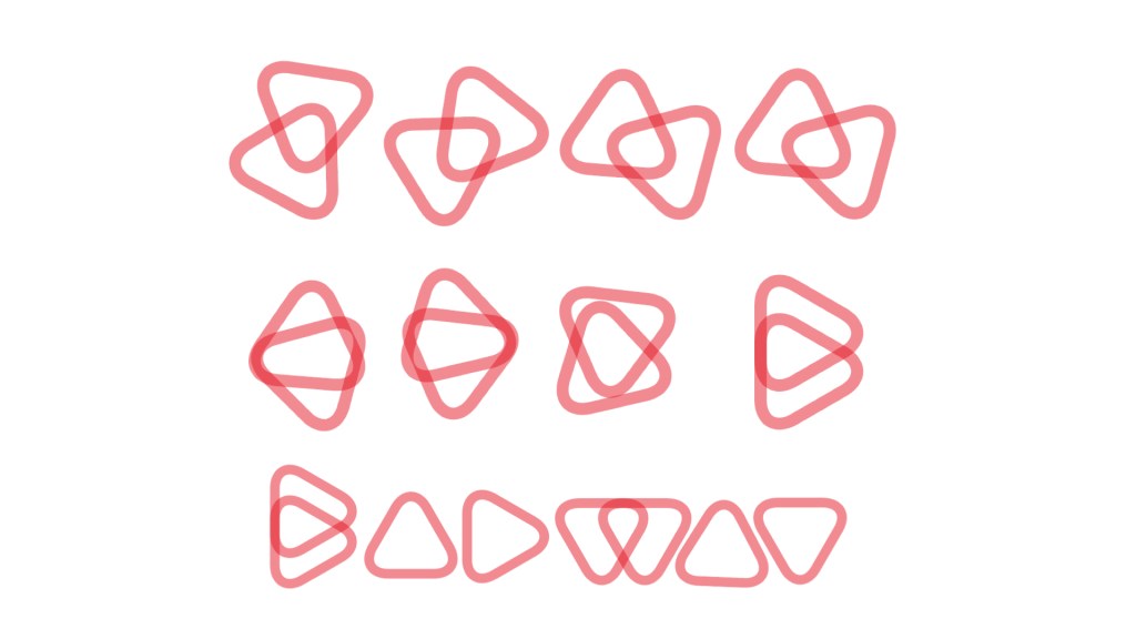
Stuart referred to the half-circle in my previous visual, and it was commented that this could be too obvious and could be developed further. As a result, I started to think about other shapes and visual references that could be used. I wanted an icon or visual reference beyond the whole logo; I wanted a symbol that would draw reference to the location and values of the project. Thinking about these values and aims, I started to draw arrows as a sign of progression and movement in a new direction. Again too obvious but this was a starting point. I developed these arrows by simplifying them, creating less uniform shapes with the idea of these arrows. This development resulted in a rounded arrow shape that I could then create a layered visual that resembled the connections and coming together of people. I started to see a visual asset that could be used in a range of solutions. I used a 50% transparency to show the overlap. I then moved onto the chosen colour palette and returned to a 100% transparency.
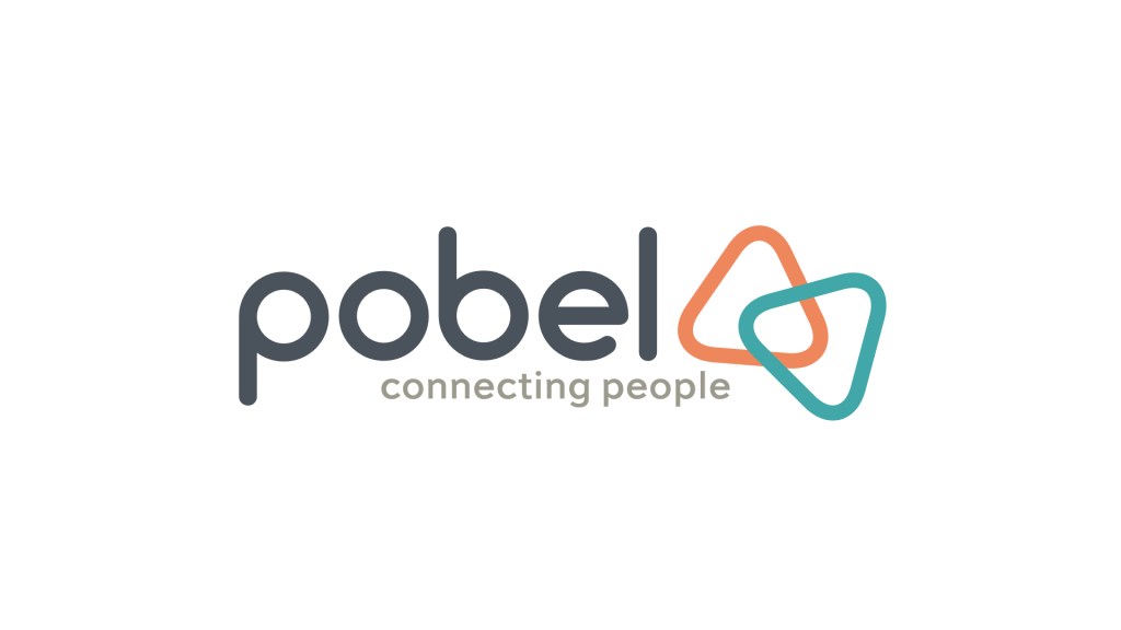
From this idea, I began to think back to the name; I wanted to have a name/title for the project that encapsulates the ideas but shows some transferability of location. I, therefore, began to think about keywords and values of this project, translating each of these words into cornish I found the word Pobel that translates as People. Adding the strapline connecting people then reads, people connecting people. I could add to this by changing the strapline to connecting people and ideas. Understanding people, connecting people and ideas. This idea provides a sense of community and togetherness. It also encapsulates the theme of the project and emphasises people being at the heart of the project. While I accept that this idea isn’t exactly groundbreaking and experimental, something that I feel is expected, this new direction is a starting point for further development and something that I believe works with this project. It has an open plan and aims not to eliminate or segregate anyone.